Editorial art poster
- Larawan
- 3:4
- 880 × 1184
Recipe ng pagbuo
- model
- GPT Image 2.5 Sunburst
- resolution
- 1K
- kalidad
- medium
Prompt
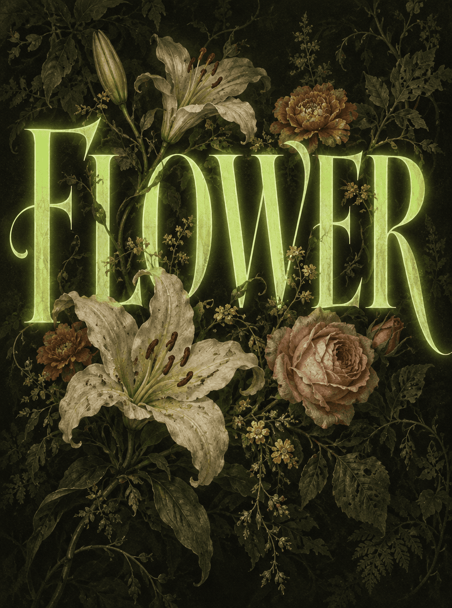
Editorial art poster, core visual is the precise word FLOWER, featuring a style collision of "vintage botanical encyclopedia × futuristic neon typography", with a deep background creating a mysterious and poetic atmosphere. The overall layering logic is clear and the texture is unified, avoiding the problems of the original version such as element clutter, style fragmentation, cheap neon texture, and chaotic plant hierarchy. Core Typography The word "FLOWER" in all caps occupies 70% of the visual area from the upper half to the center of the poster. The font is a high-contrast serif retro display font, with letters featuring elongated curves and sharp terminals, elegant and classical in structure. The fill color is a low-saturation neon acid green, using a restrained neon texture of inner glow + extremely thin outer halo, with a transparent and non-dazzling light effect, avoiding a cheap fluorescent feel. The strokes have strong contrast in thickness, with generous letter spacing, combining retro style and futuristic sense. Three-Layer Plant System (Enhancing Depth, Avoiding Clutter) Background Plant Layer Close to the deep black background with an olive-green tint, densely arranged dark-toned botanical illustrations: deep forest green leaves, winding thin stems, faded vines, and semi-hidden floral silhouettes. The plants are darkened to a brightness close to the background, distinguished only by subtle textures, faintly visible as a base to set the natural atmosphere, without stealing attention from the text subject. Midground Text Layer The neon letters of "FLOWER" are in the middle layer, serving as the absolute visual focus; thin branches and stems from the background plants may intersperse slightly into the gaps between letters, but do not obscure the main strokes. Foreground Floral Layer In front of the letters, a small number of exquisite vintage flowers are scattered, replicating the hand-painted texture of ancient botanical encyclopedias, with a naturally aged and faded paper texture: pale ivory lilies, soft gray-orange marigolds, gray-pink roses, and tiny goose-yellow wildflowers. Only the petals and leaf tips gently cover the edges of the letter strokes, with the covered area not exceeding 20% of a single letter, ensuring the text remains fully readable; the rest of the flowers stay in the gaps behind the letters, forming a clear depth of "foreground flowers — midground text — background leaves", eliminating the sense of disordered collage. Color System Primary colors: neon acid green text, deep black background with olive-green tint Secondary colors: creamy white petals, gray-orange flowers, gray-pink accents, aged beige paper tones Overall low saturation, high contrast, with colors unified in a vintage faded tone; neon green serves as the only high-saturation highlight, restrained and eye-catching without being abrupt. Lighting & Texture The overall lighting uses soft diffused top light, with gentle shadows and no hard edges; the neon text has a weak self-illumination, with the halo naturally blending into the surrounding leaves and background, creating a realistic light interaction. The entire image is covered with a very faint rough paper texture, unifying the neon glow and hand-painted plant textures, resolving the sense of style fragmentation. Hard Constraints The text must be clearly readable throughout, and floral occlusion must not destroy letter recognition; no extra text, no watermarks, no borders; overall balanced composition with a stable visual focus; no plastic-looking flowers, no flashing neon, no cluttered pile-up of plant elements.