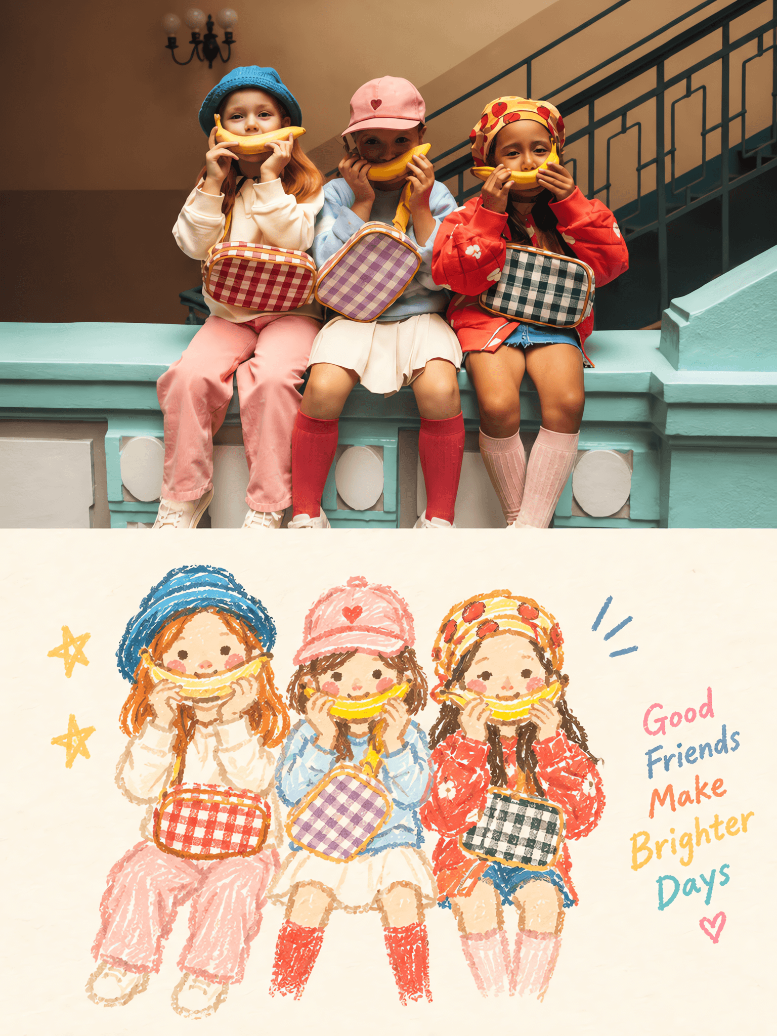
Soft Crayon Echo
- Larawan
- 3:4
- 1536 × 2048
Recipe ng pagbuo
- model
- GPT Image 2.0
- resolution
- 2K
- kalidad
- medium
- reference

Prompt
Source:Use each uploaded photo as the only visual source.Create one independent high-end design poster for each photo and output each one separately.Do not combine multiple photos into one image and do not make a collage. Format:Use a strict vertical 3:4 composition divided into two exactly equal horizontal sections.The top 50% and bottom 50% must occupy the frame equally,with a clear 1:1 split. Upper Half·Original Photograph:Keep the upper half fully photographic and faithful to the uploaded image.Preserve the subject’s identity,structure,pose,real texture,natural lighting,and original color atmosphere.Apply only subtle premium editorial color grading so the image feels like a page from an art magazine,independent publication,or exhibition photography series.If needed to fit the 3:4 layout,you may naturally and seamlessly extend the surrounding environment only in background areas.Do not stretch,distort,replace,or redesign the subject.Do not change the person,animal,object,or core scene. Lower Half·Pastel Crayon Doodle Reconstruction:First understand what is most worth remembering in the original photo:its core theme,main subject relationships,structural flow,emotional tone,and visual metaphor.Then reconstruct the scene as a retro paper-texture pastel crayon doodle illustration.Do not literally copy every object from the photo,and do not fully redraw the whole scene.Keep only the most representative contours,poses,directions,and visual memory points of the original image.Use reduction,simplification,light exaggeration,and recomposition so the viewer can immediately feel the correspondence between the lower illustration and the upper photograph. Drawing Language:The main subject should be built with thick grainy chalk-and-crayon-like hand-drawn outlines.The lines should feel slightly thick,loose,dry,and relaxed,with powdery pigment grain,small breaks,faded patches,slight hand wobble,and imperfectly closed edges.The stroke ends should feel naturally blunt and rounded.Inside the subject,use only a very small amount of pastel color blocks,simple grids,stripes,dots,or loose scribbled marks to suggest structure with minimal information.Do not create realistic volume,complete rendering,or dense detail. Small Surrounding Elements:Any surrounding stars,flowers,plants,objects,environmental clues,or abstract symbols must use the same line language as the main subject,but be simplified even further into one-stroke or few-stroke doodle symbols.They should remain simple,naive,open,slightly awkward,and mostly contour-based,with little or no fill color.Do not turn them into polished icons,stickers,or separate mini illustrations. Composition:The lower half must maintain a relationship of small-scale subject presence against large areas of negative space.Freely position the reconstructed subject according to its direction,proportion,and visual center.It may be off-center,near an edge,suspended in space,or partially cropped.The main subject and a very small number of doodle symbols should form a loose but clear visual cluster,while the rest of the space remains intentionally empty.Negative space is a major compositional element.Build a strong sense of breathing room,distance,and pause through emptiness versus density,clustering versus scattering,scale contrast,and asymmetry.Draw less rather than more.Never fill the lower half. Background Paper:The lower-half background must use a very light,clean,and bright paper tone,such as cream white,ivory white,pale off-white,soft apricot white,very light gray-white,or another near-white paper color intelligently matched to the overall color temperature of the source photo.The paper should show only very subtle fibers and fine grain.It must not look brown,yellowish,dirty gray,or aged.The background brightness must remain clearly lighter than the subject outlines and pastel marks so that all crayon contours,small doodle symbols,and any tiny note elements remain clearly visible and never blend into the background. Color System:Extract 2 to 4 of the liveliest,friendliest,and most spirit-defining colors from the upper photo,and reinterpret them as bright but soft pastel crayon colors.The palette may naturally shift into tones such as peach pink,apricot orange,cream yellow,mint green,sky blue,or pale lavender.For the main outlines and key accent marks,prefer colors that read more clearly against the background,such as coral pink,soft blue,blue-green,warm orange,pale violet,or a slightly deeper creamy tone.The palette should feel light,fresh,playful,gentle,and emotionally warm while still remaining clean and controlled. Optional Tiny Text:If the composition benefits from it,you may add only a very small amount of handwritten micro text or a tiny note in the lower half.Keep it sparse,secondary,and visually quiet.Do not let text dominate the image. Overall Style Goal:The final poster should feel like refined editorial design:real photography above,and below,a reduced pastel crayon doodle memory of the same scene.The lower half should feel light,airy,naive,but not childish;playful,but still tasteful;minimal,but still recognizable;and rich in atmosphere through line character,spacing,and selective color. Negative:No multi-photo collage,no unequal split,no realistic redraw of the entire photo,no heavy detail,no dense background reconstruction,no polished vector illustration,no glossy digital rendering,no 3D,no oil-paint effect,no thick impasto,no crayon buildup,no dark dirty paper,no brown aged paper,no muddy palette,no complex realistic shading,no sticker icons,no separate decorative mini illustrations,no cluttered layout,no overcrowded lower half,no harsh divider ornament,no logo,no watermark,no UI,and no gibberish text.
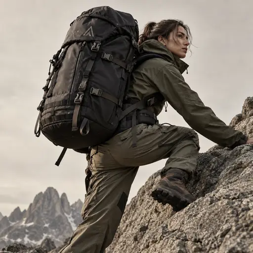
outdoor photography
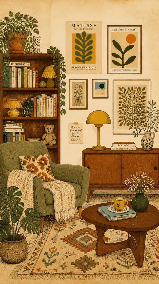
vintage interior illustration
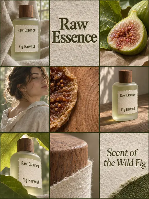
perfume advertising poster
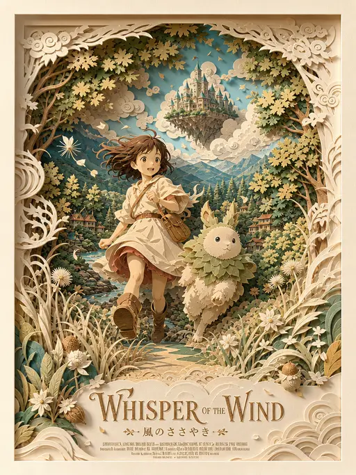
3D layered papercraft poster
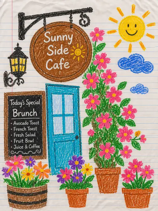
child's crayon drawing
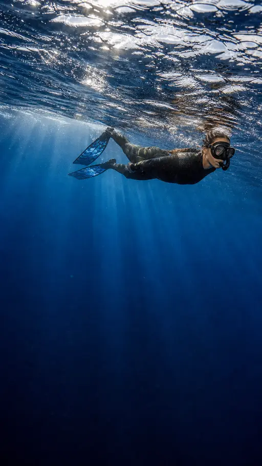
Underwater photography
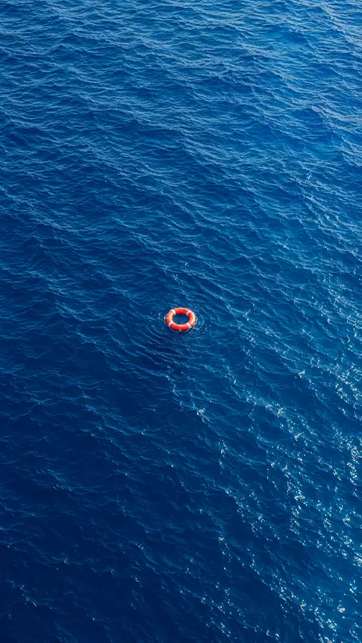
blue ocean
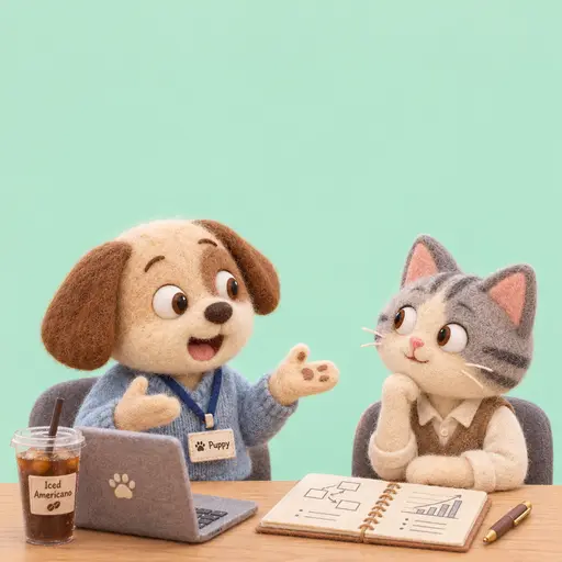
Felt-textured cartoon avatars
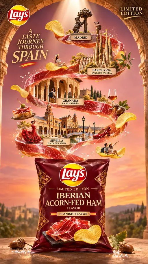
Creative Potato Chip Posters
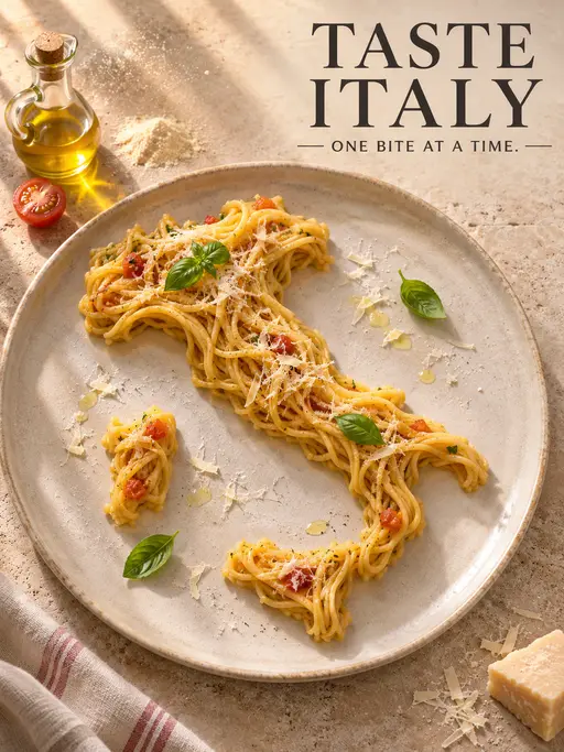
Food Advertising Posters
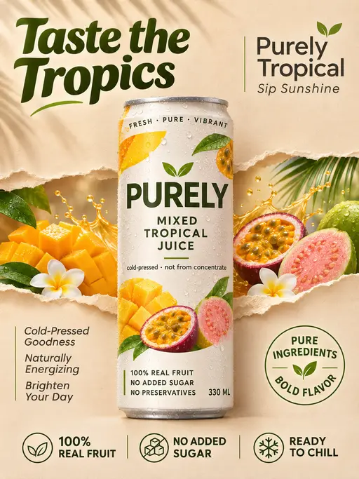
Fruit Juice Product Poster
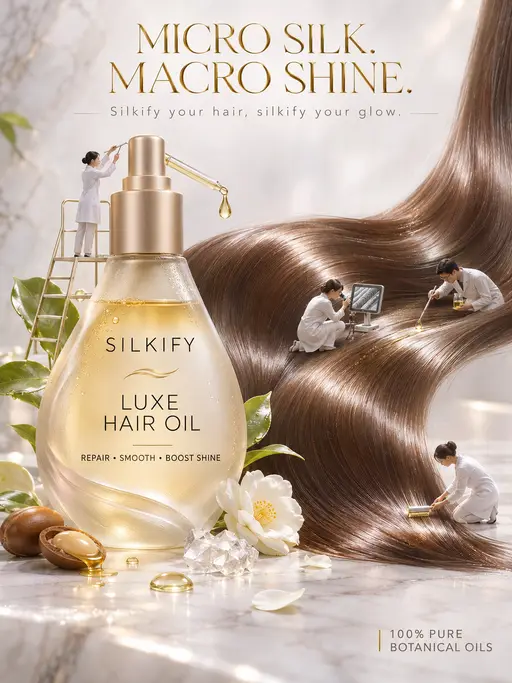
Advertisement Poster for Hair Care Essential Oil
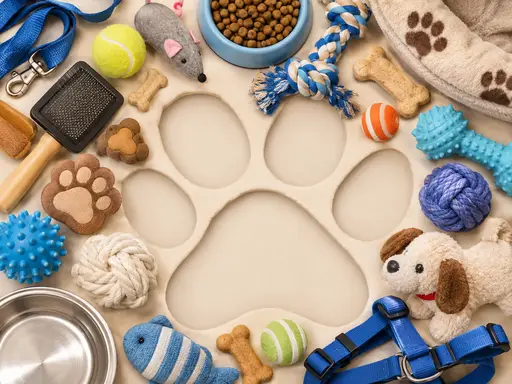
Pet Lifestyle Theme Creation
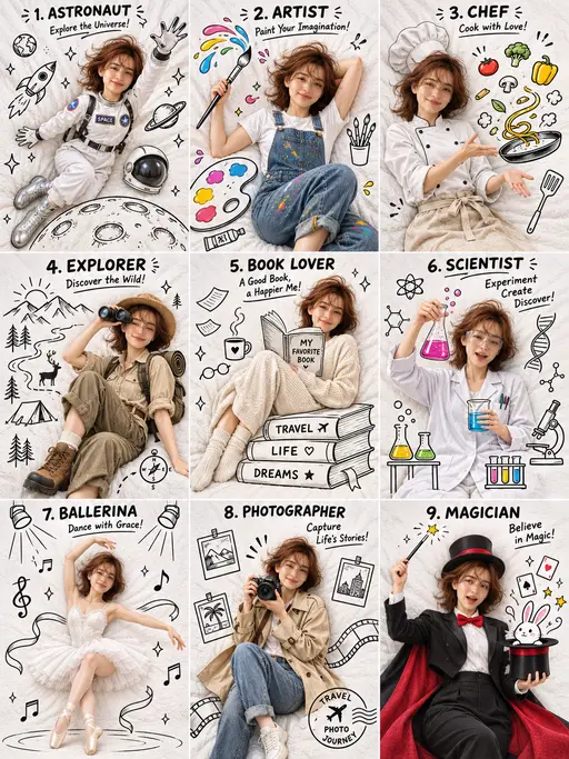
3×3 collage
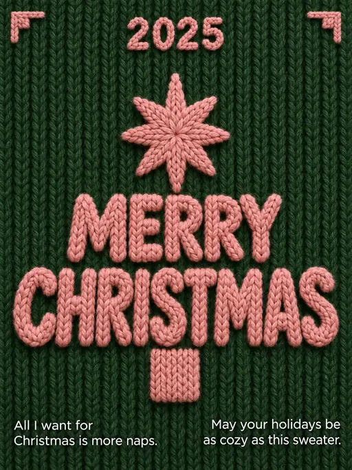
Christmas poster