
Travel map poster
- इमेज
- 2:3
- 1360 × 2048
जनरेशन रेसिपी
- मॉडल
- GPT Image 2.0
- रिज़ॉल्यूशन
- 2K
- क्वालिटी
- medium
प्रॉम्प्ट
Create an ultra-premium top-down travel planning poster for Japan, merging extreme tactile realism with a stronger cinematic journey narrative. Fully preserve the editorial logic of a first-person overhead travel board: the viewer stands inside the composition with shoes visible at the bottom center, surrounded by real travel-planning objects, route notes, destination mapping, time scheduling elements, and elegant hand-drawn guide marks. The final artwork must feel like a world-class Japanese travel campaign with deeper story tension and richer destination identity: hyper-realistic, immersive, handcrafted, clean, cinematic, and highly art-directed. Core Composition Use a strict overhead flat-lay point of view. The viewer looks down at their own legs and shoes standing at the bottom center of a carefully designed travel-planning scene. The base surface should be a dark weathered stone or charcoal-grey Japanese paving stone texture with rich natural tactile detail. Around the viewer, arrange premium travel objects in a balanced editorial layout: a full Japan map cutout, intercity route drawings, Japanese-style itinerary notes, time markers, a vintage film camera, a travel journal, a canvas shoulder bag, Japanese-style postcard fragments, transport timetables, and city destination inserts. The whole composition simulates a dedicated physical Japanese journey planning board that an experienced traveler assembles by hand before departure, with a refined and orderly layout — never a random pile. Destination Reconstruction The visual core focuses on a poetic classic Japanese travel route: Tokyo, Kyoto, Osaka, Mount Fuji, Kamakura, Hokkaido, Nara, connecting diverse scenery of urban streets, mountains, and coastlines. Use a map silhouette of Japan with highlighted hand-drawn routes precisely connecting each major stop. Enrich destination-specific details through refined printed inserts, JR railway timetable notes, Mount Fuji sunrise planning, Japanese tea house stop annotations, Kyoto lantern street sketches, shrine torii gate silhouette cards, and Nara deer stroll planning fragments. The overall image fully restores an authentic Japanese travel experience, centered around Japanese rail travel, ancient temples and old streets, tea ceremony culture, mountain morning views, urban exploration, and the texture of local night markets, with a strong atmospheric feel. Travel Story Objects Arrange physical travel planning props with strong tactile realism: a high-definition Japan map cutout, an itinerary planning map with refined pins and hand-drawn routes, a monthly travel schedule card, Japanese-style boarding pass papers, handwritten travel notes, a vintage premium film camera, a distressed canvas travel bag, train ticket stubs, Japanese-style postcard fragments, a Kyoto machiya lantern street hand-drawn card, tea house rest memo, Mount Fuji sunrise check-in record, and JR railway timetable fragments. All items are placed with artistic editing, logically ordered, fitting the Japanese travel tone — never randomly placed. Hand-drawn Annotation System Integrate refined and delicate hand-drawn travel annotations throughout the frame: dotted route lines, directional arrows, planning circles, orientation marks, minimalist travel icons, and handwritten English memo fragments, with a smart and premium brushstroke. The overall style is like an official art poster upgraded from an exquisite Japanese travel journal — relaxed yet highly textured. Unified text layout system: Main title: JAPAN Journey Supporting English words: EXPLORE · WANDER · TASTE · SUNRISE · RETURN Accent handwritten memos: railway stop annotations, tea ceremony rest reminders, Kyoto street highlights, Mount Fuji morning viewing time, night market stroll routes. All typography is light, premium, clean-layered, and full of artistic sense — no rough or bulky layouts. Material Realism Max out hyper-realistic material details: paper comes with clear fiber texture, natural folded edges, tape marks, slight warping and micro-tear texture, vintage print grain; map cutouts have real paper thickness, floating shadows and natural wear marks; travel bag shows fine canvas/leather texture, neat stitching, softened corners and natural distressing from long-term use; camera texture is precise and realistic, with metal body reflections, clear depth of field in lens glass, tiny scratches from use, and full mechanical details; travel pants have natural wrinkles and realistic drape; shoes have subtle wear, clear laces, rubber texture and natural lighting. Appropriately add fine dust, paper scraps, fine particles to maximize realistic touch and documentary atmosphere. Border and Collage Logic Frame the composition with torn paper edges, layered travel souvenir fragments, warm beige-apricot, vintage vermillion, light ink-colored paper accents, Japanese transport map fragments, and tea-stained texture paper pieces to create an exquisite editorial collage border. All collage elements are full of handmade sense, premium and restrained — the whole image reads as a complete Japanese travel memorial art collection, clean and elegant, without messy stacking. Lighting Use extremely soft and refined cinematic top light; warm and transparent directional natural light falls from the upper area of the frame, accurately highlighting the delicate textures of paper fibers, canvas leather, stone grain, printed maps, metal cameras and fabric folds, with natural and soft light transition and delicate highlight rolloff. Shadows are thin and refined, with plenty of atmosphere — not heavy or dark. The overall atmosphere is warm and healing, full of exploration and premium texture. Color Direction Adopt a restrained and premium Japanese-exclusive palette: Japanese-style beige-apricot, vintage vermillion, ink black, stone gray, leather brown, distressed paper off-white, smog blue, forest moss green, light tea brown, paired with faint Japanese street scene warm light as detail accents. The overall tone is warm and elegant, combining cultural heritage and healing atmosphere, full of Japanese minimalist premium fashion sense. Narrative Mood The overall image conveys the healing romance of roaming Japan: rail travel, mountain sunrise, ancient temple tea rooms, old street lanterns, shrine alleys, and the poetic travel of local night markets. Freeze the precious moment before the traveler's departure, where personal perspective, physical planning and Japanese travel romance perfectly blend — with a healing, retro, exploratory and slightly nostalgic atmosphere. Rendering Style Ultra-premium top-down flat-lay Japanese travel poster, first-person traveler perspective, immersive journey narrative, hyper-realistic physical props, artistic hand-drawn annotations, torn paper editorial border, elegant English typography, soft cinematic natural light, extreme material realism, 8K ultra-clear, world-class tourism campaign quality. Negative Prompt cheap collage texture, cluttered layout, cartoon icons, low-detail props, illegible scrawled handwriting, generic influencer Japanese filter, cheap sugary tones, flat lighting without depth, plastic materials, messy typography, oversaturated colors, random irrelevant props, fake Japanese atmosphere, digital UI interface, low-resolution textures, dirty image, element stacking, cheap decorations
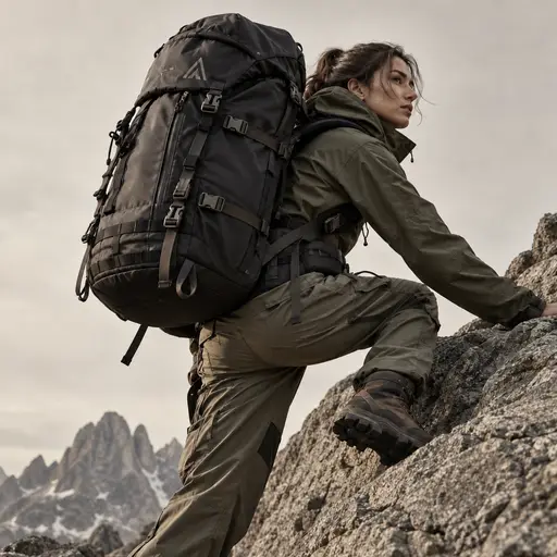
outdoor photography
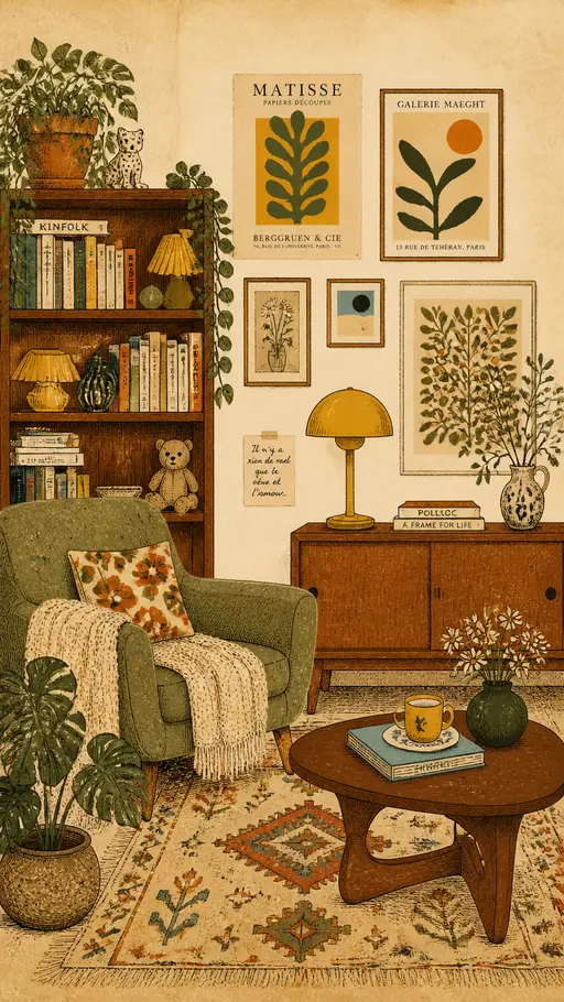
vintage interior illustration

perfume advertising poster
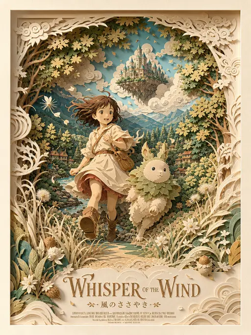
3D layered papercraft poster
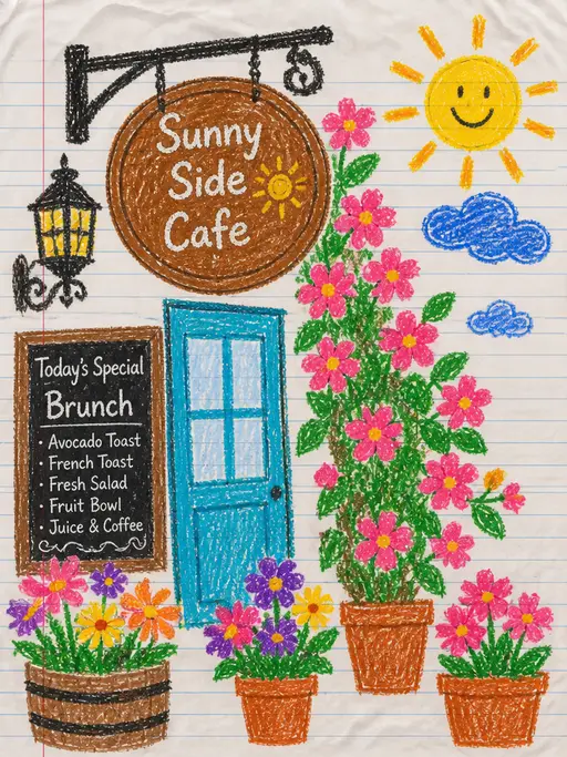
child's crayon drawing

Underwater photography

blue ocean

Felt-textured cartoon avatars

Creative Potato Chip Posters

Food Advertising Posters

Fruit Juice Product Poster

Advertisement Poster for Hair Care Essential Oil

Pet Lifestyle Theme Creation
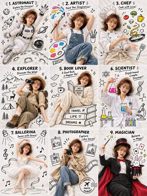
3×3 collage

Christmas poster