Fashion Brand Poster
model
gpt-image-2
prompt
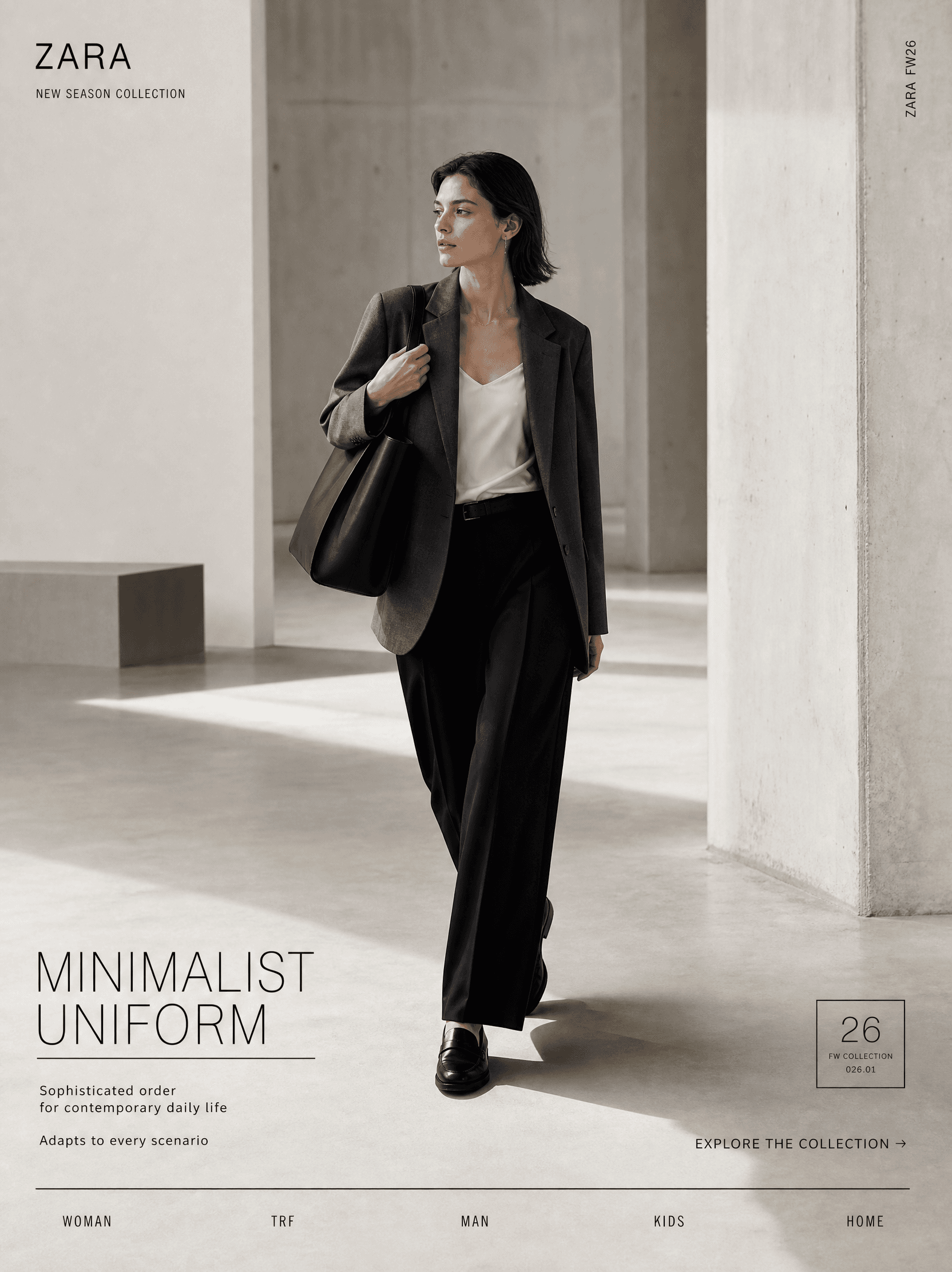
Create a 3:4 vertical 8K ultra-HD SMM campaign poster for Zara’s Minimalist Uniform collection, positioned as a global high-end fashion retail advertisement. It must deliver top-tier agency art direction and Behance front-page quality, blending hyper-real fashion photography, minimalist graphic design, and architectural spatial aesthetics to convey brand tone via extreme visual restraint — strictly banning high-saturation clashing colors, garish promotional vibes, street graffiti aesthetics, fast-fashion cheapness, and excessive branding. Core Campaign Concept Minimalist Uniform: Move beyond rigid uniform definitions to reshape everyday dressing into a sophisticated order for contemporary life. The collection adapts to all fluid identity scenarios: commuting, daily wear, travel, and social occasions. Zara becomes the foundational wardrobe for every scenario, communicating the core message: Minimal form, boundless presence. The visual language fuses Zara’s signature campaign sensibility, minimalist editorial style, architectural space photography, and ready-to-wear graphic design. It must be instantly recognizable as Zara without relying on logos, and strictly distinct from other fast-fashion and accessible luxury brand aesthetics. Subject The focal subject is a young female model aligned with global contemporary minimalist aesthetics. Preserve natural skin texture and real pores; makeup is near-bare and ultra-subtle. Her expression is cool, composed, and restrained — no exaggerated posing or influencer-style affectation, evoking the quiet presence of an urbanite moving through modern space. She wears a Zara-aligned minimalist workwear look: a boxy charcoal grey wool blazer, an off-white silk camisole, fluid black straight-leg tailored trousers, matte black loafers, paired with delicate thin silver minimalist jewelry and a structured black tote. Tailoring is precise and clean; fabric drape and texture are realistic and fluid. Branding is kept extremely subtle and hidden, emphasizing the wearable quality of high-end ready-to-wear. Capture a frozen moment of the model mid-stride: one foot forward, body slightly turned, gaze directed to the side, one hand hanging naturally, the other lightly resting on the bag strap. The hem of her clothing carries a slight dynamic flow, conveying quiet movement — perfectly aligned with Zara’s signature cool, restrained visual style. Composition Follow a rigorous minimalist editorial grid. The model occupies 40–45% of the frame, typography and graphic elements 15–20%, with the remaining space reserved for architectural negative space. Visual hierarchy flows: spatial atmosphere → model → brand mark → collection info → call to action. Ample negative space creates visual tension; text never competes with the model for focus. Color System Strictly adhere to Zara’s classic low-saturation palette: off-white as the background base, paired with charcoal black and dark grey, accented with touches of camel. The overall tone is restrained and cohesive; visual depth comes only from tonal contrast and material texture — zero high-saturation clashing colors. Background The setting is a contemporary minimalist architectural space, featuring fair-faced concrete walls, micro-cement flooring, and geometric structural columns, lit by soft north-light and long, clean shadows. The environment sits between a modern art museum and a minimalist office space: no extraneous decor, no identifiable city landmarks, with the space itself building Zara’s exclusive high-end visual world. Graphic Design Use Zara’s official minimalist sans-serif type system: headlines in medium-weight all-caps with loose tracking and generous leading; supporting copy in thin sans-serif, neutral and highly legible. Typography strictly follows brand guidelines: A small official Zara logo sits top-left, with the tiny text NEW SEASON COLLECTION underneath, surrounded by ample negative space. Top-right features vertically set thin text ZARA FW26 in extremely small, precise sizing. Bottom-left holds the campaign title MINIMALIST UNIFORM in thin all-caps, with an ultra-thin black underline, and supporting copy: Sophisticated order for contemporary daily life · Adapts to every scenario — all copy is minimal and restrained. Bottom-right includes the CTA EXPLORE THE COLLECTION → in thin black sans-serif, with no colored button, seamlessly integrated into the grid. A thin black rule divides the bottom feature strip, with centered category text. A thin black-framed “poster-within-a-poster” secondary campaign marker with a collection code is added to convey a mature global campaign sensibility. Photography & Lighting Photography follows Zara’s signature cool, elevated fashion visual style. Use a professional cinema camera with a 65mm medium focal length lens, at a near-eye-level slightly elevated angle, full-body composition, and moderate depth of field to highlight tailoring lines and fabric texture. Lighting uses a large north-light diffused key light, soft side fill, and controlled soft shadows. Natural highlights clearly render fabric texture; skin exposure is realistic and true-to-life. Ban harsh dramatic lighting, beauty-dish glamour, excessive bloom, and artificial neon. Post-Production Follow Zara’s standard campaign grading: clean low-saturation tones, natural skin, subtle film grain, crisp typography edges, and soft, restrained contrast. Strictly ban over-retouching, plastic skin, artificial HDR, and high-saturation filters. Final Output The final visual unifies space, clothing, human form, and graphic design into a cohesive Zara-exclusive composition. It is a hero SMM poster balancing high artistic sensibility and commercial communication power, print-ready with premium resolution.