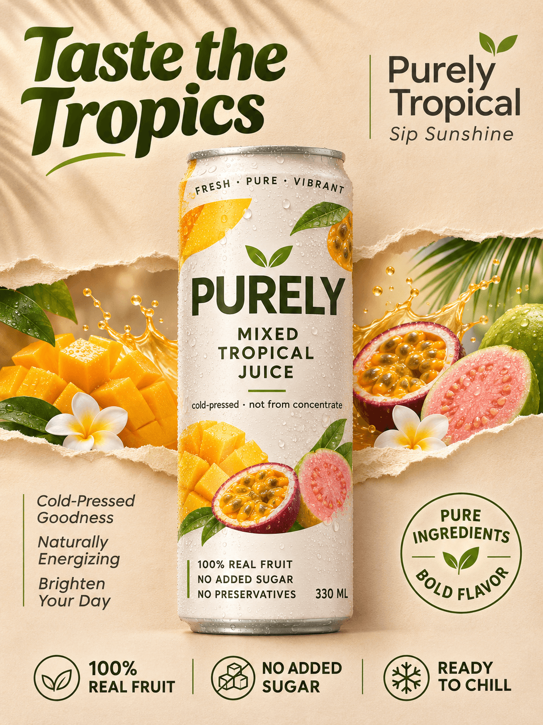
Fruit Juice Product Poster
- Gambar
- 3:4
- 1086 × 1448
Resep pembuatan
- model
- GPT Image 2.0
- resolusi
- 1K
- kualitas
- medium
Prompt
Vertical ultra-realistic premium beverage advertising poster designed for Purely mixed tropical juice, following the core "track + portal" visual logic. The authentic aluminum can serves as the absolute central subject, with tropical flavor scenes simplified into a restrained layered torn-paper display window. The overall aesthetic is curatorial, minimalist and premium, tailored for the brand’s high-end juice product line marketing. #### Composition & Layout Strictly symmetrical axial hierarchical composition. A tall, slender juice can stands perfectly centered and front-facing, carrying the core visual weight of the frame. The background is a warm sand-beige matte paper base. A controlled horizontal tear opening runs transversely behind the can, with naturally curled paper edges, as if a brand flavor display window cut into the paper surface. The torn layer stretches horizontally, never obscuring the main outline of the can, and only acts as background support, creating three-dimensional tactility through curled paper edges and front-back depth of field. Ample negative space is reserved in the upper left for the main headline, refined premium copy is placed in the upper right, and a minimalist icon information bar runs along the bottom. The classic premium ad structure of "central product + torn display + bold headline + bottom information" is fully retained, while peripheral decorative elements are streamlined to strengthen visual order. #### Can Design The can body features a matte creamy white base with a minimalist visual system of tropical fresh fruit tones — accented by soft mango gold, passion fruit orange and sage green, with a fine matte silver metal rim at the top. The can is covered with evenly distributed fine ice-cold condensation beads, presenting authentic aluminum metal texture and premium print quality. Text on the front of the can follows strict specifications: the brand name **PURELY** in large premium sans-serif font at the center; below it the subhead **MIXED TROPICAL JUICE**; further down the selling point line *cold-pressed · not from concentrate*; at the bottom the claims **100% REAL FRUIT**, **NO ADDED SUGAR**, **NO PRESERVATIVES** in sequence, with the volume **330 ML** marked at the bottom right; the ring text around the top reads **FRESH · PURE · VIBRANT**. The overall can design is minimalist and premium with clear information hierarchy, meeting the visual standards of global premium beverages. #### Display Layer & Supporting Elements Inside the tear opening sits a refined mixed tropical fresh fruit scene, with sparse and restrained elements that never overpower the main product: halved fresh mango, cut-open passion fruit, sliced guava, dynamic yet controlled splashes of freshly squeezed juice droplets, plus a small amount of palm leaves and plumeria flowers gently extending from the corners. The fruits retain authentic peel texture and translucent pulp quality; the juice splashes show natural liquid tension and luster. The whole layer resembles a miniature tropical fresh fruit installation, precisely echoing the "mixed tropical juice" product attribute, avoiding cluttered element stacking. #### Lighting & Color Palette The key light is soft directional commercial studio light from the upper left, complemented by soft warm fill light from the front. Palm leaves cast faint, soft shadows on the paper background; fine fading highlights appear on the can’s condensation beads, fruit cross-sections and juice splash edges, creating natural and understated three-dimensionality. The color ratio is precisely controlled: 65% warm sand-beige background and creamy white can form the premium base; 25% fresh fruit tones including mango gold, passion fruit orange and creamy pulp convey flavor; 10% sage green botanicals and dark gray text serve as accents. The overall color palette is bright and vivid without being garish, with soft light and shadow transitions, eliminating muddy color casts and pure black shadow patches. #### Material & Texture The work blends ultra-realistic product photography with tactile paper set design, accurately presenting multi-material contrasts: the fiber texture and torn fuzzy edges of warm sand-beige matte paper, the fine metallic matte finish and three-dimensional condensation beads of the iced aluminum can, the peel texture and translucent pulp quality of tropical fruits, the liquid luster and tension of juice splashes, and the crisp ink fidelity of the can’s printed graphics. The overall visual quality meets the standard of a top-tier beverage launch: minimalist, vibrant, tactile, with sharp and premium art direction. #### Typography Specifications All copy is in English, styled as high-end graphic design with generous spacing, and all text avoids the core outline of the can. The oversized main headline **Taste the Tropics** sits in the upper left, in a bold modern organic display font with strong sculptural presence. The premium tagline **Purely Tropical** is in the upper right, with smaller text *Sip Sunshine* beneath it. Small selling point copy in the lower left reads, in sequence: *Cold-Pressed Goodness*, *Naturally Energizing*, *Brighten Your Day*. Three icon labels are arranged horizontally at the bottom center: **100% REAL FRUIT**, **NO ADDED SUGAR**, **READY TO CHILL**. The circular seal in the lower right reads **PURE INGREDIENTS / BOLD FLAVOR**. All text is accurately spelled with clear hierarchy, free of garbled or distorted characters, and harmoniously aligned with the can’s brand visual identity. #### Output & Constraints Retouched premium juice commercial poster with product as the first priority. No human figures, irrelevant props or redundant tropical elements. The can has geometrically correct proportions, legible label text, credible physical form of the torn paper, anatomically accurate fruit, and physically consistent juice splashes. The overall visual language is calm, premium, clean and vibrant. Cheap stock advertising aesthetics, garbled AI text, muddy color casts and cluttered stacking are strictly avoided. The work maintains a premium commercial photorealistic style throughout.
Tentang prompt ini
A fusion of hyper-realistic product photography and tactile paper set design
Tag

outdoor photography

vintage interior illustration
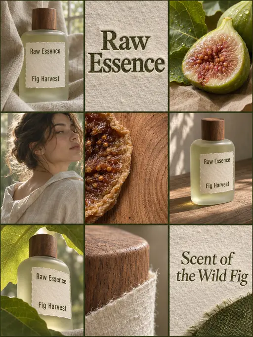
perfume advertising poster

3D layered papercraft poster
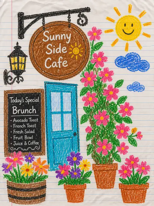
child's crayon drawing
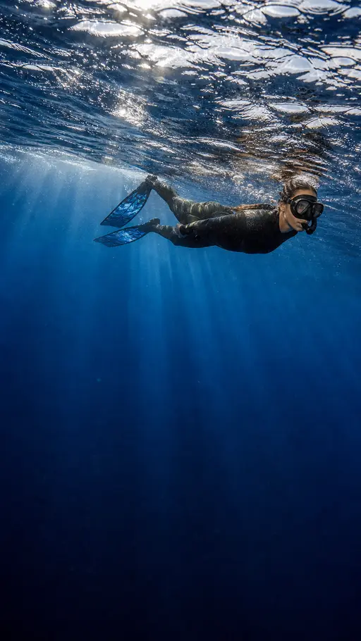
Underwater photography

blue ocean

Felt-textured cartoon avatars
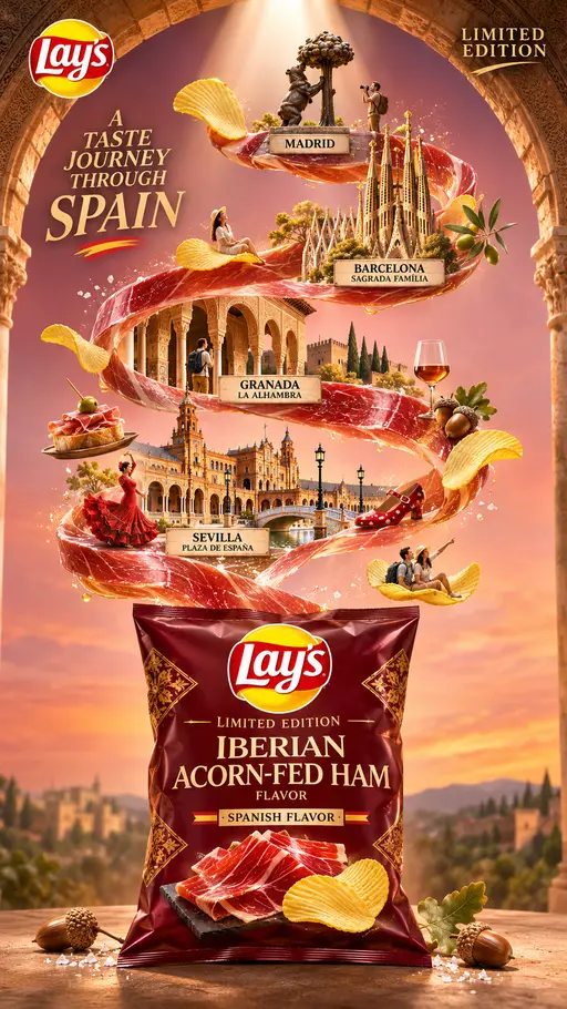
Creative Potato Chip Posters
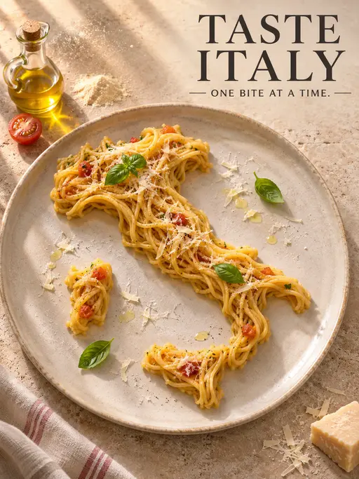
Food Advertising Posters
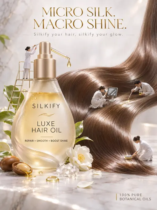
Advertisement Poster for Hair Care Essential Oil

Pet Lifestyle Theme Creation
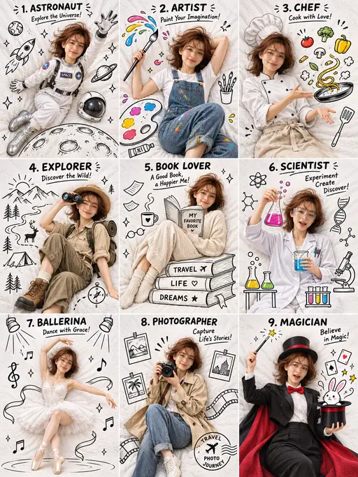
3×3 collage

Christmas poster

Christmas poster