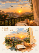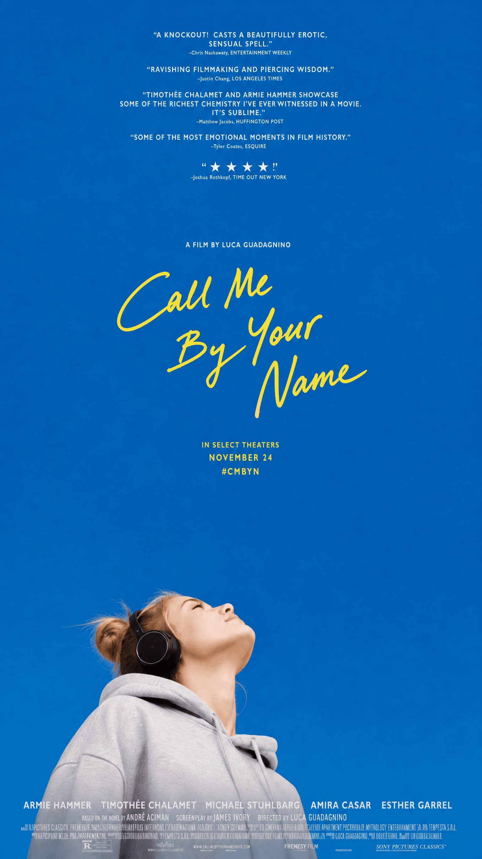
Call me by your name poster
model
gpt-image-2
prompt
Generate a film poster-style portrait based on a user-provided photo. The core concept is to use a vast, pure color field to cradle the subjects who are nestled at the edge of the frame, each gazing upward at the sky. Approximately three-quarters of the entire image is occupied by a clean, saturated, uncluttered monochromatic color field—resembling an infinitely distant sky—creating a sense of openness, longing, and the breathing room of a summer day. The subjects occupy only a narrow band along one side of the frame, about one-quarter of the composition, surrendering the vast majority of space to the empty color field. The composition adapts to the aspect ratio: in a vertical format, the subjects hug the bottom of the frame in a low horizontal row, with the sky extending upward; in a horizontal format, the subjects align vertically along one side (e.g., the left), while the empty color field spreads expansively toward the opposite side (e.g., the right), with text placed in that open area. Regardless of orientation, the subjects and text always sit at opposite ends, with negative space dominating. The camera angle must be an extremely low angle from below (worm's-eye view): each subject's head is tilted backward, chin raised, throat and neck extended, faces turned upward toward the empty color field above, gazing into the sky. The viewer primarily sees the underside of the jawline and the contour of a profile or three-quarter view—subjects must never face the camera directly, never make eye contact at eye level, never pose as frontal ID-style portraits, and their gaze must never fall on the viewer but always toward the sky above. Only the head, shoulders, and a small portion of the upper body are visible; the lower edge is naturally cropped by the frame. The subject(s) are not limited to any specific category; everything is strictly based on what actually appears in the input photo. Their identity, number, species, and combination must faithfully correspond to the original photo, one-to-one. Do not spontaneously multiply, duplicate, reproduce, or add any extra subjects beyond the photo. The key cuddling posture is one of mutual leaning rather than looking in the same direction: subjects lean back-to-back, head-to-head, or one rests the back or side of their head on the other's shoulder or neck, leaning against each other in opposite or different directions. Each subject tilts their head toward their own side of the sky, their gazes toward different directions of the empty color field, rather than converging on a single focal point. Every subject maintains a chin-raised, upward-gazing posture, conveying an overall mood of intimacy, closeness, and each lost in their own thoughts. Unless the user explicitly requests duplication or mirroring, do not replicate the same face or subject multiple times. In the empty color field far from the subjects, place a handwritten title with dry-brush texture and slight cursive connections, the letterforms casual, slightly slanted, and playful, arranged in two or three staggered lines. Use a bright accent color that warmly contrasts with the main color field (a bright yellow temperament, hue able according to the theme's mood), making the text feel like a floating personal signature. The default title text is the handwritten English phrase "Call Me By Your Name"; replace it with user-specified content only when provided. The title position adapts to the aspect ratio: in vertical format, it falls in the upper-middle of the top empty space; in horizontal format, it sits in the center of the large negative space on the side opposite the subjects. Above the title, place a single line of smaller, thin explanatory text (default "a film by …" style); below the title, place two to three lines of even smaller uppercase information in the accent color or white (default cinema release and tagline-style phrases like "IN SELECT THEATERS / NOVEMBER 24 / #CMBYN", customizable by the user). For the vertical version, additionally stack several lines of tiny white movie review quote snippets centered at the very top, and at the bottom, edge-aligned, press a line of white uppercase lead actor names and a dense, understated small-text copyright information bar, forming a complete film poster text hierarchy. The default main color field is the pure, saturated, slightly deep cobalt blue / azure blue of the original work—the blue of a clear summer noon sky, approximately #0A66AC (very low red, moderate green, high blue), distinctly blue without leaning cyan, gray, purple, baby blue, navy, or ink blue. Only replace the entire color when the user specifies another theme color, and the replacement must retain the same purity, saturation, and high brightness relationship. The overall color roles are: a single large area of pure, high-brightness color field dominates; one warm handwritten accent color (default bright yellow) serves as the focal point; white text carries information; the figures retain their realistic natural skin tones and clothing colors. The image is bright, translucent, clean, saturated but not muddy, carrying an open and longing, gentle atmosphere. Even with a deeper color field, maintain clear light distinct tonal steps, and breathable negative space, avoiding grayness, datedness, stuffiness, muddiness, or artificial distressing. The visual weight is firmly anchored in the contrast between the vast empty field and the edge-gazing subjects; the subjects must never be enlarged to fill the frame, never be shot from a frontal eye-level angle, and must never lose the large negative space and upward-diverging gazes.
parameters
Reference Images