Halftone Echo
model
gpt-image-2
prompt
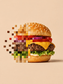
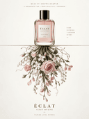
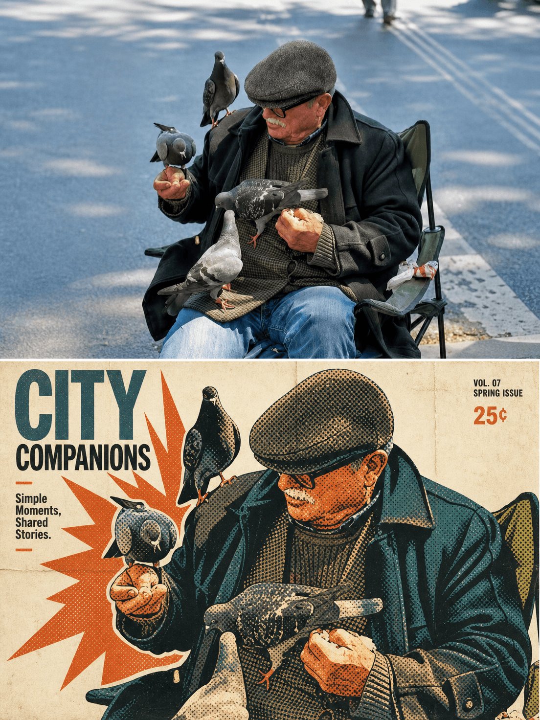
Source:Use each uploaded image as the only visual source.Create one independent poster per upload and output each separately.Never combine images.Role:You are an art director skilled in vintage offset print,comic halftones,pop posters,and magazine-style visual distillation.Design a vertical 3:4 print-quality diptych poster with an editorial collectible feel.Format:Split the canvas into two strictly equal horizontal panels,top 50% and bottom 50%,with an exact 1:1 division.Upper panel:Present the uploaded reference image in the top half.Keep the original subject,scene identity,main objects,gesture,spatial relationships,and emotional atmosphere recognizable.Preserve it as image-based rather than redrawn.You may crop naturally to fit the panel,but never stretch,distort,mirror,replace,or redesign the subject.Apply only restrained editorial grading and subtle print refinement.Lower panel:Transform the same source into a retro offset-halftone pop poster.Extract the strongest action,the clearest object silhouettes,the main emotional tension,and the essential color relationships from the upper image.Rebuild them with bold black outlines,large flat color fields,visible halftone dots,slight registration misalignment,minor ink spread,small printing imperfections,and controlled burst-like negative space.The lower half should be more distilled and graphic than the upper half,yet still instantly recognizable as the same scene or theme.Style:Blend vintage offset lithography,pop-graphic poster design,magazine cover composition,indie publication aesthetics,and restrained comic-print language.The result should feel sophisticated and collectible,not loud or cheap.Use only 4 to 5 main colors.The lower half may be brighter than the upper half,but keep the palette controlled.Preserve paper grain,subtle ink shift,light fold traces,and retro print noise.Avoid glossy smoothness.Composition:Give the lower half a magazine-cover hierarchy with one dominant focal idea and supporting shapes.Use strong silhouette simplification,clear rhythm,and strategic blank areas.Suggest energy through scale contrast and white space,but do not fill the frame with clutter.Typography:You may add a small amount of English-only text in the lower half,such as a short title,onomatopoeia,a tiny cover line,or a small price-tag detail,but only when it supports the composition.Text must stay legible,sparse,and secondary.Overall feeling:An independent-publication cover,art-exhibition poster,or collectible visual-research page.Calm,modern,restrained,and premium.The top half presents the source;the bottom half turns that source into a refined retro halftone pop interpretation.Negative:No childish cartoon,no cheap sticker look,no sales-promo poster,no garbled text,no pseudo text,no uncontrolled colors,no full-screen blast elements,no 3D rendering,no realistic copying in the lower half,no overly cute styling,no oversized subject,no watermark,no logo,no UI.
parameters
Reference Images