Love this? Log in to make your own version.
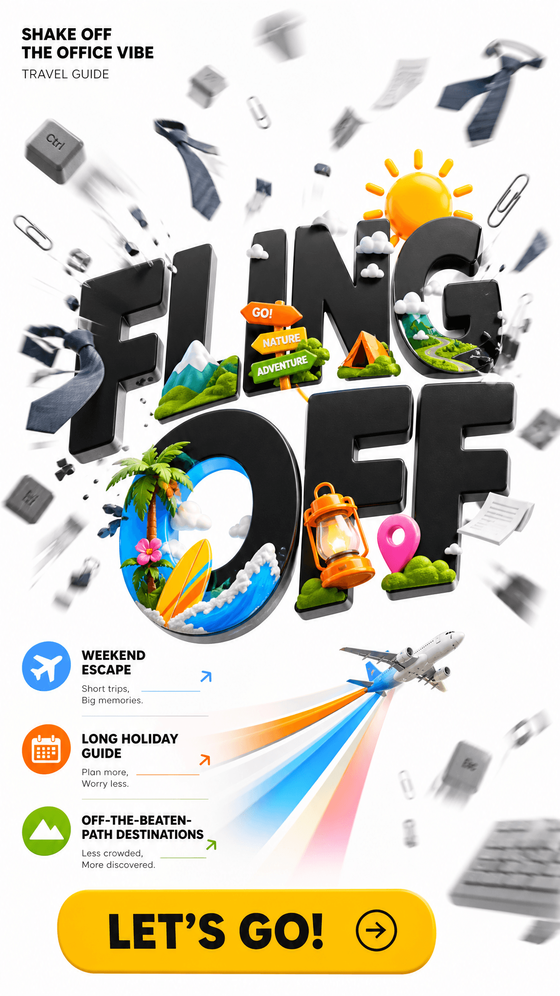
Internet Operations 3D Illustration Poster
- Image
- 9:16
- 1152 × 2048
Generation recipe
- model
- GPT Image 2.0
- resolution
- 2K
- quality
- medium
Prompt
Top-Tier Internet Operations 3D Illustration Poster Prompt Standard: Cutting-edge master-level internet operations visual design, viral Behance / Dribbble style Format: C4D-style 3D illustration poster Lighting: Global soft-light rendering, soft diffuse shadows Vibe: High-saturation dopamine color palette, abstract artistic expression, clean minimalist background, visually fresh and bright, youthful and cheerful, refined and delicate Theme: Shake Off the Office Vibe — Travel Guide Physical Interaction: FLING OFF Aspect Ratio: 9:16 Create an avant-garde travel guide poster. The core visual uses the physical mechanism of “fling off” to create a strong contrasting interaction between the dullness of the office and the vitality of travel. Abstract 3D elements and an oversized main title coexist in the same physical world. The driving force of travel violently flings away the office symbols attached to the typography, while travel symbols seamlessly embed themselves in their place, fully conveying the theme of “shaking off the office vibe.” The image uses a clean, minimalist solid-color background, ultra-bold geometric typography, photorealistic 3D materials, and generous negative space to present the design quality of contemporary top-tier operations visuals. Interaction Logic: The strokes of the main title originally have low-saturation mini office elements attached to them (keyboard keys, document corners, tie knots, paperclips). Driven by a forward and upward flinging force, these elements scatter and break free along natural parabolic trajectories toward the outside of the frame. Bright abstract travel symbols (mini mountains, clouds, road signs, the sun, camping lanterns) immediately embed themselves into the vacated stroke areas. The tension of the fling slightly pulls at the edges of the typography, causing the strokes to undergo soft deformation in the direction of the force. The scattered elements have natural motion blur and trails, following realistic physics of gravity and inertia. Core Constraints • The interaction focuses on the single physical mechanism of “fling off.” All movements follow realistic logic of inertia, gravity, and force-induced deformation. • Untouched areas of the typography remain clean, hard, geometric, and clearly legible. • Strictly forbidden: random liquify effects, illogical element stacking, generic low-quality 3D typography, floating debris scattered without pattern, digital distortion. Layout & Grid Adopt a rule-breaking editorial grid with strong scale contrast, asymmetric composition, information arranged along edges, and abundant whitespace/negative space. Include clearly hierarchical information modules: • Main Visual Area: Oversized main title + 3D interactive elements • Auxiliary Information Area: Staggered layout of three types of guide tags: “Weekend Escape”, “Long Holiday Guide”, “Off-the-Beaten-Path Destinations” • Call-to-Action Area: A rounded “Let’s Go” button placed at the bottom of the frame. Strictly forbidden: traditional list-style layouts, long divider lines, boxed titles, rigid bottom information bars, template-like travel poster compositions. Typography & Palette • Main Title: Ultra-bold, rounded geometric sans-serif • Subtitles / Tags: Light, modern sans-serif • CTA Button: Same bold sans-serif as above • Palette: • Background: Pure, soft white, clean and free of impurities • Primary Colors (Travel Elements): Dopamine high-saturation palette — clear sky blue, vibrant orange, lemon yellow, grass green, berry pink • Secondary Colors (Office Elements): Low-saturation cool gray, navy blue, gradually fading during the flinging process • Typography: Pure black, with natural transitions where it merges with 3D elements Materials & Rendering • Global C4D physics-level soft-light rendering, with uniform ambient light diffusion, soft and translucent shadows, no hard-edged dead black. • All 3D elements have a matte frosted texture, with rounded chamfered edges and an extremely subtle granular surface, presenting a delicate designer-toy-grade 3D quality. • Travel elements are translucent and bright, while office elements are matte and dull, strengthening the thematic contrast through material differences. • Scattered elements have natural motion blur trails, with lengths that conform to the logic of movement speed. Final Effect The overall visual impact is strong, allowing the theme to be recognized at a glance even in thumbnail size. At first glance, the viewer sees the flinging main title and the vibrant travel colors; at second glance, they understand the creative logic of “shedding office elements and switching to a travel state.” The whole piece is youthful and energetic, combining a high-end design sense with strong operational appeal, meeting the visual standards of top-tier internet content
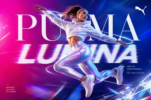
Sports Figure Poster
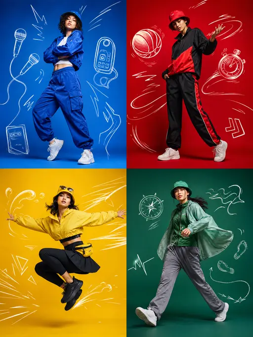
Sports Illustration × Photorealistic Poster
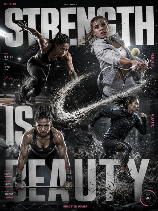
Athletic Character Poster
micro drama
pet poster

Cinematic photograph
brand poster
micro- drama
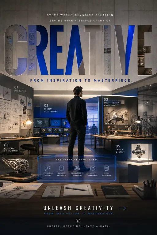
Global Brand Campaign Poster
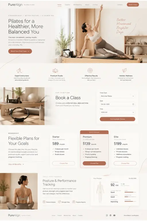
Pilates studio landing page UI design
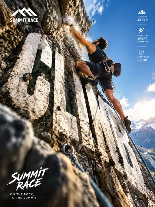
Vertical Outdoor Rock Climbing Competition Poster
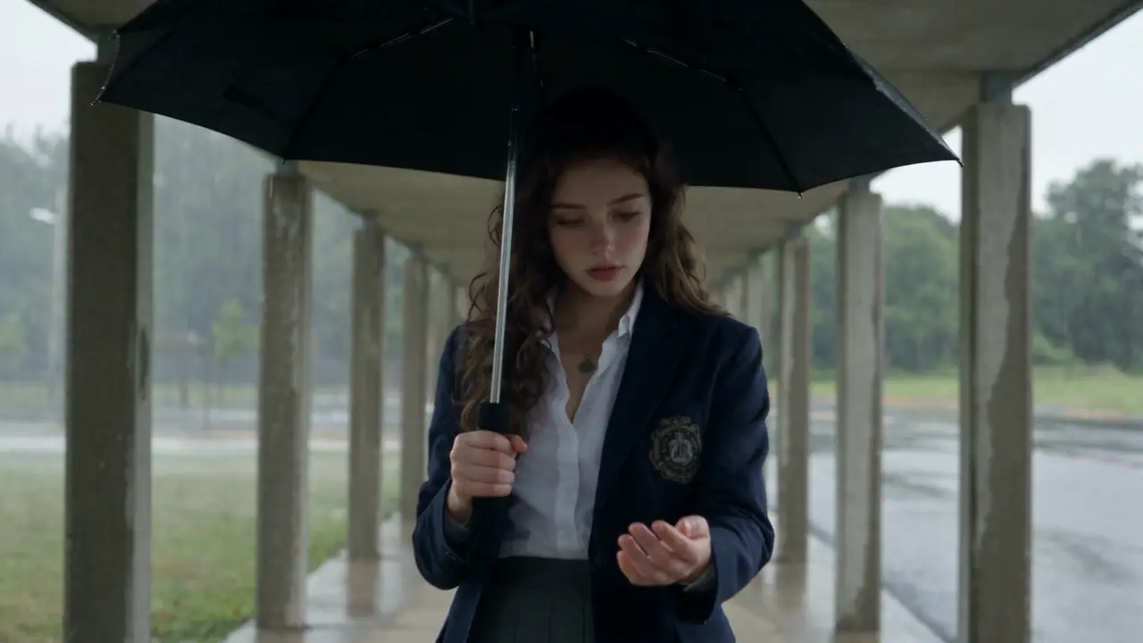
Micro-drama
Instagram-style candid shot

2000s American teen-campus vignette

Daily routine