Love this? Log in to make your own version.
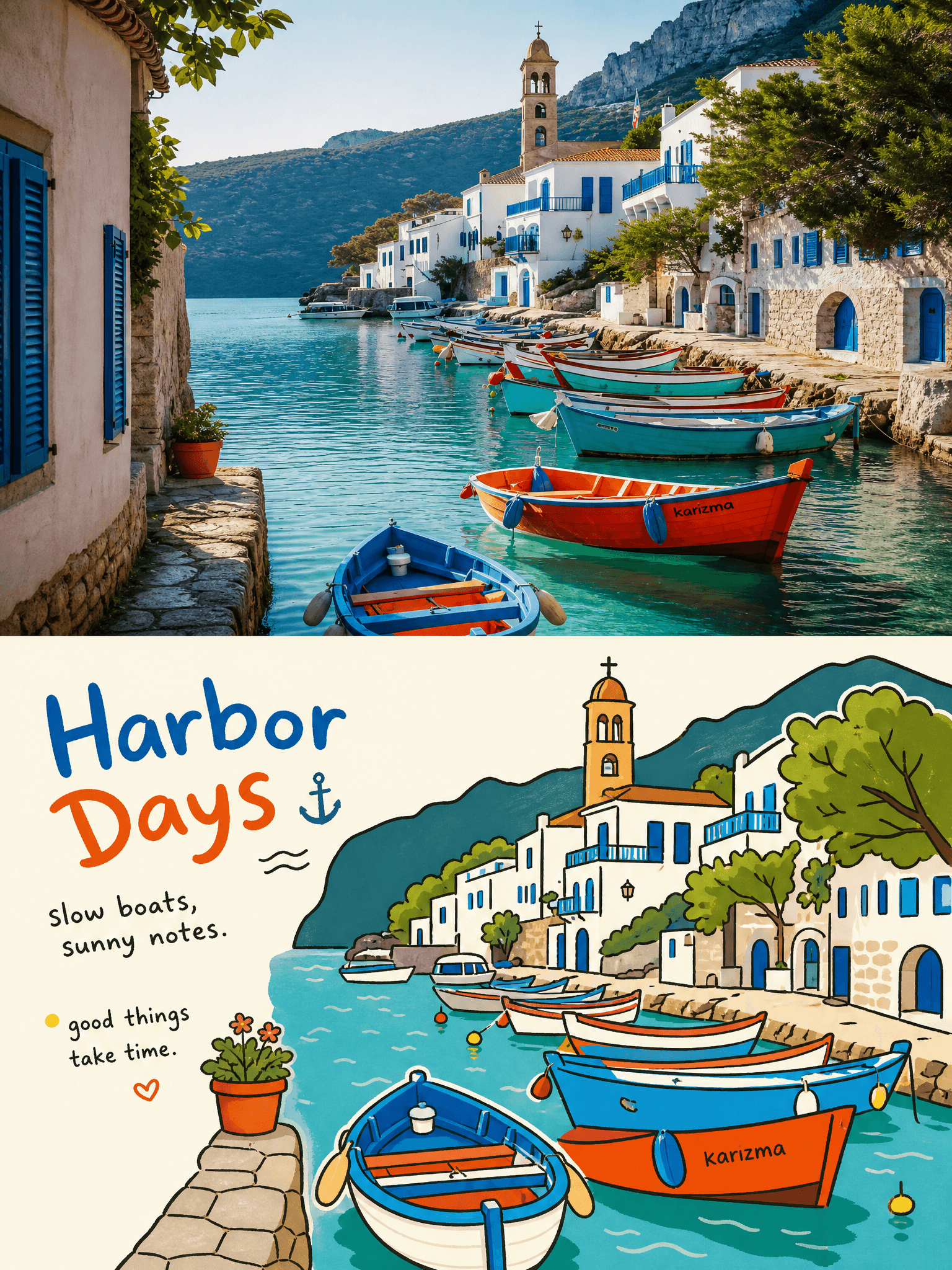
Playful Scene Poster
- Image
- 3:4
- 1536 × 2048
Generation recipe
- model
- GPT Image 2.0
- resolution
- 2K
- quality
- medium
- reference

Prompt
Use each uploaded photo as the only content source.Create one independent premium poster per photo and output each separately.Never combine multiple photos.Use a vertical 3:4 canvas divided into two strictly equal horizontal panels,top 50% and bottom 50%.Keep the split obvious. Top half:Keep the upload photographic.Preserve subject identity,count,pose,real texture,natural light and shadow,and original color mood.Apply only subtle editorial grading for an art-magazine feel.You may gently extend the environment to fit 3:4,but never stretch,mirror,distort,or redesign the subject or scene. Bottom half:Extract the most recognizable subject,silhouette,pose,and narrative relationship from the photo and rebuild them as a relaxed awkward Korean-style flat editorial illustration.Keep the general layout and core action,but remove realistic lighting,perspective depth,and material detail.Simplify people,animals,objects,and buildings into rounded,clear,slightly exaggerated geometric forms with bold wobbly hand-drawn black outlines,occasional broken edges,and flat solid fills.The lower image must still read as the same moment shown above. Composition:Keep one clear visual center and use the rest as supporting accents.Create rhythm through scale contrast,overlap,partial cropping,and loose asymmetry.Use broad areas of bright flat background and negative space around the subject.Avoid dense scenery or detailed backgrounds.The result should feel like a designed picture-book or indie editorial illustration. Color:Sample the brightest and most recognizable colors from the photo and turn them into a limited set of bright flat color blocks.You may use vivid blue,red,yellow,green,white,and related hues when supported by the source,but do not force one fixed palette.Keep the color clean,friendly,and lively,with strong contrast between subject and background.Avoid gradients,heavy shadows,muddy gray,dirty mixing,plastic gloss,or dull desaturation. Typography:All readable text must be in English only.Create one short English title from the subject,action,emotion,or story,and add a few brief English phrases,numbers,or playful notes.The title may feel slightly hand-lettered,uneven,or gently tilted,while smaller text stays restrained and legible.Place text along the subject contour,color-block edge,negative space,or layout axis,with mild rotation or misalignment so it feels embedded in the illustration.Keep text concise and avoid big commercial headlines. Overall feeling:Real photography above + awkward flat illustration below + lighthearted editorial design.Bright,childlike,friendly,and playful while still clean,graphic,and tasteful. Negative:No multi-photo collage,no unequal split,no realistic redraw,no glossy 3D,no polished vector smoothness,no complex perspective,no dense detail,no muddy palette,no realistic shading,no anime,no manga,no cheap souvenir feeling,no watermark,no logo,no UI.
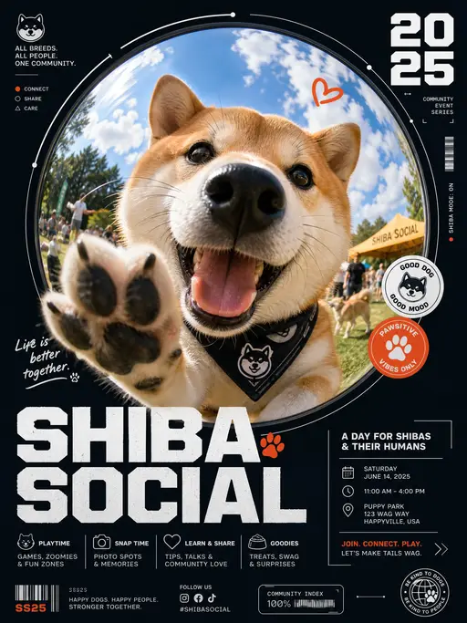
pet poster
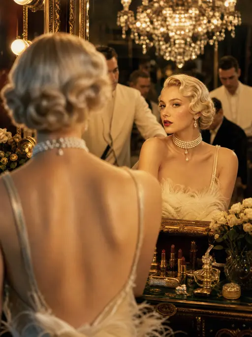
Cinematic photograph
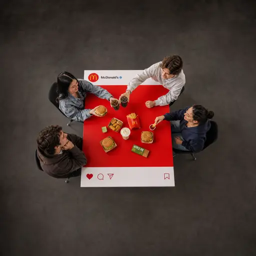
brand poster
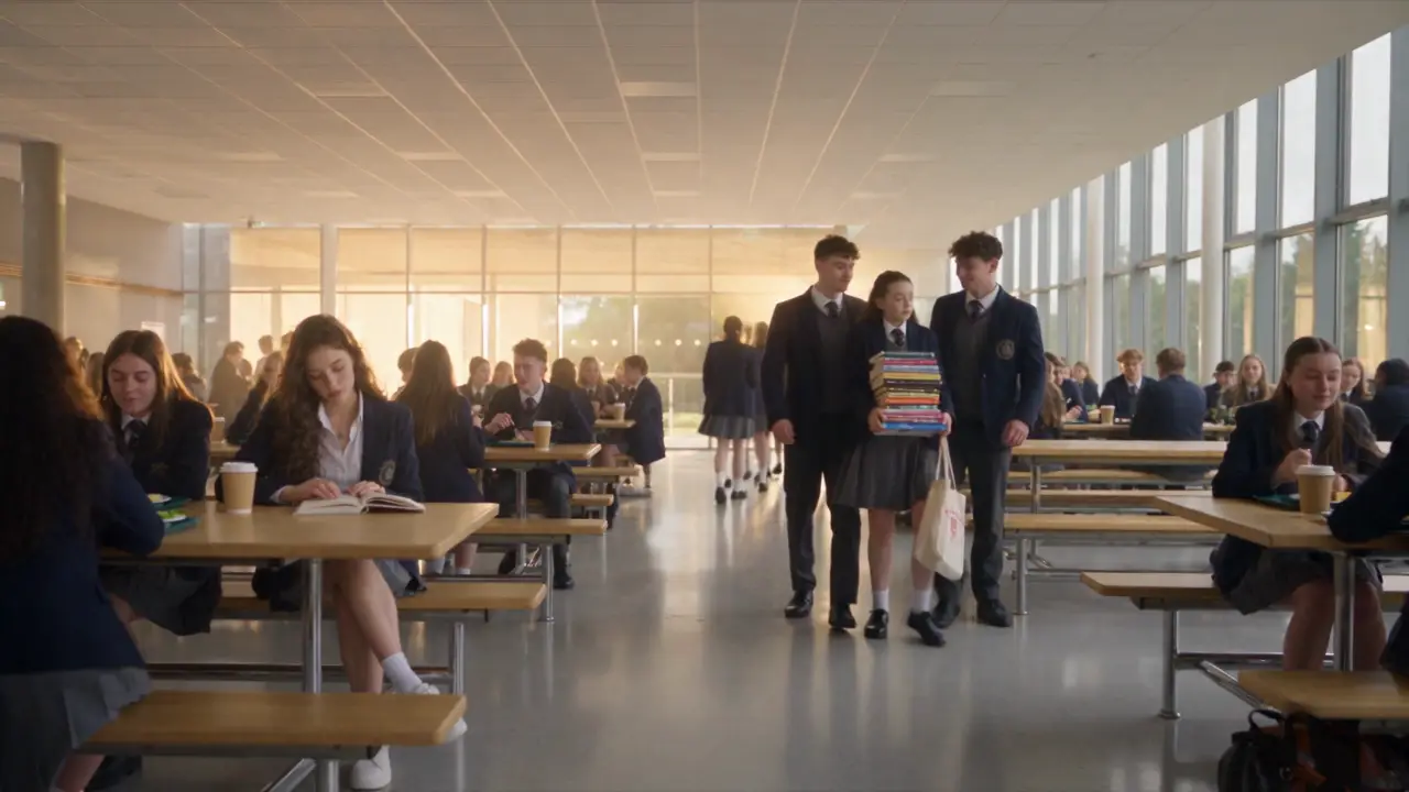
micro- drama
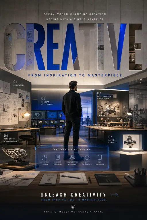
Global Brand Campaign Poster
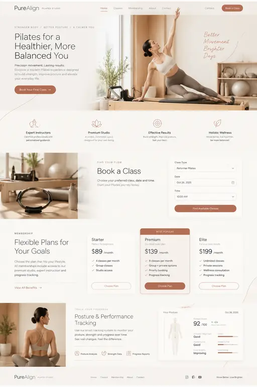
Pilates studio landing page UI design
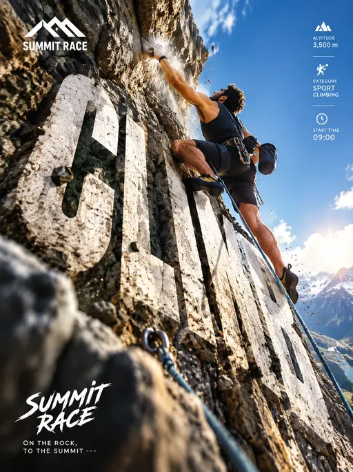
Vertical Outdoor Rock Climbing Competition Poster
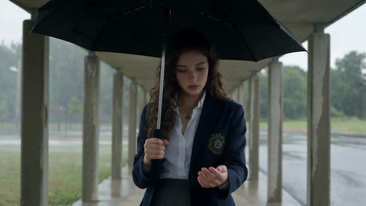
Micro-drama
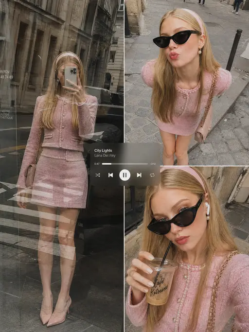
Instagram-style candid shot
2000s American teen-campus vignette
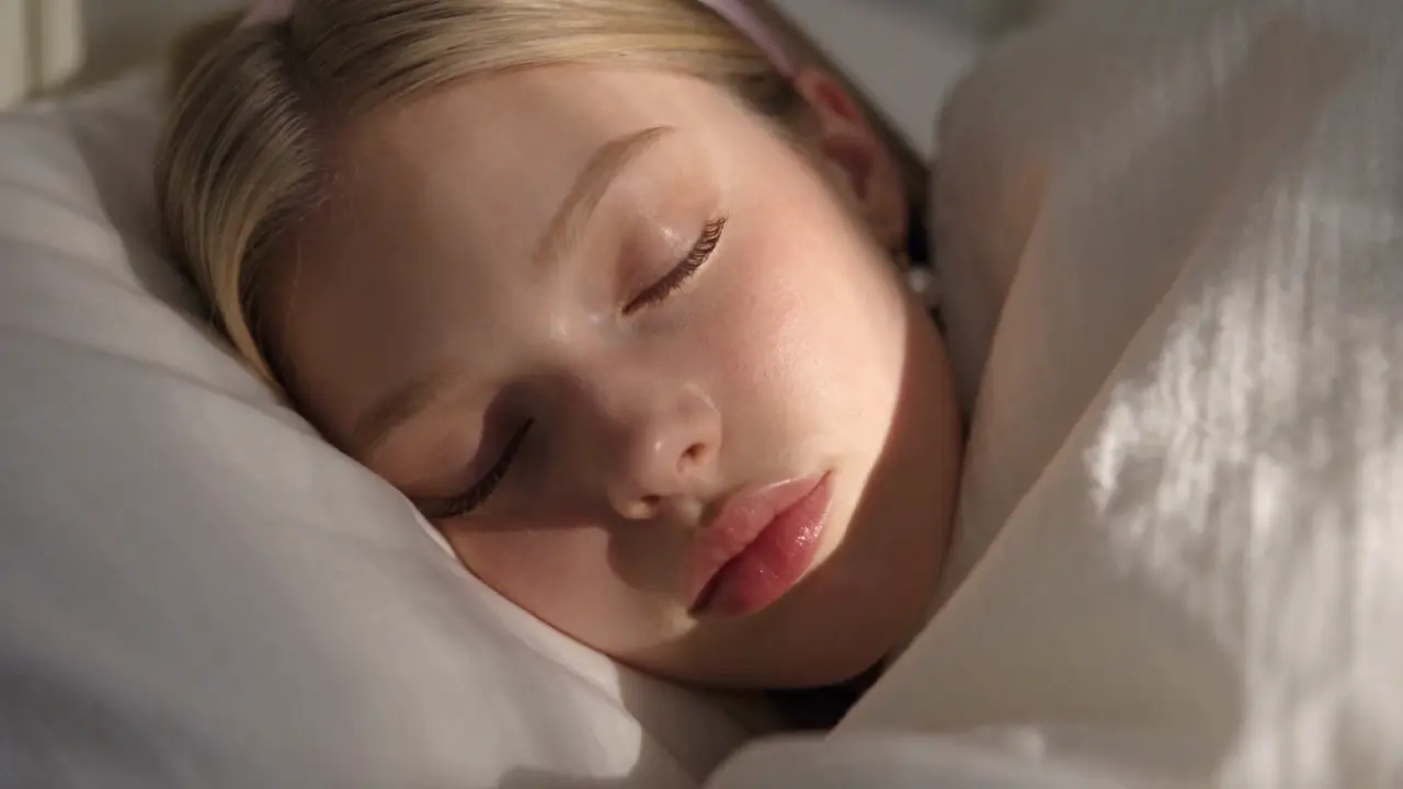
Daily routine
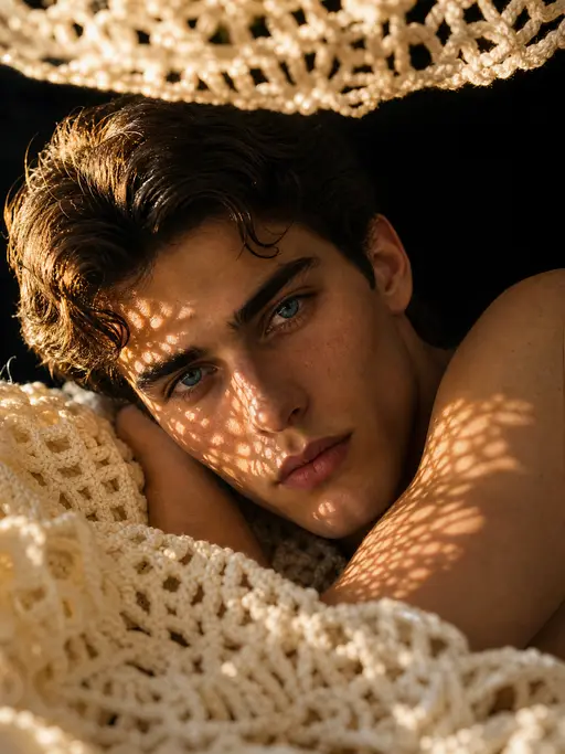
Editorial portrait
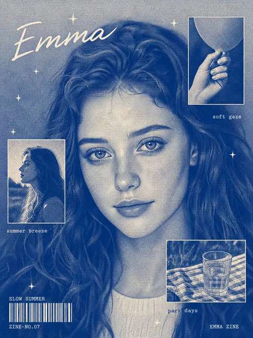
Character poster
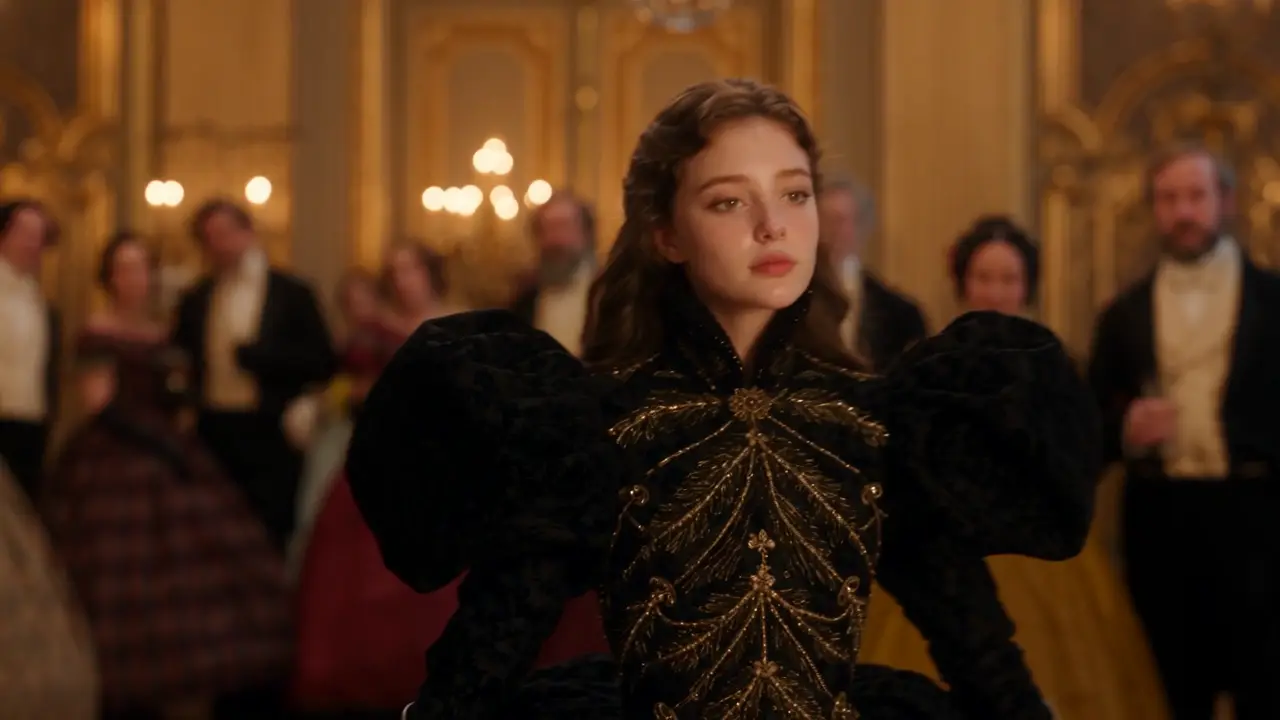
Micro-drama sequence
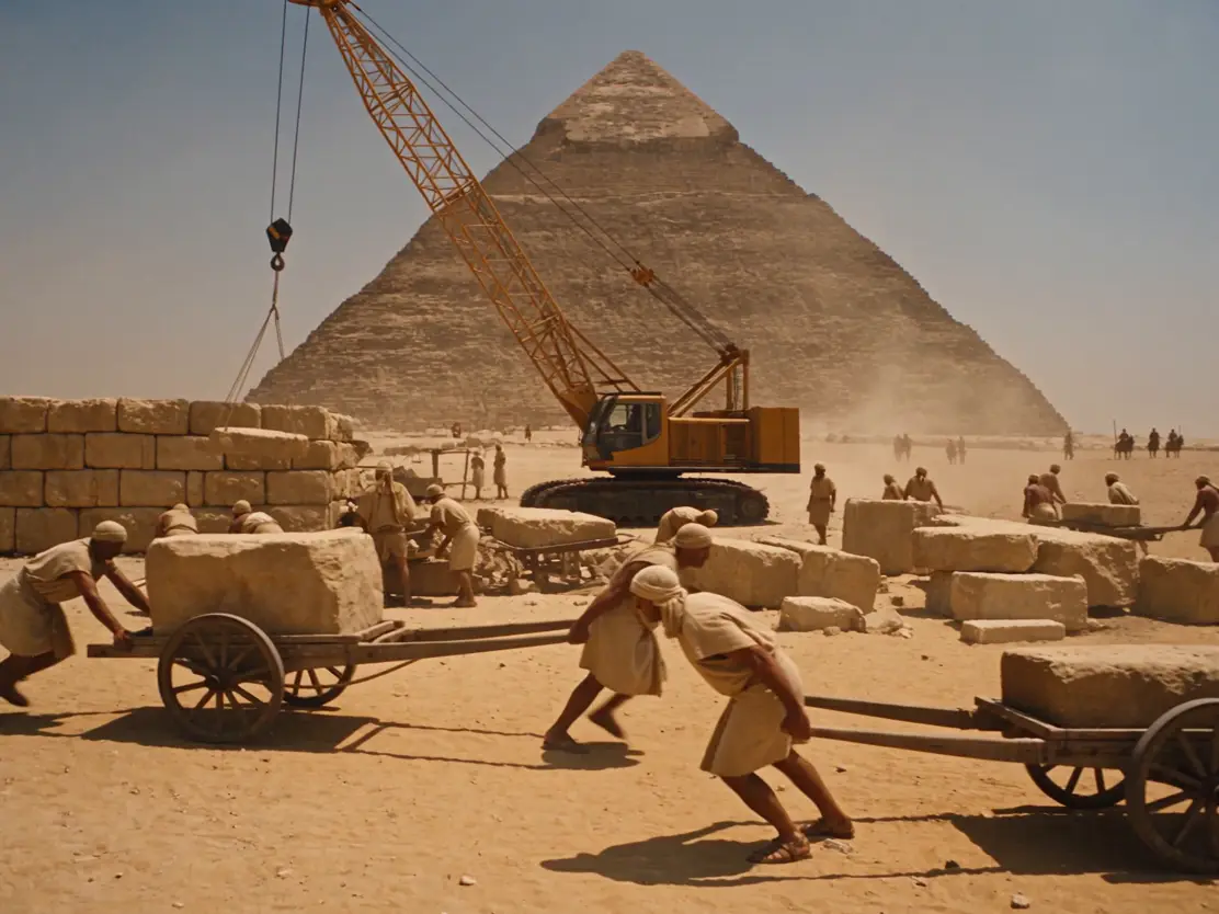
Ancient Egyptian comedy video