Love this? Log in to make your own version.
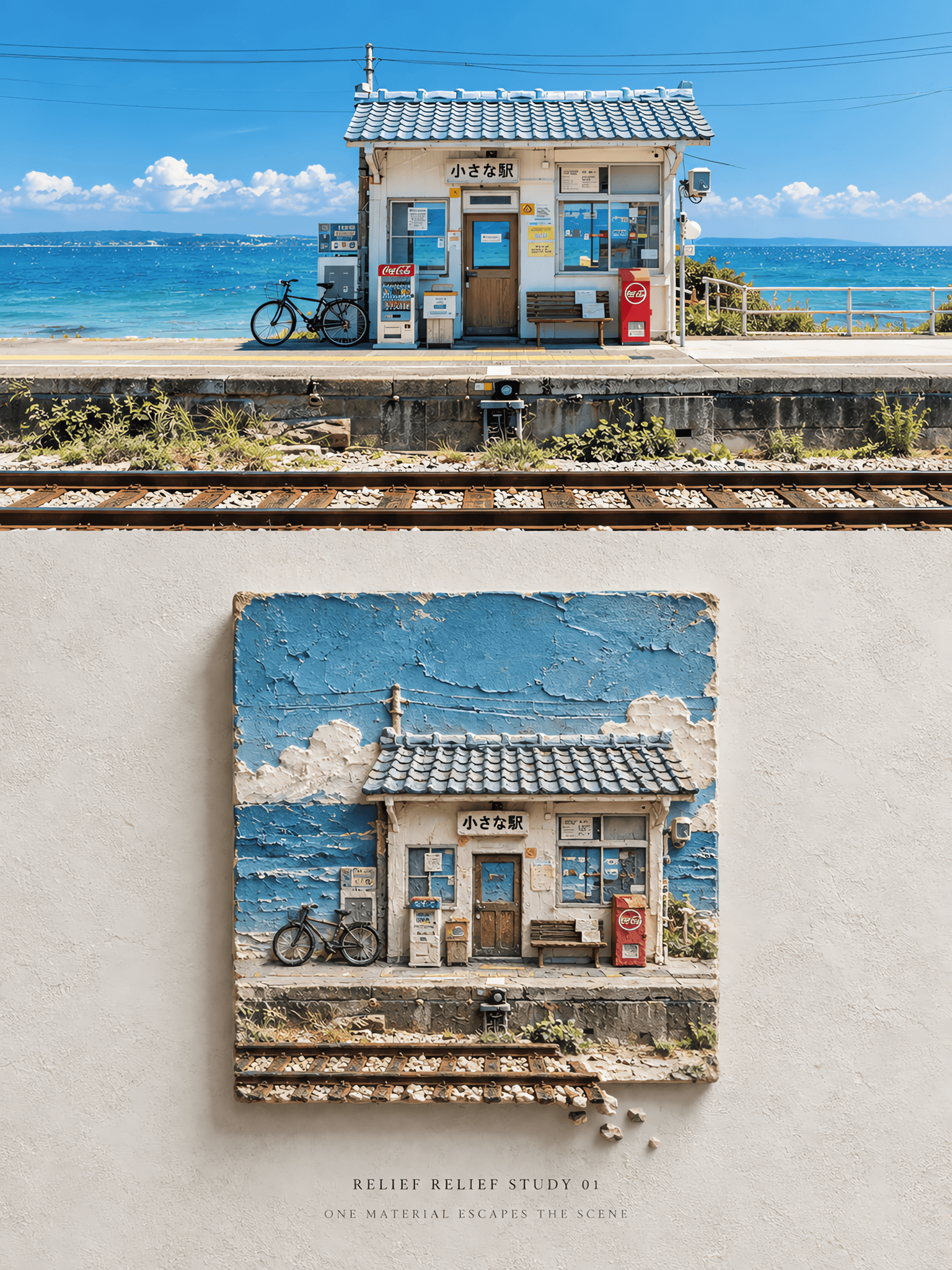
Relief Escape Study
- Image
- 3:4
- 1536 × 2048
Generation recipe
- model
- GPT Image 2.0
- resolution
- 2K
- quality
- medium
- reference

Prompt
Source:Use the uploaded travel photograph as the only visual source.Create one independent premium art poster from this single image only.Do not combine multiple photos. Format:Create a **vertical 3:4 travel art poster** with a clear **top-and-bottom structure**:real photography above and a square physical relief artwork below.The **upper photographic section should occupy about 42%–45% of the total height**,and the lower section should occupy the remaining space.The two sections should feel elegantly connected within one refined editorial composition. Upper Section · Original Photograph:Keep the upper section as the **real input photograph**.Preserve the original people,animals,buildings,roads,mountains,water,landmarks,and all major subjects exactly as they appear.Maintain the original **number of subjects,pose,structure,viewing angle,spatial relationships,natural light,and original color atmosphere**.Apply only **very subtle publication-level color grading** to give the photo the feeling of a premium travel magazine or exhibition print.Do **not** turn the image into illustration.Do **not** replace landmarks.Do **not** redesign,restage,or alter the main subject matter. Lower Section · Square Embedded Relief Scene:Use a **pale gray,warm white,or mineral gray rough wall surface** as the background of the lower section.At the center of this lower area,place a **solid physical square relief panel** with a clear **1:1 square format**.All four sides of the relief panel must be approximately equal in length,and the relief must read unmistakably as a **standard square object**.Do **not** turn it into a rectangle,horizontal panel,or irregular large silhouette. Relief Reconstruction Logic:Reinterpret the scene from the photograph and compress it into a **square material specimen / sculptural bas-relief artwork**.Do **not** fully copy the entire photo.Instead,extract only the **3 to 6 most recognizable core elements** from the original scene,such as architecture,road,mountain ridge,trees,human silhouettes,water surface,railway,vehicles,or a landmark.Then reorganize them inside the square through **scaling,cropping,reduction,layer shifting,overlap,and front-back stacking** to create a composition that works specifically inside the square format.The result should feel like the same place has been distilled into a compact relief study. Material and Relief Quality:Render the square artwork with convincing **handmade physical material textures** such as **mineral coating,plaster,pulp board,rough cement,and sandstone**.The relief must show strong tactile presence,including **visible grain,palette-knife marks,pressed indentations,fine cracks,chipped edges,gaps between layers,side thickness,and real contact shadows**.It should feel like a solid handcrafted object mounted against the wall,with clear depth and material weight.Emphasize a “touchable” object quality.Avoid smooth plastic CGI surfaces or slick polished 3D rendering. Color System:Use colors extracted **only from the original photograph** and compress them into a restrained palette of **3 to 7 matte mineral tones**.The colors should remain quiet,earthy,and material-based.Do not introduce unrelated high-saturation colors.The relief should feel muted,cohesive,and sculptural rather than brightly decorative. Overflow Rule · One Element Escapes:Choose **only one single element** from the photograph to become the **overflowing element**.This may be sea water,reflection,road,railway,vine,tree branch,smoke,or an architectural component.That one element may extend outward from the **bottom edge or one side edge** of the square relief panel,creating a subtle “breaking out of the frame” effect.The overflow must remain controlled and occupy only about **5%–12% of the overall poster area**.All other visual elements must stay contained **inside the square relief panel**.This is essential for keeping the composition clean and conceptually precise. Composition and Negative Space:Leave **ample blank space** around the square relief so it feels like an independent artwork hanging on a wall.Do not crowd the lower section.The relief panel should remain the clear focal point within a calm exhibition-like setting. Typography:Do **not** place text on top of the relief panel.Instead,add a small restrained block of text **below or slightly below one side of the relief**,set within the blank space.Render the following exact text in a **small,thin,restrained style** with the feeling of an art publication or exhibition catalogue: **RELIEF RELIEF STUDY 01** **ONE MATERIAL ESCAPES THE SCENE** The typography should feel subtle,quiet,and secondary to the image. Overall Style Goal:The final poster should feel like **a real captured moment above and the same scene compressed below into a square material relief specimen**.The mood should be contemporary,editorial,quiet,collectible,and gallery-ready. Negative:No multi-image collage,no grid,no mosaic,no sequins,no circular relief,no long horizontal relief,no irregular giant relief,no smooth plastic 3D,no digital glitch effects,no full literal copy of the photo,no excessive realism in the relief,no logo,no watermark,no AI label,no cluttered layout.
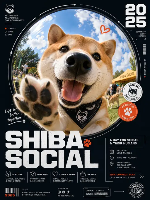
pet poster
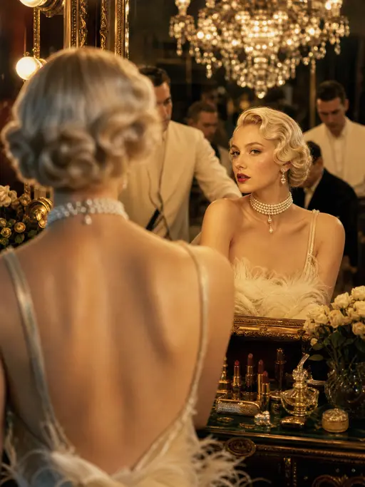
Cinematic photograph
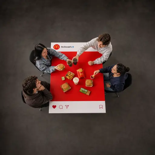
brand poster
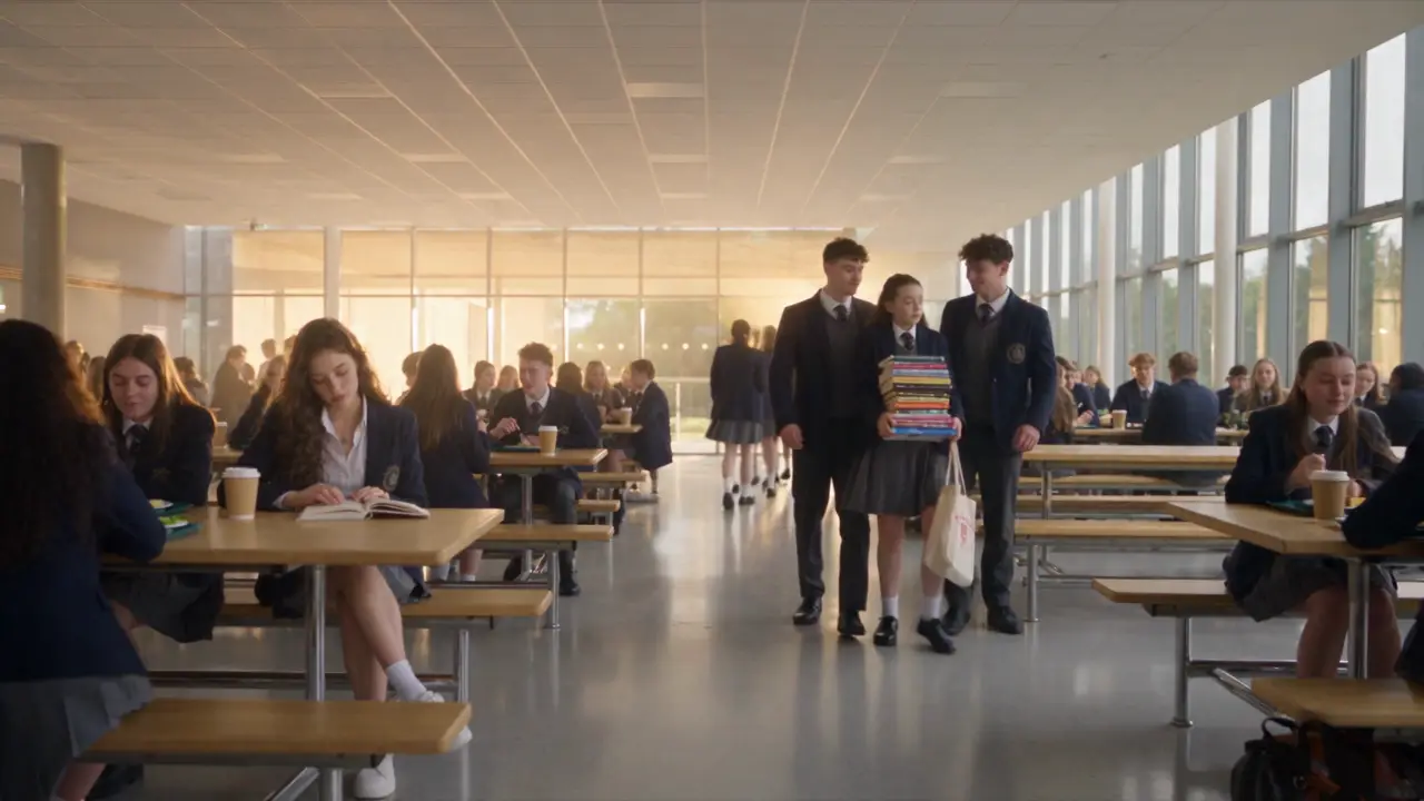
micro- drama
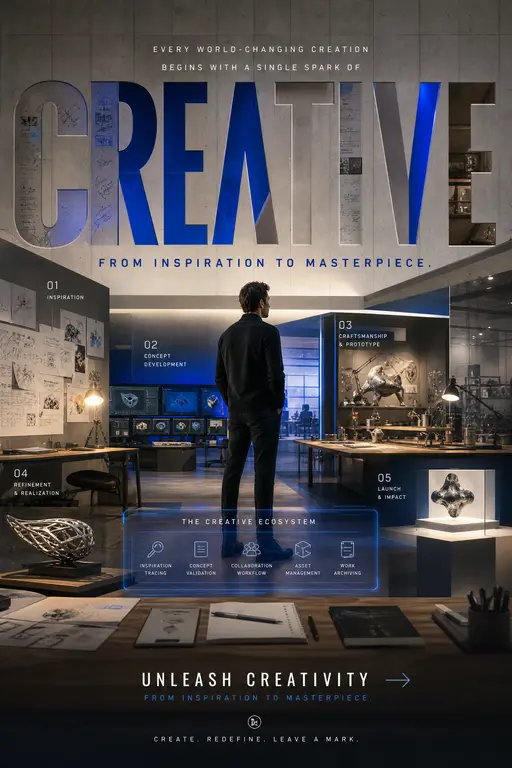
Global Brand Campaign Poster
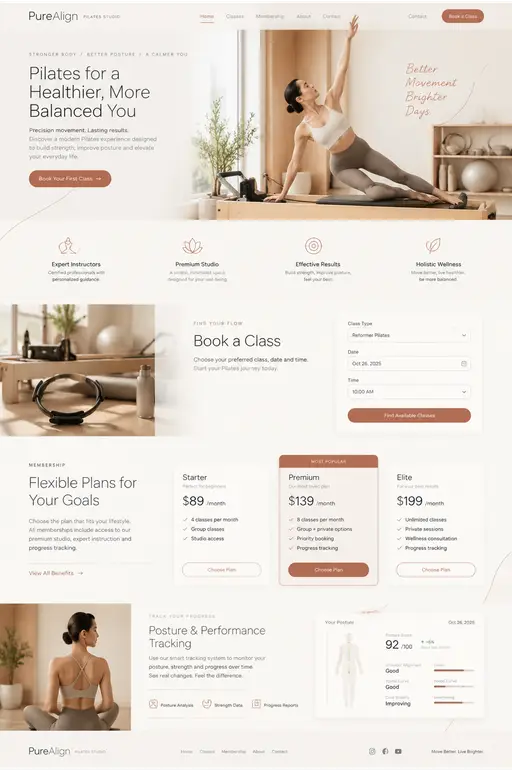
Pilates studio landing page UI design
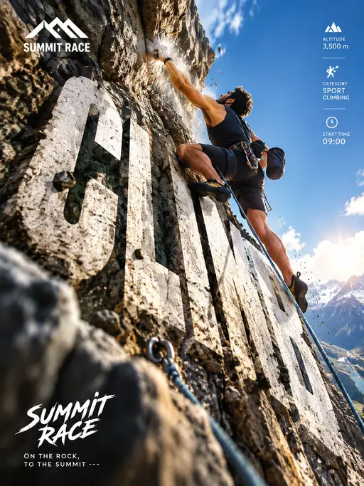
Vertical Outdoor Rock Climbing Competition Poster
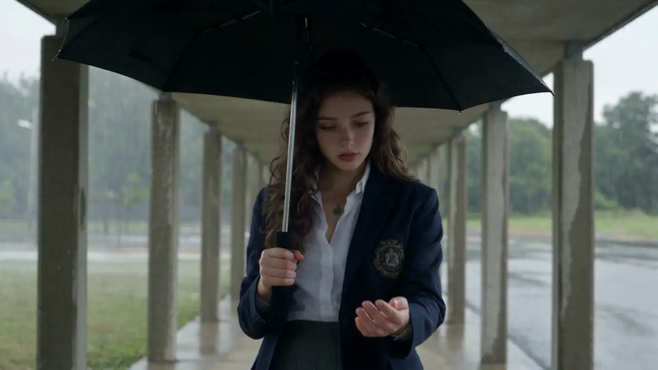
Micro-drama
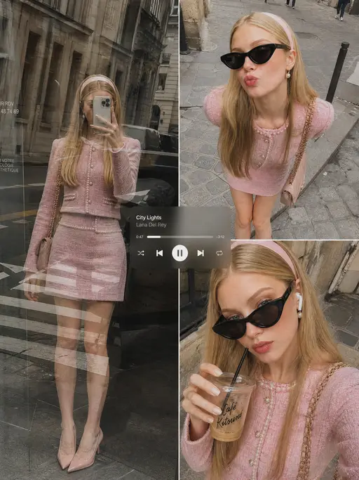
Instagram-style candid shot
2000s American teen-campus vignette
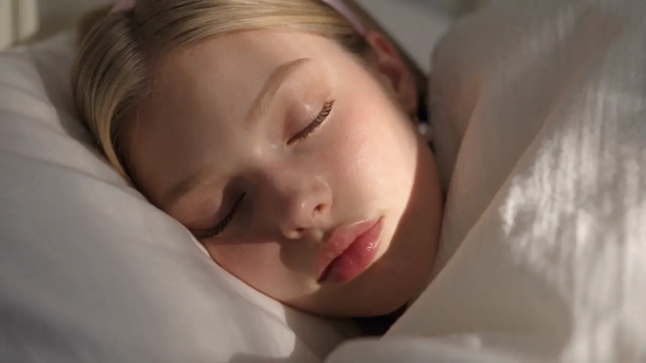
Daily routine
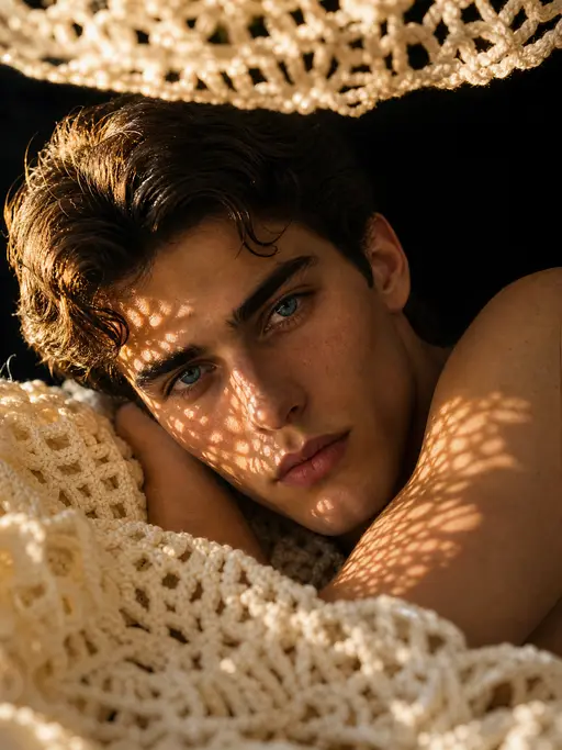
Editorial portrait
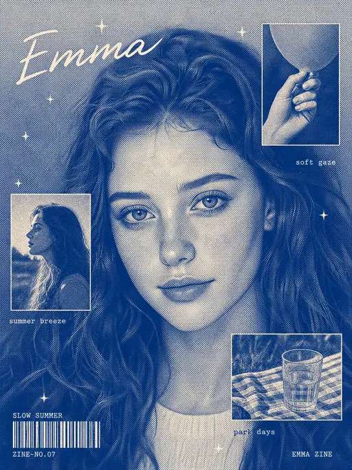
Character poster
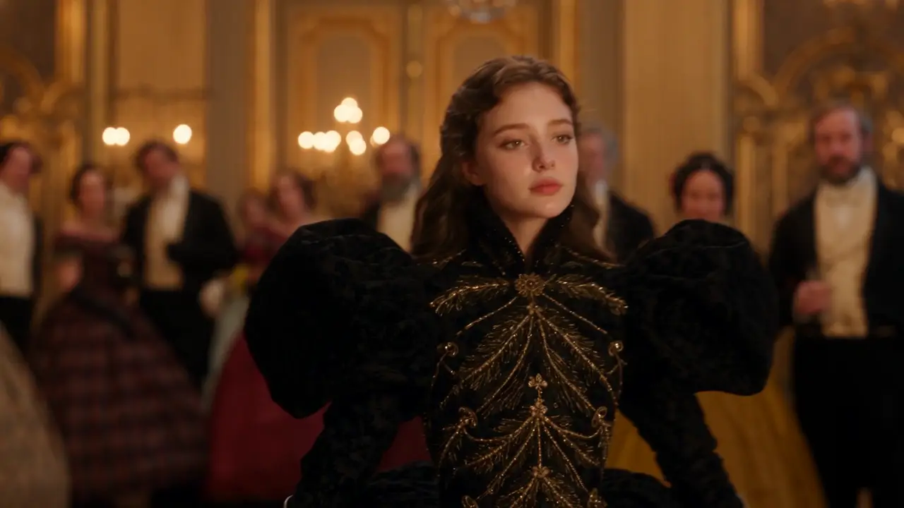
Micro-drama sequence
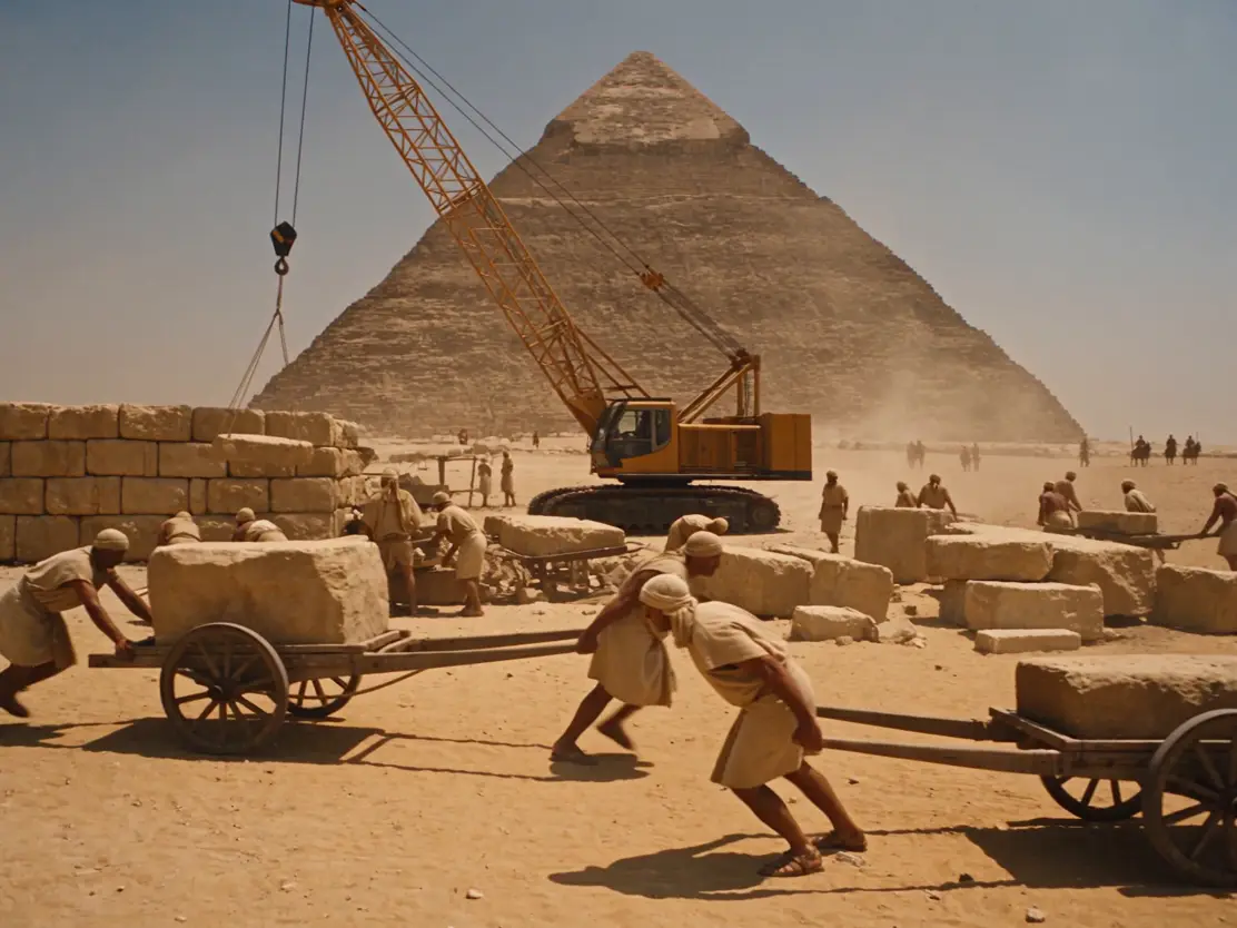
Ancient Egyptian comedy video