Love this? Log in to make your own version.
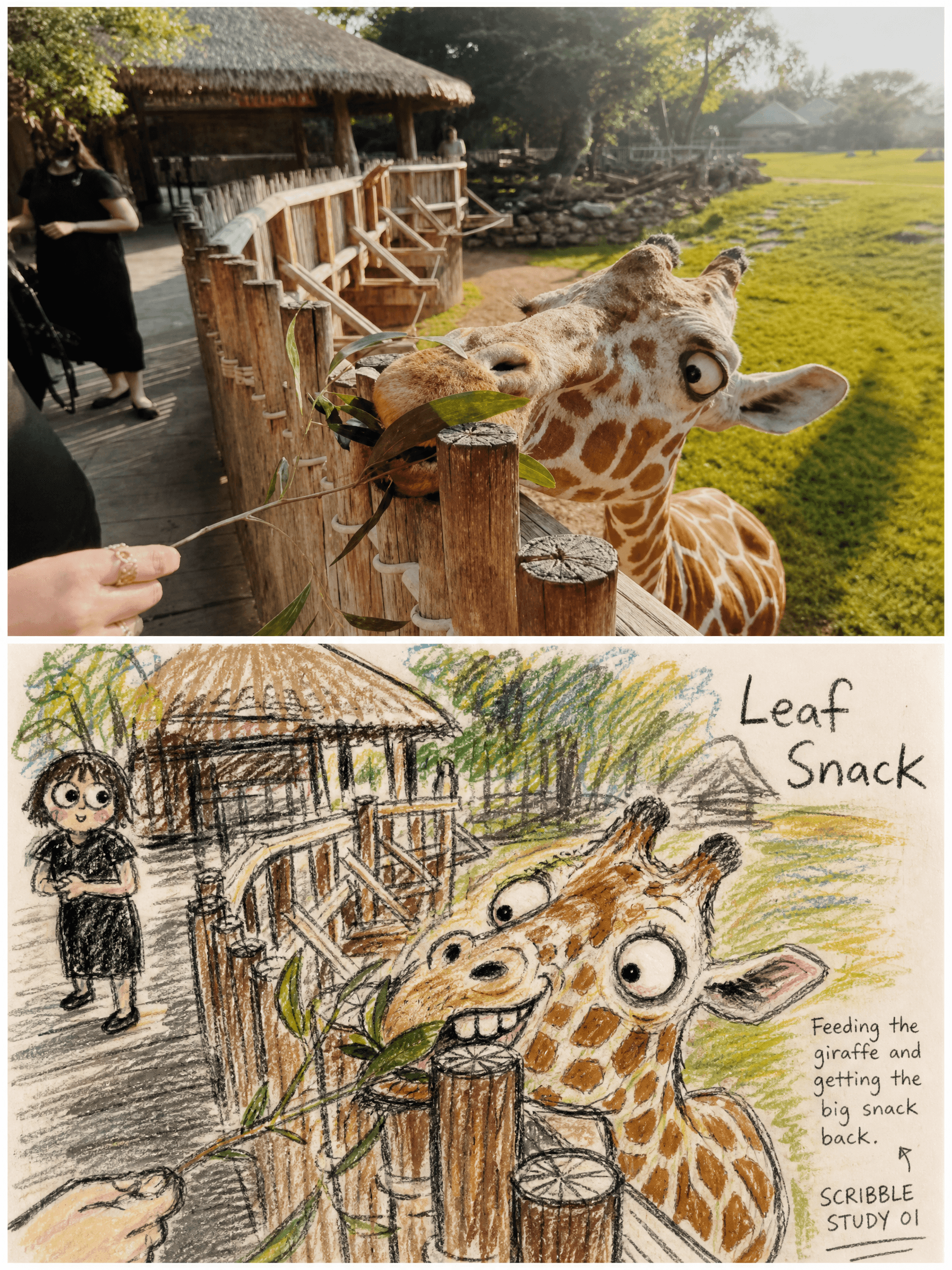
Scribble Mischief
- Image
- 3:4
- 1776 × 2368
Generation recipe
- model
- GPT Image 2.0
- resolution
- 2K
- quality
- medium
- reference

Prompt
Source:Use each uploaded photo as the only visual source.Create one independent **3:4 vertical comparison poster** per upload and output each separately.Never combine multiple photos into one image and never make a collage. Format:Build the poster with a clear **top-and-bottom diptych layout**.The image is divided into two clean stacked sections:the **upper half remains real photography**,and the **lower half becomes a rough hand-drawn reinterpretation** of the same scene.The relationship between the two halves must be obvious and immediate. Upper Half · Original Photograph:Keep the upper half fully photographic and faithful to the uploaded image.Accurately preserve the subject’s **identity,number,pose,action,clothing,animal fur color,architectural structure,environmental relationships,viewing angle,and real natural light**.Only apply subtle premium photographic color grading for a polished editorial feel.Do not add or remove any person or animal.Do not change the location,subject relationships,or major composition.Do not turn the photographic area into illustration.Do not invent new landmarks or alter the real scene. Lower Half · Rough Crayon Scribble Reinterpretation:Transform the same subject into a **rough,funny,awkward,and slightly goofy crayon doodle** with a faint silly goblin-like expression energy,but **not horror** and **not any existing cartoon character**.Preserve the most recognizable **contours,pose,gesture,and relationships** from the original photo,but do not copy it realistically.The lower half should feel like a deliberately messy,expressive,and humorous reinterpretation of the same memory. Character and Face Treatment:People or animals in the lower half may have their **faces slightly enlarged** for emphasis.Exaggerate **eyes,eyebrows,nose,teeth,tongue,mouth corners,and facial proportions** to create skewed,asymmetrical,slightly clumsy,and absurd expressions.The face may look crooked,off-balance,and handmade,but it must still remain clearly identifiable as the original subject.Do not make the expression scary,gory,grotesquely monstrous,or disturbing.Keep it playful,strange,and intentionally “not pretty.” Drawing Medium and Mark-Making:Use **thick black crayon,oil pastel,and greasy colored pencil** as the core drawing materials.Repeatedly search for the contour with visible hand pressure.Lines should be **shaky,broken,overlapping,uneven in thickness,and imperfect**.Keep visible signs of **erasing,redrawing,overshooting,going outside the form,and unfinished correction marks**.The drawing must feel genuinely handmade,raw,and unpolished.Do not use smooth outlines,clean vector edges,flat perfect fills,or refined digital coloring. Color Handling:Extract the main colors from the original photo and compress them into a **limited rough palette**.Render skin,clothing,fur,or objects with **dry rubbing,uneven layering,patchy fill,partial blank paper,and rough color friction**.Let the paper show through in places.Use irregular color overlap and inconsistent density.Do not use smooth gradients,polished shading,or glossy digital paint. Background Treatment:Keep only a **small amount of environmental information** needed to identify the place or preserve the action relationship,such as a building,a bench,a railing,a road,a tree,a landmark,or a few location cues.Render these background elements with **loose,low-density,sketchy marks** rather than full reconstruction.The subject should feel more concentrated,more impactful,and more visually dominant,with **warm paper white and moderate negative space** around it. Typography and Handwritten Notes:In the lower half,add brief handwritten English text.Generate a **1-to-3-word main title** based on the image.Also include the exact phrase **“SCRIBBLE STUDY 01”**.Then add **one short handwritten observational sentence** describing the real action,expression,or mood seen in the photo.The lettering must look like **crooked,dry,slightly broken pencil or crayon handwriting**:readable,but irregular,casual,and handmade.Never use clean digital typography. Overall Feeling:The final poster should emphasize a deliberately **“not beautifully drawn” handmade doodle aesthetic**:rough,funny,absurd,slightly goofy,and full of awkward expressive energy,while still preserving the original photo’s **human relationships,animal traits,and travel-memory feeling**.The result should feel like a premium editorial photo above and a chaotic personal sketch-note version below. Negative:No polished cartoon style,no cute chibi look,no anime,no manga,no smooth vector graphics,no realistic academic sketch,no horror,no blood,no fixed template face,no full detailed background copy,no excessive decoration,no changing subject number or pose,no invented landmarks,no logo,no watermark,no gibberish text,and no extra unnecessary text.
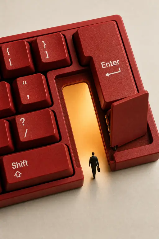
Product Photography
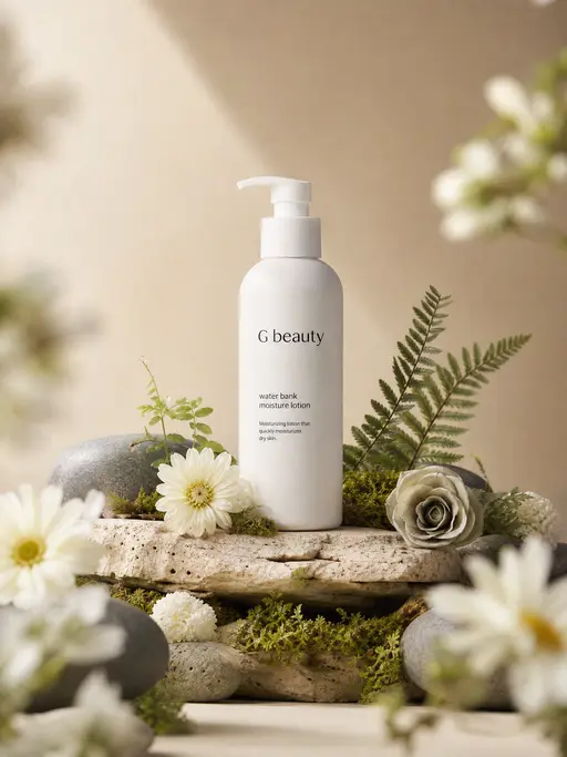
Product Photography
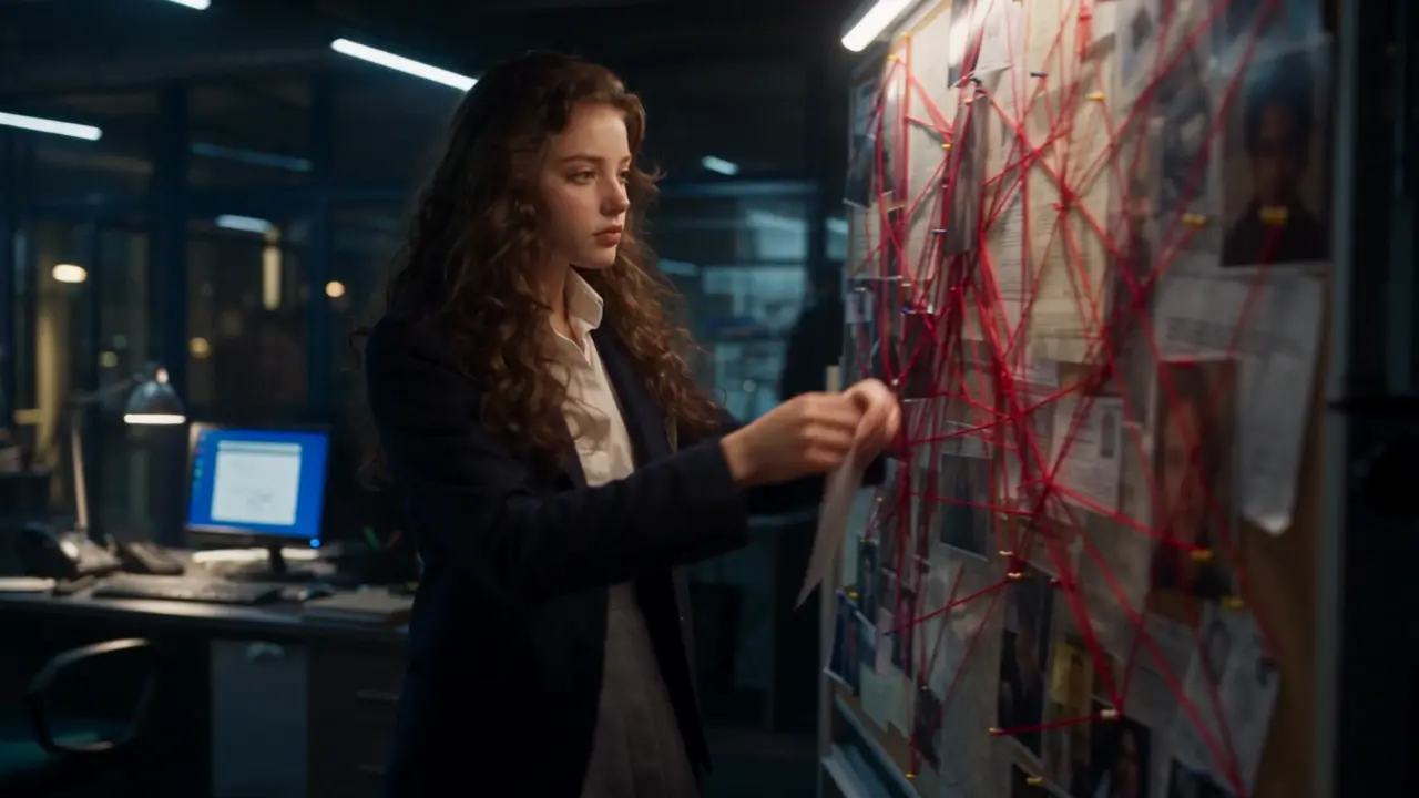
cinematic procedural-mystery sequence
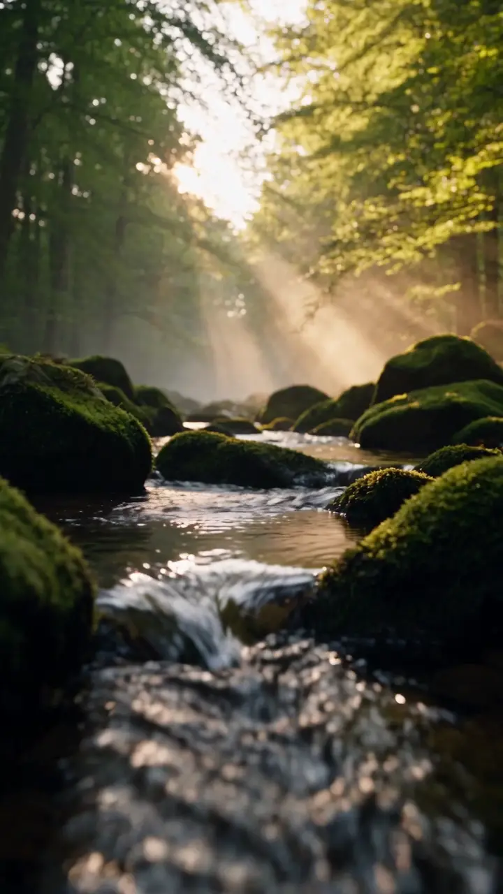
short film
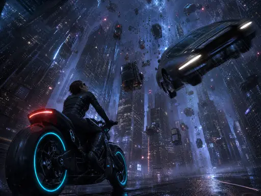
Cinematic-quality keyframe for a sci-fi film
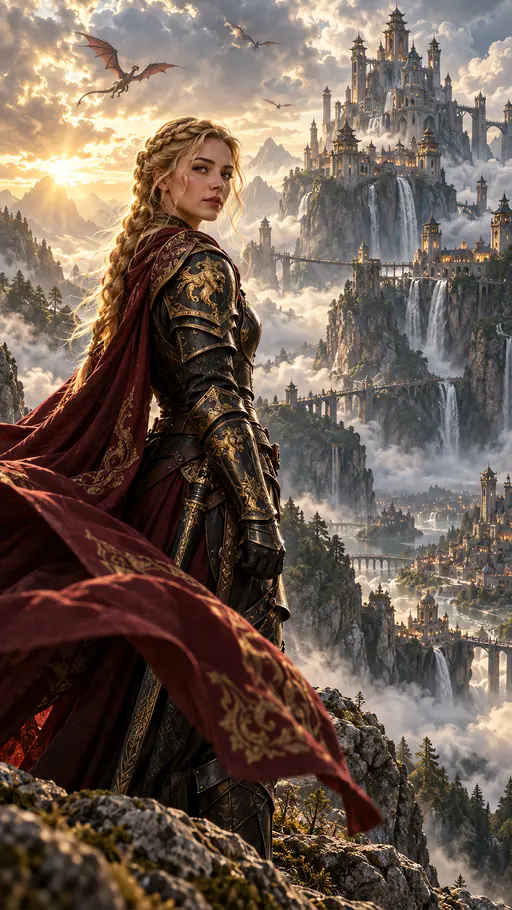
Cinematic portrait
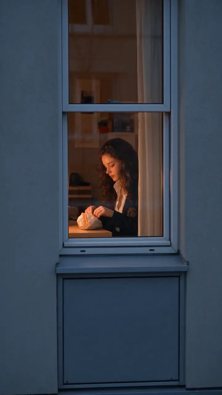
Second-person handheld POV
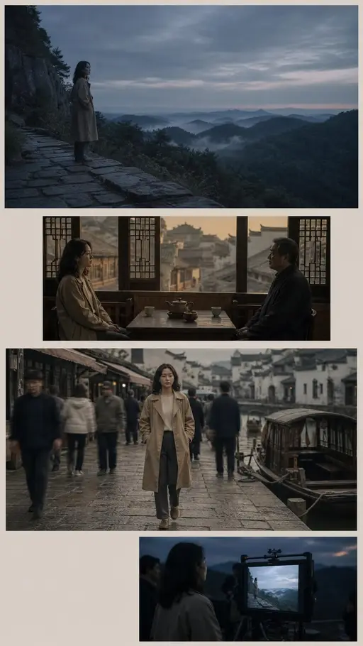
Cinematic storyboard
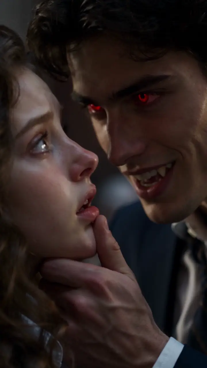
short-form drama creation
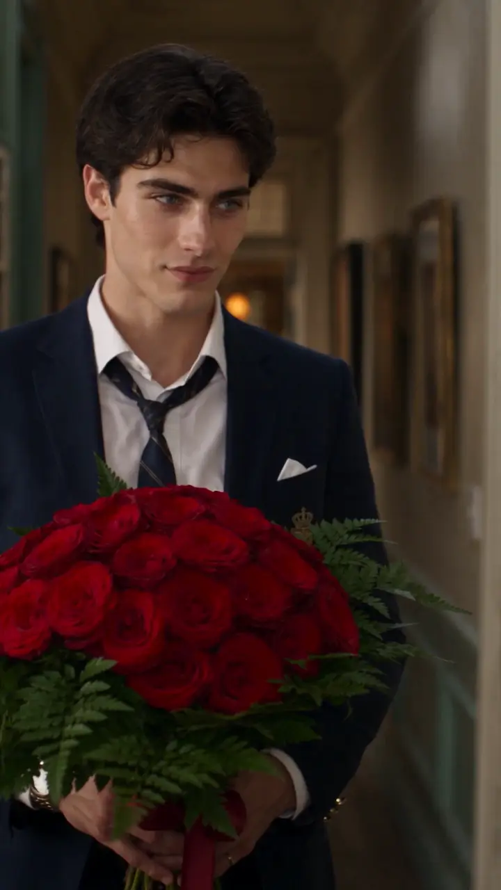
short-form drama creation
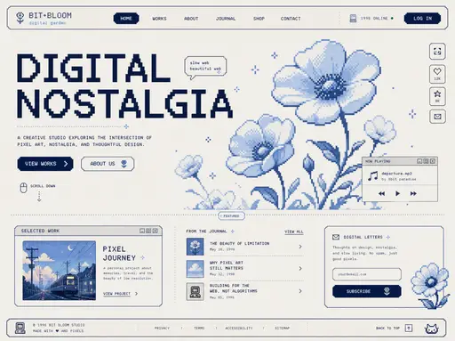
Pixel-art website
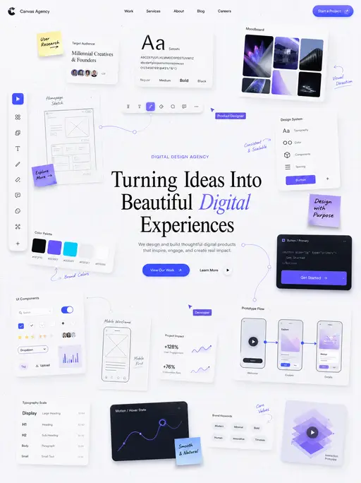
UI mockup
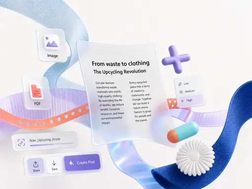
UI mockup
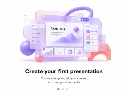
3D SaaS onboarding illustration floats
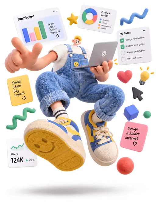
3D illustration