Love this? Log in to make your own version.
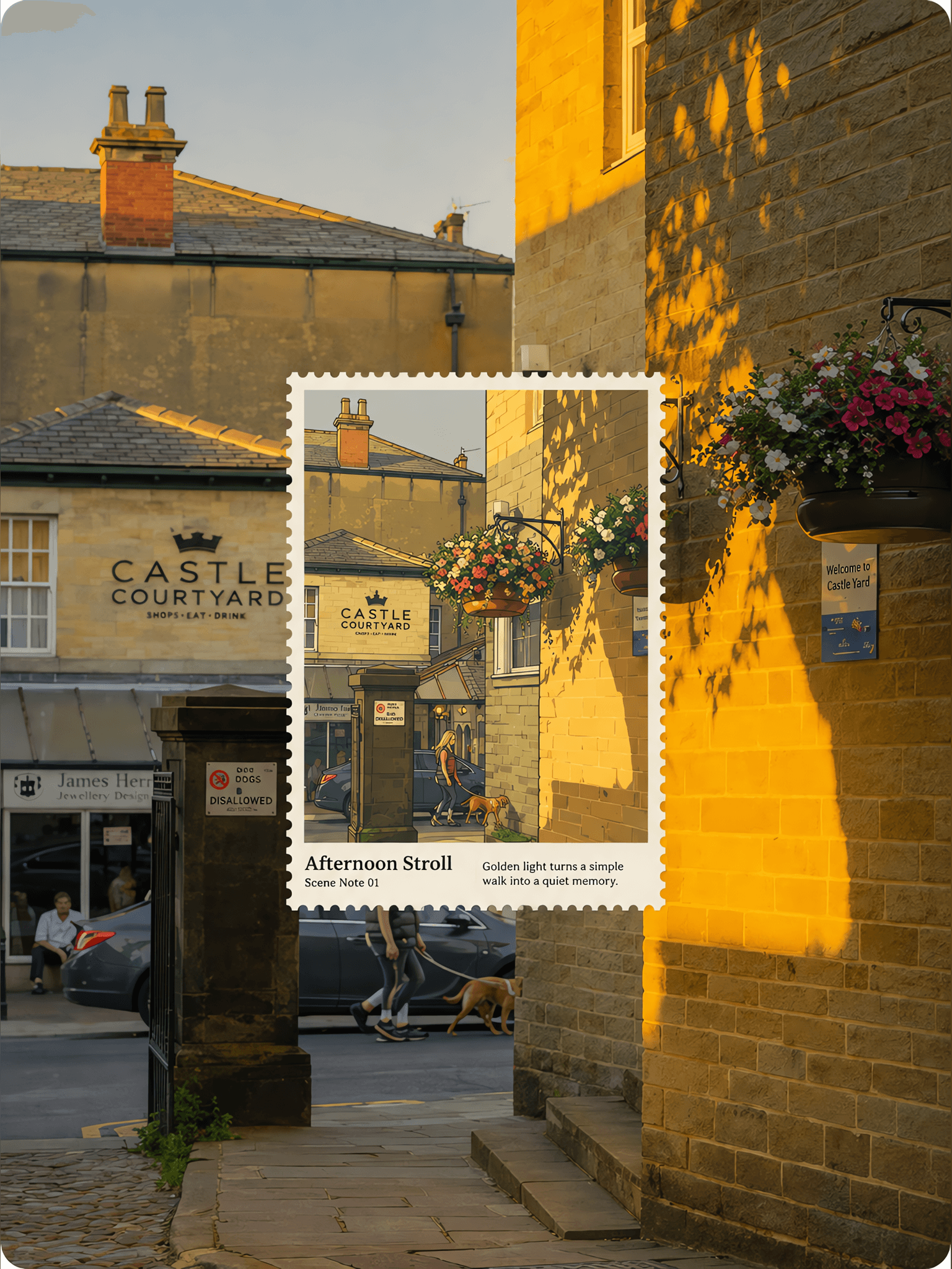
Stamp Scene Window
- Image
- 3:4
- 1536 × 2048
Generation recipe
- model
- GPT Image 2.0
- resolution
- 2K
- quality
- medium
- reference

Prompt
Create “real-photo anime stamp window” artwork for each uploaded travel photo.Output each photo separately;never combine uploads.Use the original photo as the full-canvas base.Preserve subject identity,count,pose,proportions,position,camera angle,natural light,shadows,scene relationships,and photo texture.Do not split the frame or repaint the whole image. Stamp window:Place one flat postage-stamp window over the core subject area.It must sit exactly on the original subject and cover the key footprint,but stay a compact standard stamp shape rather than stretching to match a tall alley,wall,building,or road.Inside the stamp,redraw the same subject as a retro anime illustration;outside the stamp,keep the original photo photographic.The inside and outside must show the same instant and align precisely. Continuity:Keep subject count,center position,scale,pose,direction,and perspective unchanged.Key edges such as feet,wheels,waterlines,roads,tracks,steps,and horizons should connect naturally across the stamp edge.Do not move the subject,zoom into a new close-up,or show both a photo subject and a illustrated duplicate. Ratio and size:Use only two fixed stamp proportions:vertical 3:4 or horizontal 4:3.No other ratio.For standing people,towers,and vertical streets,use vertical 3:4.For boats,vehicles,stalls,coastlines,and wider scenes,use horizontal 4:3.Keep the stamp moderate,never long or dominant.Vertical stamps should be about 42-50% of full image height.Horizontal stamps should be about 44-54% of full image width.Always derive the other dimension strictly from the chosen ratio and leave visible photo breathing room on all four sides. Perforation:All four sides need clear,even,uniform perforations.Keep equal paper-edge width on every side.The stamp lies flat on the photo.No thickness,shadow,curled edge,tilt,or floating-card effect. Illustration:Inside the stamp,use loose ink lines,retro cel-animation flat rendering,vintage print grain and light paper texture.Simplify the photo into 3-5 colors while preserving the most recognizable hues.Remove complex detail and keep silhouette,gesture,core structure,and essential cues.Reserve about 35-60% of the stamp interior as calm color fields or negative space. Typography:All readable text must be in English only.Generate only three truthful elements from the visible scene:1)a 1-3 word title,2)one small note like “Scene Note 01”,and 3)one short observation sentence.Place text only inside low-information areas of the stamp.If the exact location is uncertain,use a scene-based title and never invent a place name or date. Negative:No collage,no full-frame anime conversion,no moved subject,no changed pose,no broken alignment,no oversized stamp,no tall narrow stamp,no extra-wide stamp,no uneven perforations,no rounded card,no shadow,no floating stamp,no 3D,no cluttered background,no other-language text,no fake location,no date,no logo,no watermark,no UI.

Sports Figure Poster
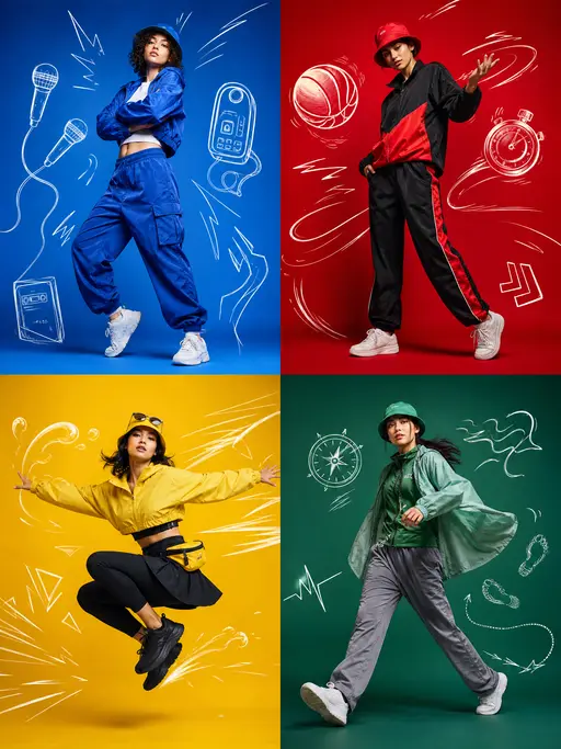
Sports Illustration × Photorealistic Poster

Athletic Character Poster
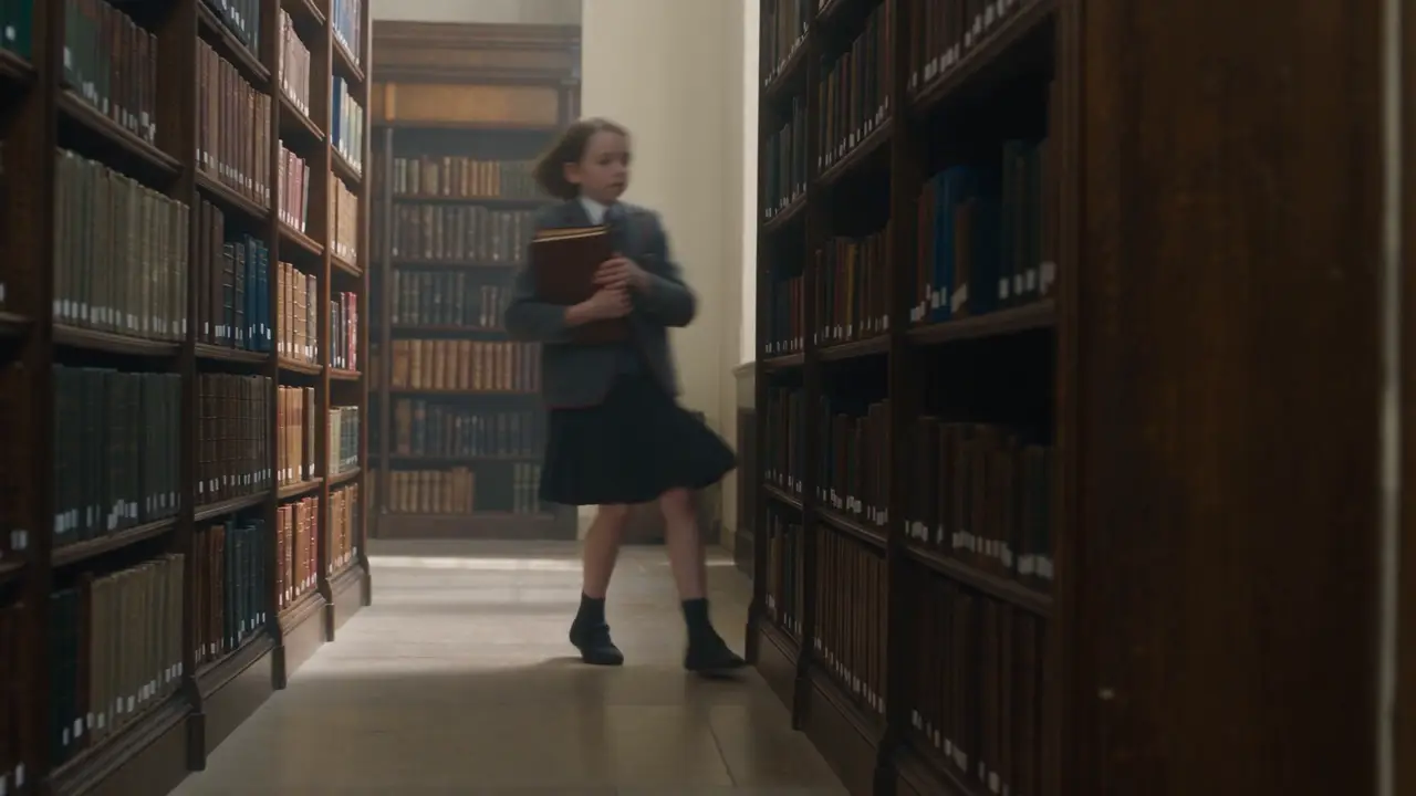
micro drama
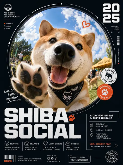
pet poster

Cinematic photograph
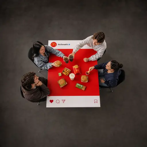
brand poster
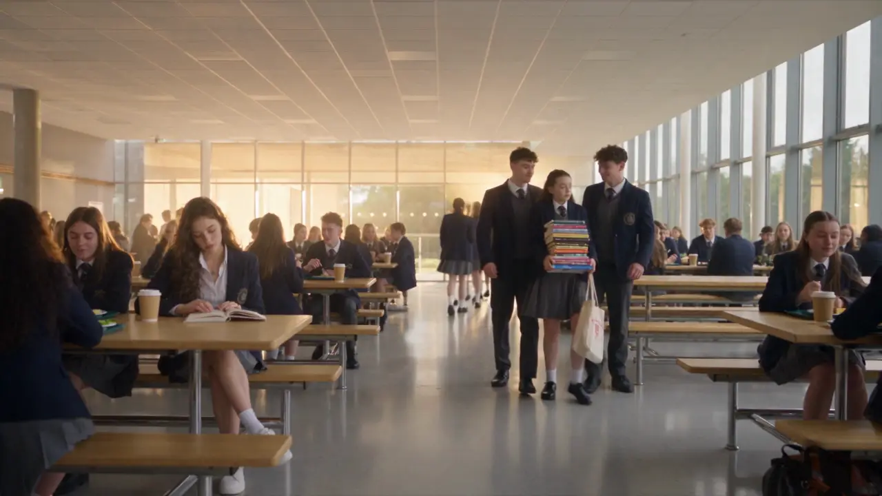
micro- drama
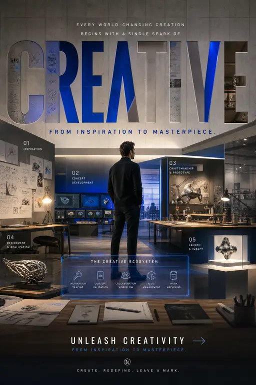
Global Brand Campaign Poster

Pilates studio landing page UI design
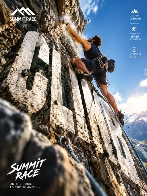
Vertical Outdoor Rock Climbing Competition Poster
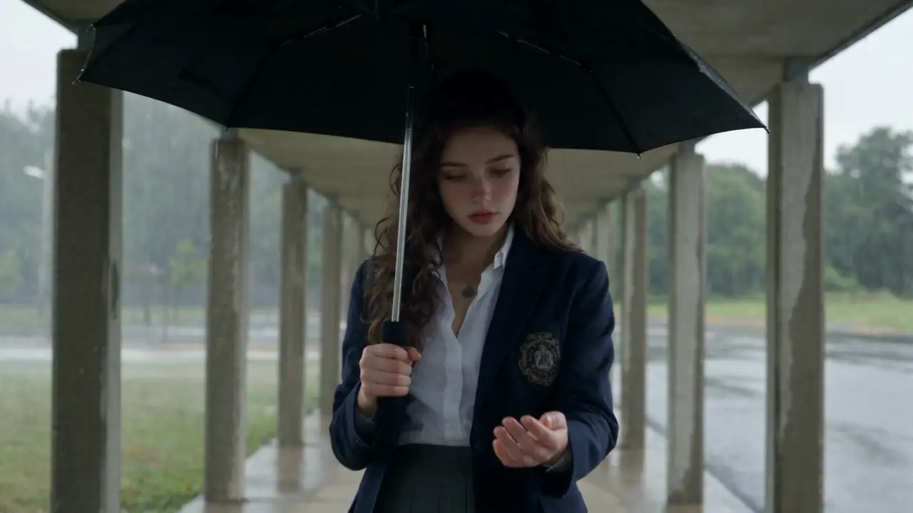
Micro-drama
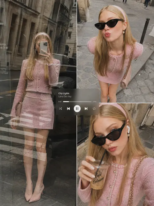
Instagram-style candid shot
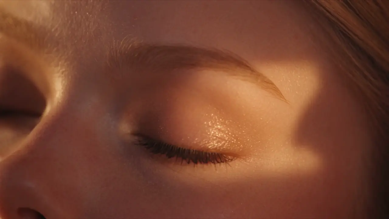
2000s American teen-campus vignette

Daily routine