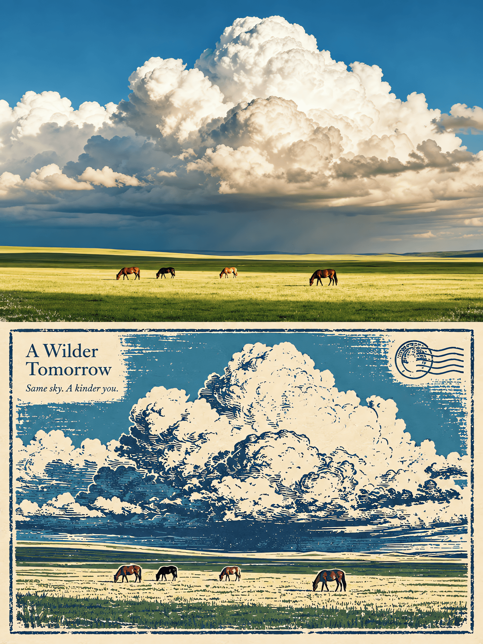
Stamped Travel Print
- Image
- 3:4
- 1536 × 2048
Generation recipe
- model
- GPT Image 2.0
- resolution
- 2K
- quality
- medium
- reference

Prompt
Edit the input photo and transform it into a static travel poster in a strict vertical 3:4 format,1200×1600 pixels.If another output size is used,keep the exact same proportional structure.The canvas must be divided into two perfectly equal horizontal sections:the upper half is 1200×800 and the lower half is 1200×800.In pixel logic,the photographic area ends at y=799 and the paper-print area begins at y=800.There must be no extra band,no added footer,and no separate title area below the poster.All text must live inside the lower half’s existing negative space.The two sections must remain exactly the same height. Upper half·Real photograph: Use the uploaded image as a full-bleed real photographic panel occupying the entire upper half.Preserve the subject identity,pose,proportions,objects,architecture,perspective,spatial relationships,natural light,and original color atmosphere.Do not repaint or reinterpret the subject.Do not add text,borders,paper texture,or graphic decoration to the upper half.Only allow natural cropping or a very subtle background extension when absolutely necessary to fit the 3:4 layout,but never stretch,distort,or redesign the core subject.The upper half must remain clearly photographic,clean,and authentic. Lower half·Rubber-stamp print reinterpretation: Transform the same scene into a rubber-stamp print / relief print style composition occupying the entire lower half.The lower half must feel like a true handcrafted print on cream paper,not a photo filter and not a digital painting.Use a warm cream or soft ivory paper ground with very subtle paper fibers.Render the image primarily with deep navy carved linework,combined with flat ink areas derived from the source photo’s inherent colors.Use restrained,muted color blocks sampled from the original image rather than bright artificial hues.Keep slight ink loss,controlled under-inking,and small irregularities so the print feels tactile and authentic. Image translation logic: The lower half must correspond closely to the upper photo in contour,subject placement,and spatial logic.Preserve the main silhouette,important objects,basic architecture,and overall scene relationship so the viewer can instantly recognize that both halves depict the same place and moment.Simplify details into carved marks,engraved contours,and block-printed shapes.Do not make it look like a processed photo effect.It must read as a genuine printmaking interpretation with carved outlines and hand-inked surfaces. Printmaking texture and details: Use carved navy linework,slight edge irregularity,subtle ink spread,minor missing-ink areas,and delicate visible paper fibers.Include a lightly distressed narrow border around the printed composition,but only inside the lower half.This border should feel slightly worn or imperfect,like the edge of a hand-pulled print.You may also include one small stamp-like print element and one non-verbal postmark motif within the lower half only.These must be purely graphic printmaking details,small in scale,and integrated naturally into the lower-half design.The postmark must contain no readable words. Typography: Do not create a separate bottom title strip.Do not add any extra height for typography.Place a short English serif title in the top-left area of the lower half,embedded directly into existing blank space.In the line just below it,add one short English sentence or phrase that feels poetic and travel-related.The typography should be elegant,restrained,and integrated with the print composition.Use a refined serif typeface or a print-like serif feeling.Keep the text small to medium in size and harmonized with the lower-half image.Do not use place names,dates,brand names,or gibberish.Do not generate excessive copy. Layout rules: The top and bottom halves must touch directly with no gap between them.Do not add a divider line,no ornamental separator,and no decorative band between the halves.The transition should be a clean direct meeting of image and print.The final result should feel like a refined editorial travel poster:real photograph above,handmade rubber-stamp print below,balanced 50/50,quietly sophisticated,and visually collectible. Negative constraints: No extra bottom title area,no unequal section heights,no separator line,no collage,no full poster border outside the design,no text in the top half,no paper texture in the top half,no repainting of the photographic subject,no photo-filter imitation in the lower half,no smooth digital illustration,no glossy rendering,no excessive distress,no neon colors,no place names,no dates,no brand names,no watermark,no logo,and no gibberish text.

perfume advertising poster
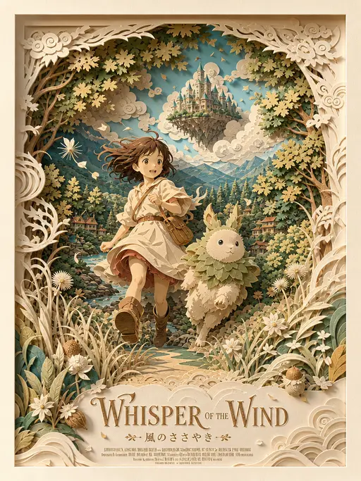
3D layered papercraft poster
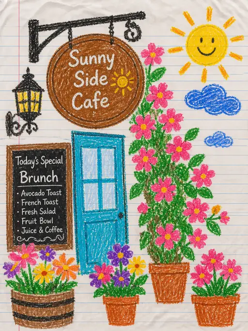
child's crayon drawing
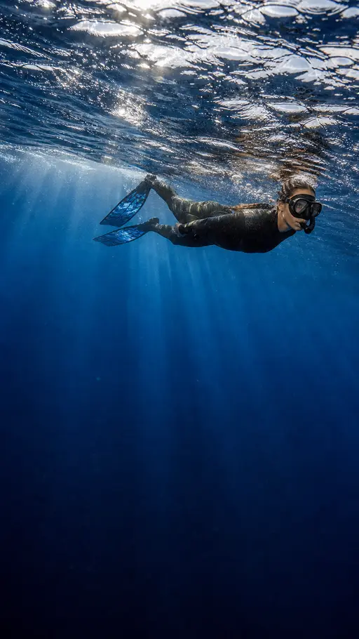
Underwater photography
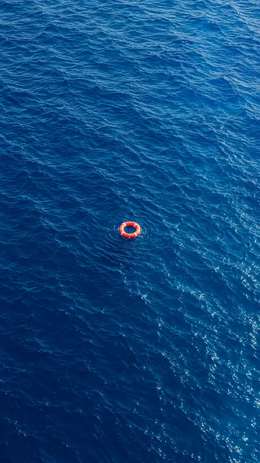
blue ocean

Felt-textured cartoon avatars
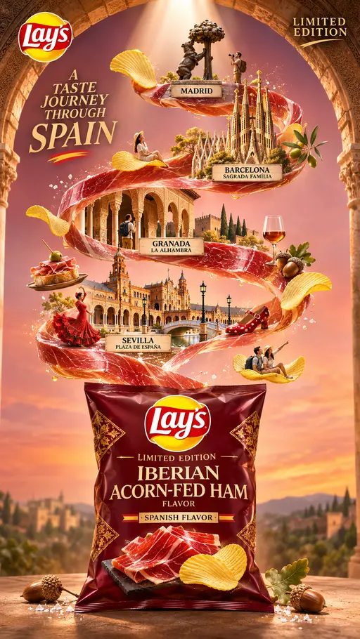
Creative Potato Chip Posters
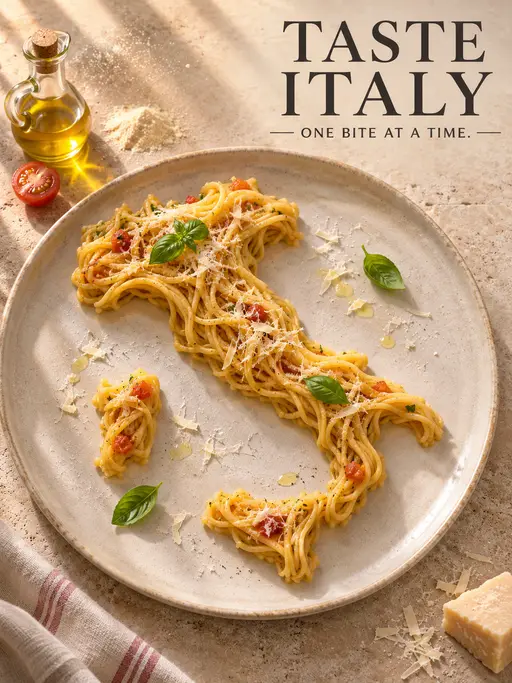
Food Advertising Posters
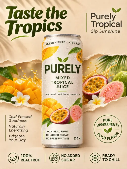
Fruit Juice Product Poster

Advertisement Poster for Hair Care Essential Oil
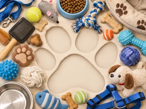
Pet Lifestyle Theme Creation

3×3 collage
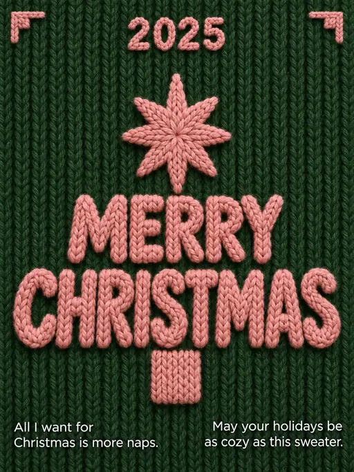
Christmas poster

Christmas poster
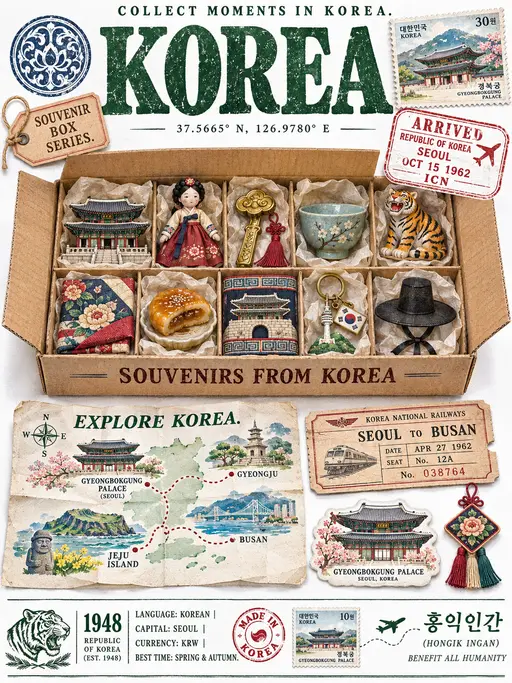
Travel-Themed Posters