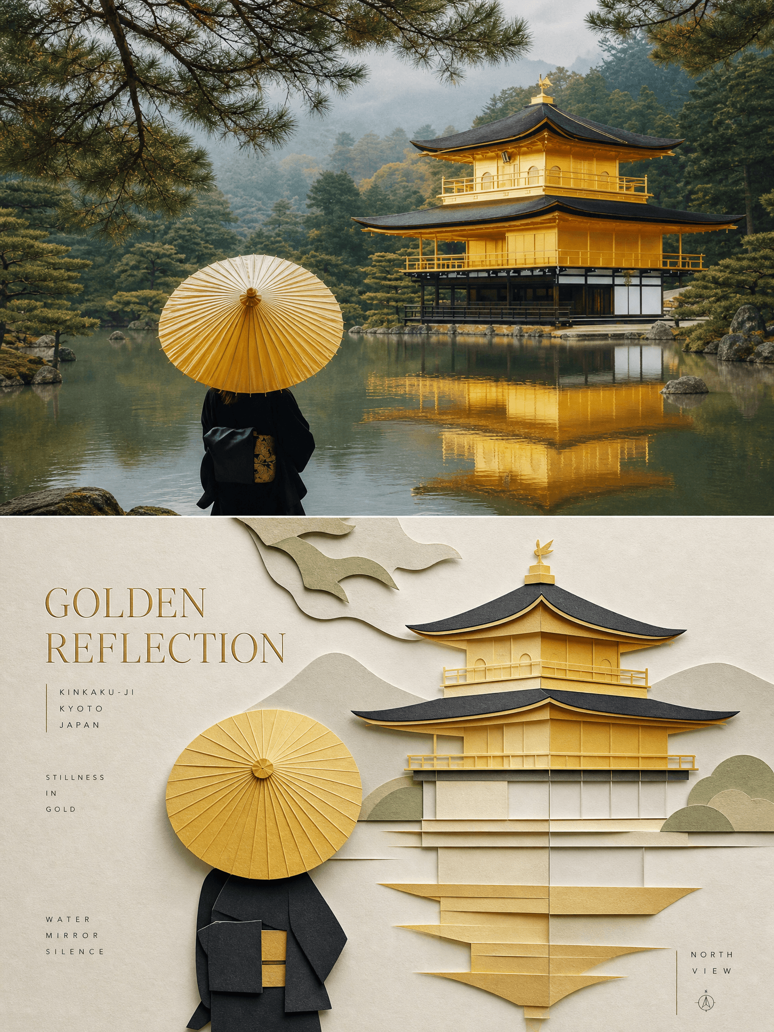
Paper Layer Study
- Obraz
- 3:4
- 1536 × 2048
Przepis generowania
- model
- GPT Image 2.0
- rozdzielczość
- 2K
- jakość
- medium
- referencja

Prompt
Source:Use each uploaded photo as the only visual source.Create one independent editorial poster per upload and output each separately.Do not make a collage and do not combine multiple photos into one image. Format:Use a **vertical 3:4 composition** divided into two **strictly equal horizontal halves**,with the **top 50% and bottom 50%** occupying the frame equally.The overall result should feel refined,balanced,and clearly editorial. Upper Half · Original Photograph:Keep the upper half photographic and faithful to the uploaded image.Preserve the original main subject without alteration,including its identity,structure,pose,and key visual relationships.Maintain the **real texture,natural light,and original color atmosphere** of the photograph.Apply only **subtle editorial-grade color grading** so the image feels like a page from an **art magazine,independent publication,or exhibition photography series**.To fit the composition,you may gently extend the surrounding **sky,ground,or nearby environmental background**,but never stretch,distort,or redesign the subject.Do not turn the upper half into illustration. Lower Half · Minimal Layered Paper Relief Reconstruction:Reinterpret the most recognizable **subject,contour,pose,and scene relationship** from the photograph as a **minimal layered papercraft / paper relief composition**.Use **one dominant main subject** as the visual anchor.Do not mechanically copy every detail from the original image.Instead,rebuild the scene through **folding,cutting,layering,masking,and partial occlusion**,retaining only the most essential **silhouette,proportion,and structural logic**.Translate a small number of supporting environmental elements into **foreground,middle-ground,and background paper layers**.Use **scale contrast,generous negative space,clean alignment,and overlapping depth relationships** to keep the subject instantly recognizable while maintaining a restrained editorial composition. Papercraft Logic and Construction:Build the lower half from **high-quality matte cardstock or paperboard** with a refined handmade feel.The forms should feel intentionally simplified and carefully arranged,not overly decorative or overly literal.Let the paper layers create the illusion of shallow spatial depth through **stacking,edge separation,and contact shadow**.Some pieces may be slightly folded or lifted to enhance the tactile handcrafted effect.Keep the structure elegant,calm,and precise. Color System:Extract the most vivid and most recognizable colors from the original photo,then compress them into a **limited,harmonious papercraft palette**.Use a **warm ivory or light paper tone** as the base color.Add only a few stronger hues for the main subject,a deeper structural color for form definition,soft transitional layer colors,and a very small amount of accent color.The palette should feel curated,quiet,and editorial rather than loud.Avoid glossy plastic-looking 3D,cheap craft-paper textures,neon colors,and high-saturation complex gradients. Material and Surface Quality:Show the tactile quality of **premium matte paper** with **fine paper fibers,clean cut edges,and soft contact shadows under natural diffuse light**.Emphasize the believable feeling of a real handcrafted object.Preserve subtle physical paper qualities rather than digital slickness.The lower half should feel touchable,elegant,and materially rich. Typography System:Integrate a **refined editorial typography system** into the lower half.Create a **short main title** based on the subject’s identity,place,action,material,mood,or symbolic meaning.Then add **2 to 4 smaller supporting text groups**.These may include object names,location cues,numbers,sequence markers,coordinate-like strings,directional words,state words,material terms,classification tags,or one extremely short poetic phrase.Do **not** use any year.The **main title** should carry the emotional and identity weight,while the **smaller text** should add rhythm,order,and sophistication. Typography Placement and Interaction:Integrate the text naturally into the composition so it interacts with the paper forms.Arrange text **along the edges of paper layers,around the main silhouette,on geometric axes,or inside areas of negative space**.Typography may appear **horizontal,vertical,rotated,with wide letter spacing,flush-edge alignment,corner placement,cross-block layout,embedded placement,or partially overlapped/occluded placement**.The **main title** may have a subtle folded-paper or relief-like character,while the smaller text should remain **thin,modern,precise,and restrained**.The typography should enhance the editorial feel without overpowering the image. Overall Style Goal:The final poster should feel like **real photography above and a distilled paper-sculpture editorial reinterpretation below**.Elegant,tactile,balanced,and highly designed.The result should have a clear sense of **editorial sophistication,material sensitivity,and visual calm**,while still making the relationship between the original photo and the reconstructed paper subject immediately understandable. Negative:No collage of multiple photos,no unequal split,no overcrowded composition,no literal full-detail copy of the original scene,no glossy plastic 3D,no cheap craft look,no neon palette,no oversaturated gradient,no messy layout,no decorative clutter,no random typography,no year,no watermark,no logo,no UI,and no unrelated extra elements.
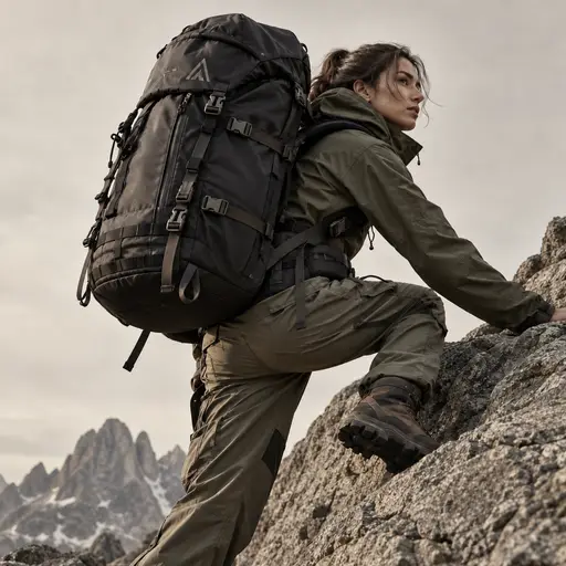
outdoor photography
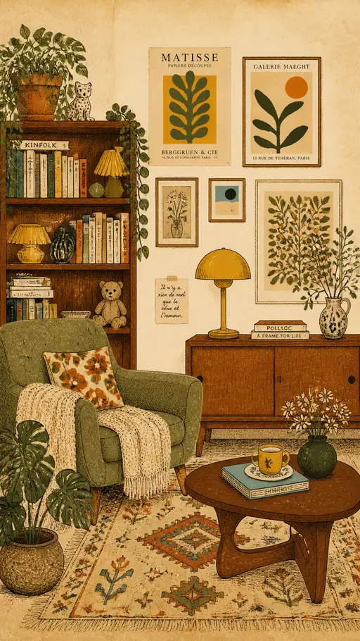
vintage interior illustration
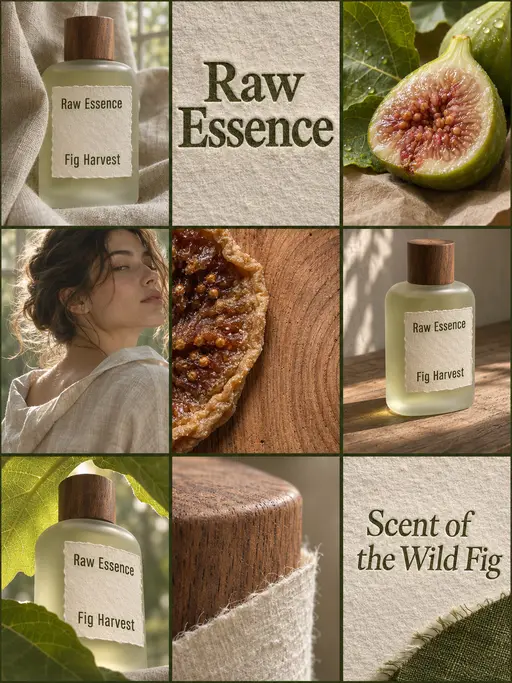
perfume advertising poster
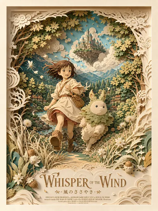
3D layered papercraft poster
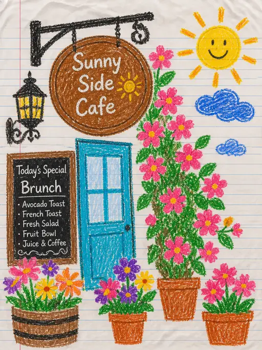
child's crayon drawing
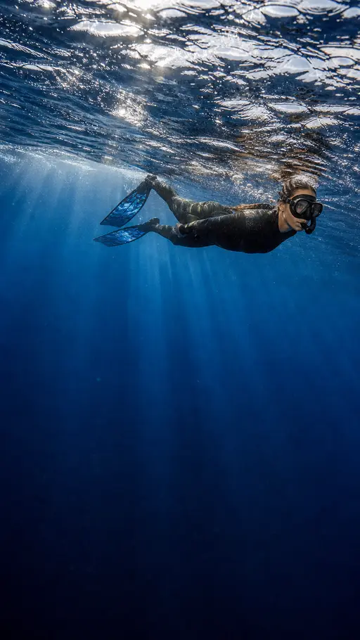
Underwater photography
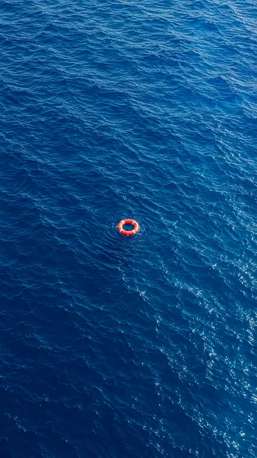
blue ocean
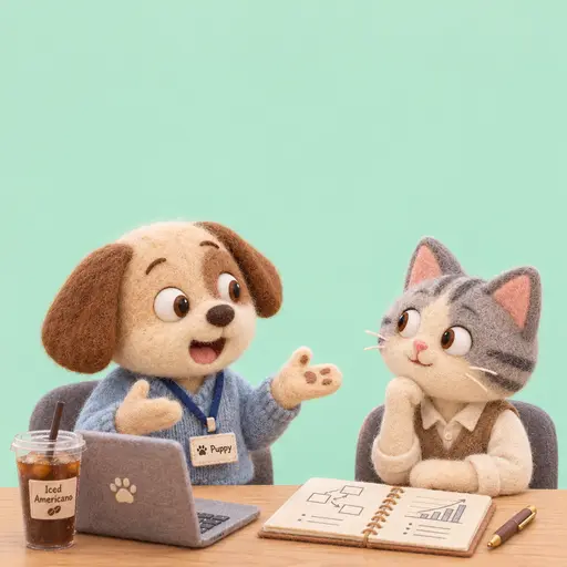
Felt-textured cartoon avatars
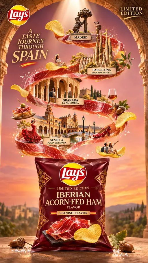
Creative Potato Chip Posters
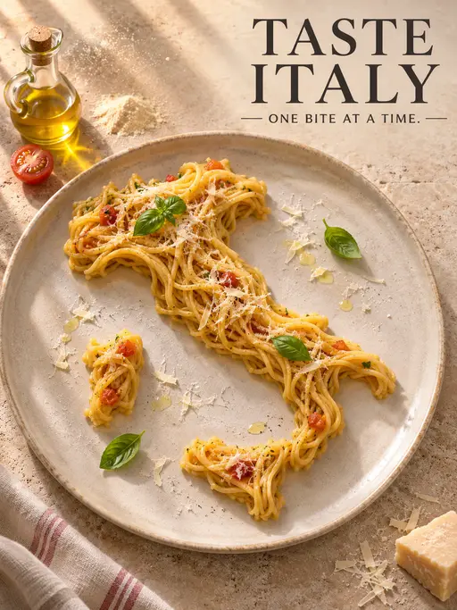
Food Advertising Posters
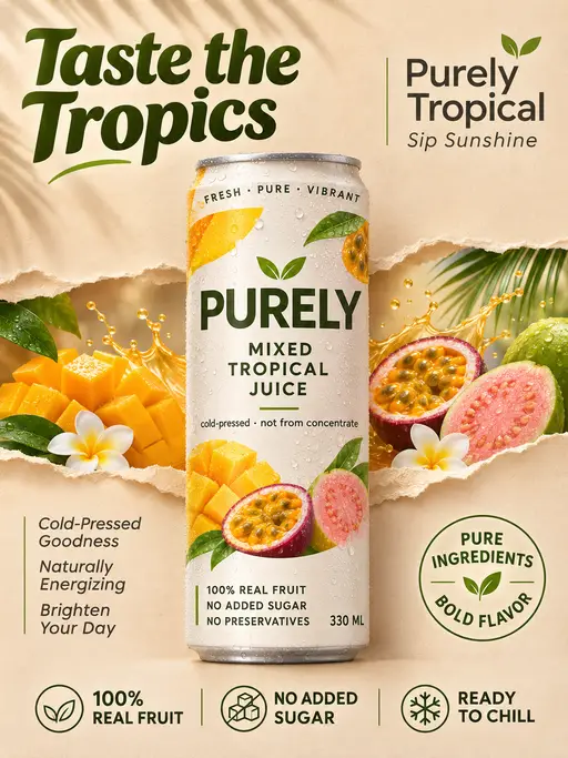
Fruit Juice Product Poster
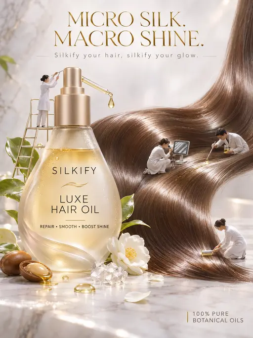
Advertisement Poster for Hair Care Essential Oil
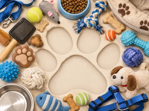
Pet Lifestyle Theme Creation
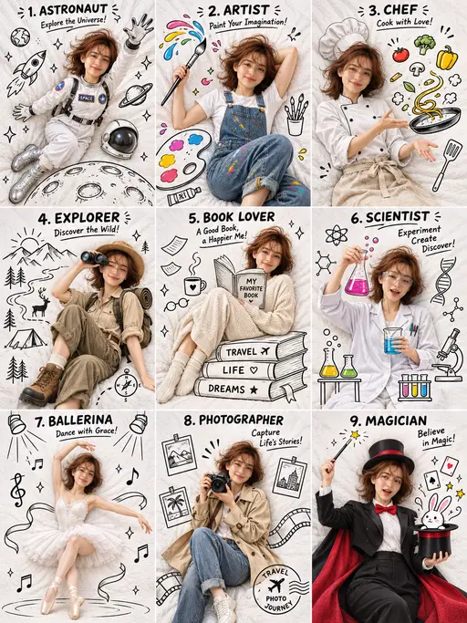
3×3 collage
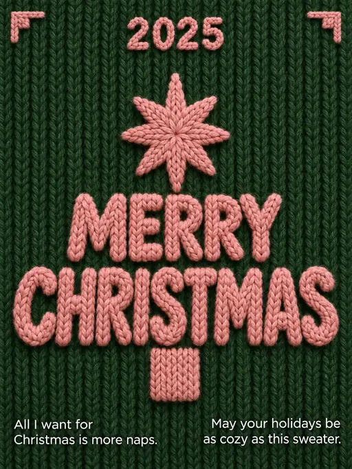
Christmas poster