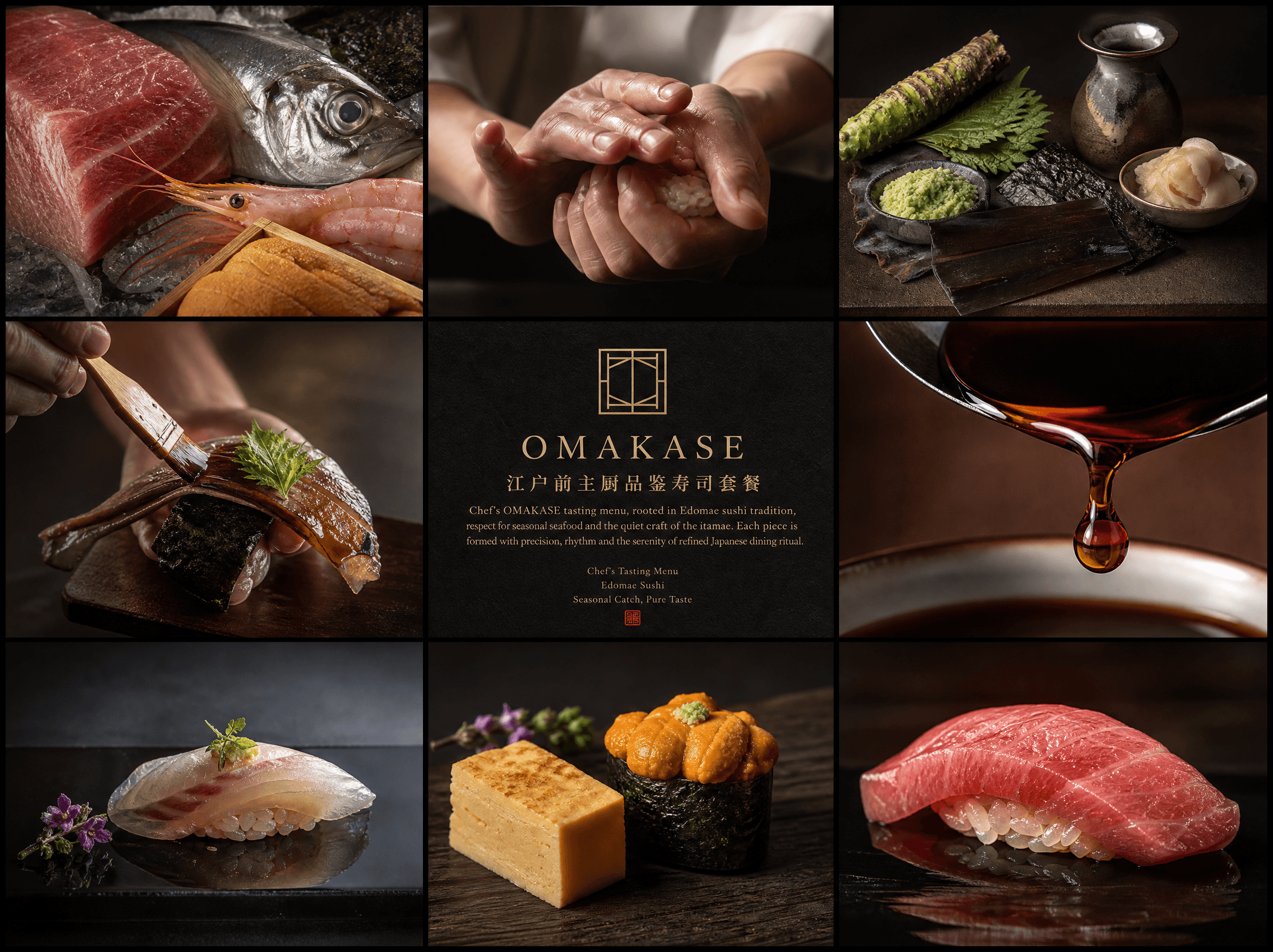
Premium Japanese dining menu design
- Gambar
- 4:3
- 2224 × 1664
Resep pembuatan
- model
- GPT Image 2.0
- resolusi
- 2K
- kualitas
- medium
Prompt
Create an ultra-premium 3×3 editorial grid landscape menu poster for an OMAKASE sushi restaurant, serving as a promotional piece for the chef’s tasting menu. The image is rooted in Japanese kaiseki aesthetics—intellectual, serene, restrained, ingredient-centric, and exuding understated luxury. The overall mood merges the craftsmanship of sushi artisans, the pacing of a seasonal tasting menu, and the quiet, refined culinary culture of a high-end Edomae sushi establishment. Adopt a strict nine-panel grid composition with three columns and three rows, precise borders, elegant spacing, and a calm editorial balance. The visual system is minimalist and architectural, restrained, and magazine-worthy, like an Edomae sushi tasting story told through raw ingredients, plated sushi, artisan gestures, and refined typography. The composition is unified and elegant, carefully curated, not noisy or commercial. Core concept: This high-end Edomae sushi restaurant presents a chef’s OMAKASE tasting menu shaped by restraint, precision, narrative pacing, and modern Japanese minimalist aesthetics. The poster acts as a culinary manifesto for an intimate sushi ryotei (private dining house), where each piece of sushi is a carefully orchestrated part of the tasting journey. This is not an ordinary menu board, nor a random collage of ingredients. The overall texture is that of an elite Japanese dining brand visual. Design the nine panels as a sushi tasting journey: Panel 1: Ultra-close macro of seasonal fresh ingredients—otoro (fatty tuna), horse mackerel (aji), sweet shrimp (amaebi), sea urchin (uni)—with a thin, moist sheen of seawater on the surface, clear texture, and poetic soft lighting. Panel 2: Close-up of an artisan’s hands shaping sushi, skillfully molding sushi rice, fingertips controlling the firmness of the rice ball, demonstrating Edomae sushi technique. Panel 3: Still life of high-end culinary accompaniments—wasabi, shiso leaves, pickled ginger, kombu, hand-brewed soy sauce, toasted nori—arranged with restraint in a Japanese editorial aesthetic. Panel 4: Dynamic cooking moment—lightly brushing sauce on fish with a brush, placing shiso garnish, nori curling—captured with extreme realism, seizing the artisan’s precise operation. Panel 5: Central information panel, using deep charcoal black, washi paper gray, and natural wood tone background, paired with a minimalist custom restaurant logo and refined tasting menu introduction typography. Panel 6: Close-up of sauce—soy sauce slowly dripping, viscous and translucent, with delicate luster and exceptional material realism, expressing the refined sensory texture of Japanese cuisine. Panel 7: A complete piece of hand-pressed sushi, with ample negative space, matte black lacquer plate, minimalist garnish, Michelin-level plating. Panel 8: Another dish from the tasting menu—tamagoyaki (savory egg custard), uni gunkan maki, or a small appetizer—rich in layered texture, embodying Japanese restrained aesthetics. Panel 9: The final hero dish panel, showcasing the signature otoro (fatty tuna) hand-pressed sushi, concluding the composition with haute cuisine finesse, serene luxury, and completing the culinary narrative. The central panel establishes the brand temperament of a high-end Edomae sushi ryotei. Create an original custom restaurant logo: minimalist, architectural, Japanese washi paper aesthetics, editorial, timeless, internationally premium. The logo is inspired by Japanese menu cards, culinary rituals, wooden lattice geometry, and a lettermark badge with the quiet symmetry of ryotei architecture. The texture is expensive and understated, rich in oriental heritage, never flashy or overly decorative. Typography follows a refined Japanese editorial typographic system. Main title: “OMAKASE” Chinese subtitle: “江户前主厨品鉴寿司套餐” Elegant English introduction copy: “Chef’s OMAKASE tasting menu, rooted in Edomae sushi tradition, respect for seasonal seafood and the quiet craft of the itamae. Each piece is formed with precision, rhythm and the serenity of refined Japanese dining ritual.” Optional supporting English lines: “Chef's Tasting Menu” “Edomae Sushi” “Seasonal Catch, Pure Taste” The typography is literary, with a haute couture editorial feel, spacious, understated authority, beautiful hierarchy, and a premium print texture. Avoid cheap menu fonts, flashy display fonts, and cluttered copy. The dishes possess exceptional realism and artisan-level delicate texture: a moist sheen on raw fish, fine granular texture of sushi rice, the crispy yet pliable texture of toasted nori, translucent quality of sauces, fine fibers of ingredients, clean plate rims, and restrained, minimalist garnishes. Each dish respects seasonal ingredients, with kaiseki-level aesthetics, never heavy or casual. Lighting is soft, serene, and cinematic: deep yet breathable shadows, gentle directional highlights, subtle reflections on sauces and fish, quiet specular reflections on lacquer plates, and soft tonal transitions across the grid. The atmosphere is like the warm glow of a ryotei transformed into editorial food photography. Color palette suits the elegant texture of a Japanese ryotei: ink black, charcoal gray, natural wood brown, off-white, washi paper beige, light moss green, pale reddish-brown, soft warm gold, linen light gray. The tones are subtle and tranquil, rich in poetic depth, rejecting high saturation and aggressively commercial colors. Each panel background is minimalist and premium: dark wood countertop, matte black lacquer tabletop, soft ryotei shadows, warm neutral studio background, ample elegant negative space. No cluttered interior scenes, no diners in frame, no large alcohol-centered subjects, all extraneous props removed. The image revolves entirely around the artisan, ingredients, and cuisine, with a deep, serene, intimate, and high-end quality. Overall mood: Japanese ryotei, artisan-led, kaiseki-inspired, poetic, serene, intimate, refined, gastronomic, editorial, understated luxury, world-class. Rendering style: Ultra-realistic high-end Japanese cuisine food photography, Edomae sushi tasting menu editorial grid, custom restaurant logo, elegant literary typography, soft cinematic lighting, ultra-detailed ingredient realism, kaiseki-level plating, premium Japanese dining brand promotional visual, 8K, world-class commercial quality. Negative prompt: alcohol bottles as main subject, cheap menu board, fast food/snack atmosphere, izakaya cluttered scene, bright gaudy colors, flat lighting, rough generic logo, crowded typography, fast-food sushi styling, cartoon food, messy plating, ordinary flyer layout, numerous props, harsh commercial bright light, low-end restaurant brand.

outdoor photography
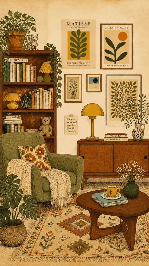
vintage interior illustration
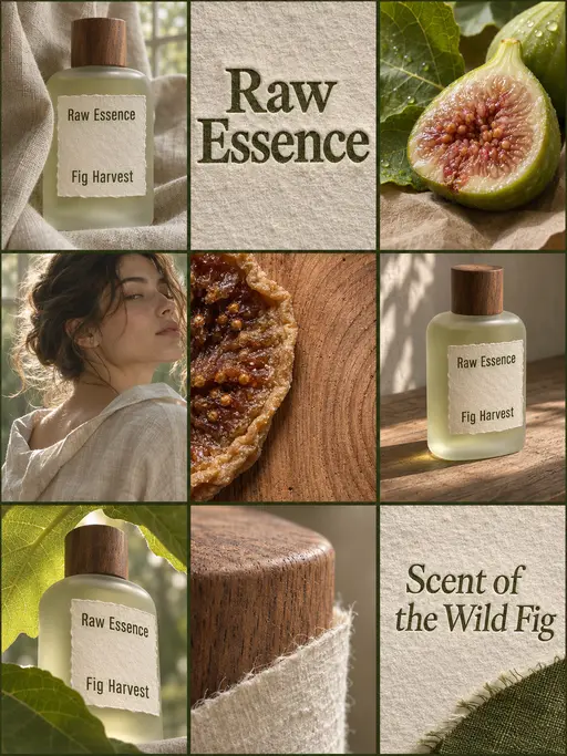
perfume advertising poster
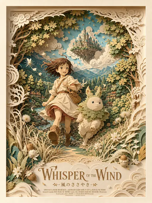
3D layered papercraft poster
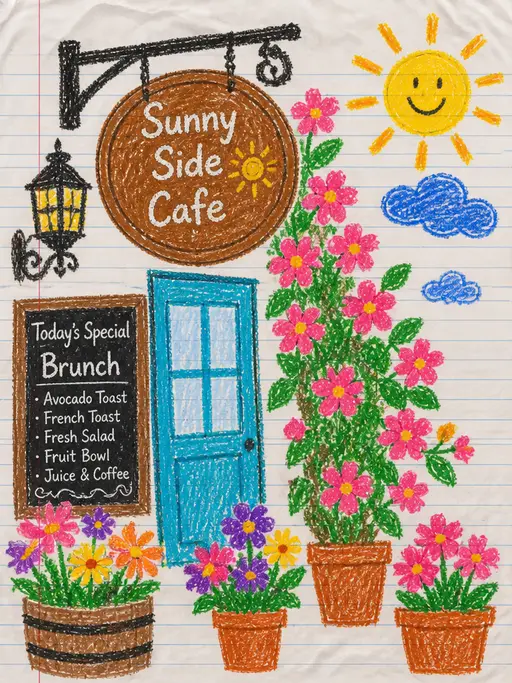
child's crayon drawing
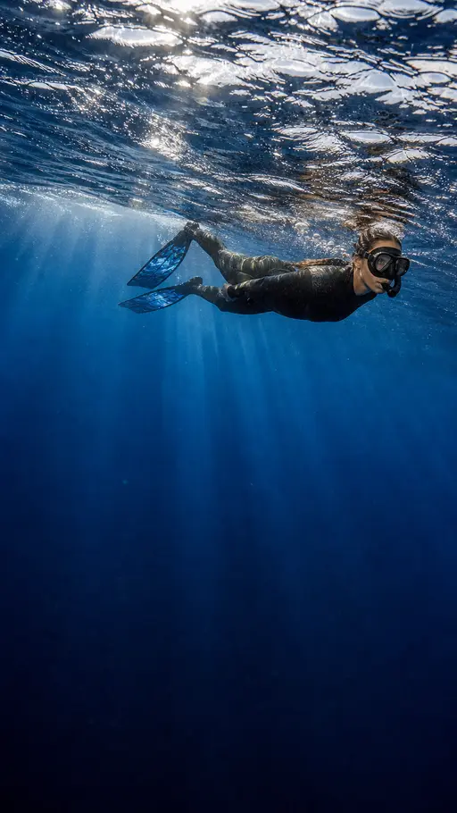
Underwater photography
blue ocean

Felt-textured cartoon avatars
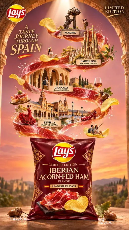
Creative Potato Chip Posters
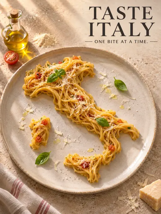
Food Advertising Posters
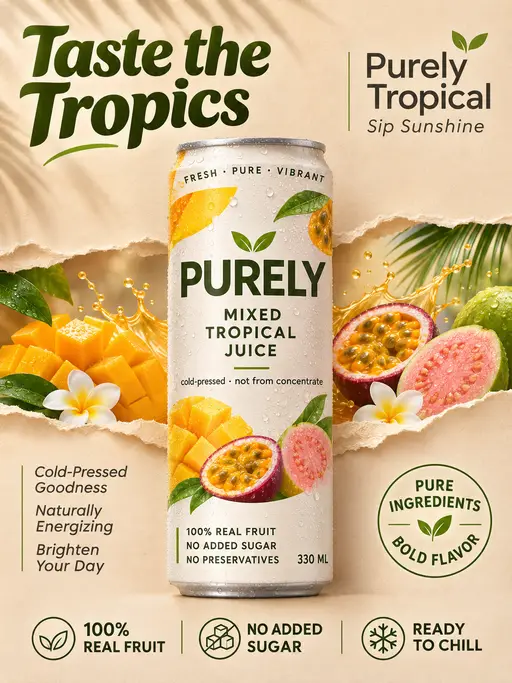
Fruit Juice Product Poster

Advertisement Poster for Hair Care Essential Oil
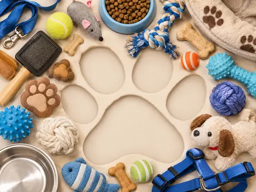
Pet Lifestyle Theme Creation
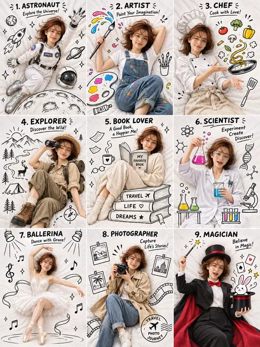
3×3 collage

Christmas poster