Culinary poster
model
gpt-image-2
prompt
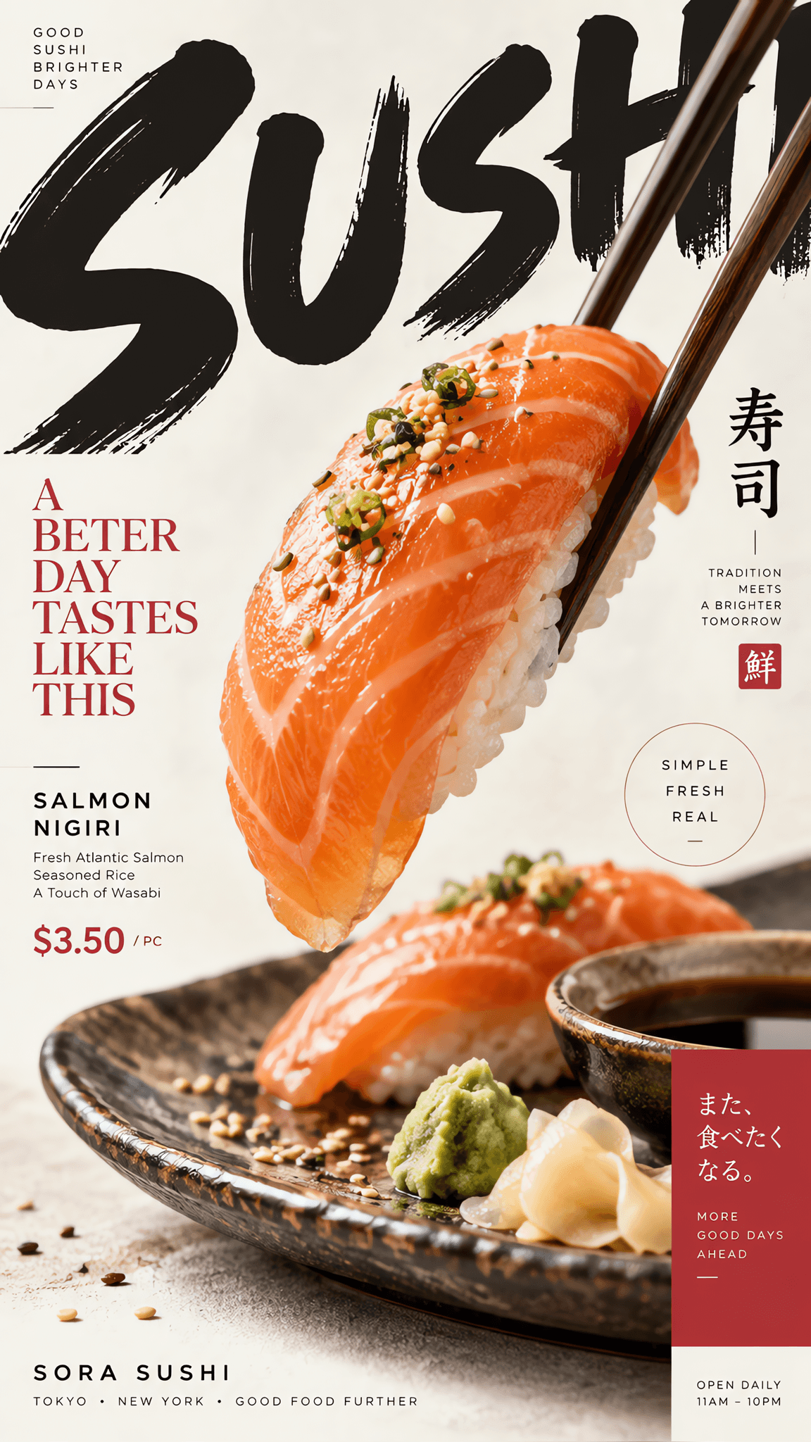
Create a vertical editorial sushi food poster. The entire composition is built around the natural shape and arrangement of the sushi itself. Use one clear hero sushi product presented with ultra-realistic food photography, accurately capturing the plump grain texture of the sushi rice, the delicate marbling and fresh sheen of the sashimi, the crisp edges of the nori, the fine creamy texture of wasabi, the translucent reflections of soy sauce, and subtle ingredient crumbs. Avoid CGI, plastic textures, over-smoothed retouching, or generic e-commerce food photography. Let the form of the sushi determine the flow of the layout: elongated nigiri drives a vertical visual flow, a fan-shaped sashimi platter guides circular typography, and diagonally placed nigiri creates natural diagonal tension. Use oversized editorial typography as an active part of the composition. The main typography should be bold and prominent, cropped by canvas edges, partially hidden behind sashimi and sushi, split across different areas, or rotated/extended beyond the frame based on the sushi's geometry. Food and typography must deeply overlap and interact—let the sushi cover parts of letters, cross typographic boundaries, break through color blocks and grids—so photography and graphic design merge into one, rather than simply placing text beside the product. Maintain a clear hierarchy: oversized display typography, hero sushi photography, main headline, product name and ingredient information, and concise supporting details such as price or hours. All supporting copy should be concise and meaningful; no meaningless filler text. Use a restrained color system with a soft neutral background of light off-white or pale warm gray, preserving the food's natural colors, paired with 1–2 restrained brand accent colors. Only add a few graphic elements such as thin lines, dots, open frames, geometric color blocks, or small information labels. The composition should be energetic and asymmetrical, precisely art-directed, with ample negative space for readability. The final result presents a modern food editorial design quality, featuring bold typography, dynamic composition, photorealistic sushi photography, a retro-modern brand feel, and crisp visual rhythm. The style is playful yet professional