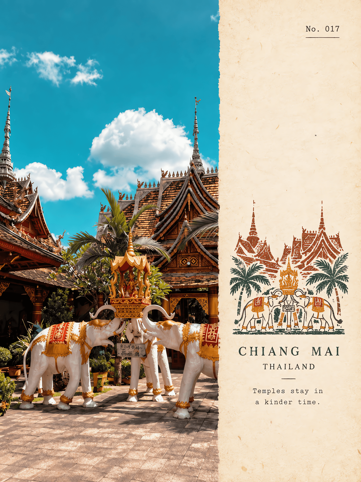
Stamped Travel Notes
model
gpt-image-2
prompt
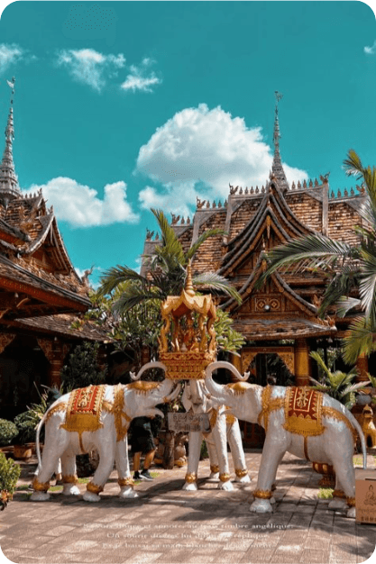
Use each uploaded photo as the only visual source.Create one independent “rubber-stamp travel note poster” per photo and output each separately.Never combine uploads or make a collage.Use a horizontal 4:3 canvas with a clean editorial layout.Two connected zones,no visible divider:left photo zone about 58% of the width,right aged-paper zone about 42%. Left zone:keep the upload fully photographic.Preserve the main subject,architecture or landform,plants,people when present,spatial relationships,natural light,real texture,and original color mood.Apply only restrained publication-level grading and delicate film grain.You may crop naturally to fit the layout,but never stretch,distort,move,replace,erase,or repaint the main subject. Right zone:build a warm ivory aged-paper field with fine fibers,soft grain,and matte texture.Keep abundant blank space. Stamped motif:extract only the most place-defining cues,such as the main silhouette,key building shape,terrain profile,road,shoreline.Compress them into one small multicolor rubber-stamp impression placed in the lower-middle of the right paper zone.The motif occupies only about 30-38% of the right-zone height and stays modest with large empty margins around it.It is a stamp image,not a full illustration or logo. Reduction rule:do not copy every object.Keep only the minimum needed for instant recognition.Remove crowds,vehicles,dense windows,repeated buildings,broken vegetation,and irrelevant clutter. Interpretation guide:keep the clearest contour and landmark logic.Iconic buildings may retain roofline,dome,arch,tower,or facade.Mountain settlements become a few stepped masses.Coastal scenes keep cliff outline and shoreline.City panoramas keep the skyline and one landmark.Natural views keep the main landform,tree mass,shoreline,or road direction.If a foreground object matters,preserve it as a simple stamped silhouette. Color and stamp craft:extract 2-4 ink colors from the source.Use restrained hues such as carbon black,deep green,brick red,ochre,or slate blue when suitable,but do not force a fixed palette.Keep color sparse.Render each color as a separate hand-stamped layer with carved marks,uneven ink density,tiny gaps,minor misregistration,light pressure shifts,soft edge wear,and occasional broken imprint texture.The result should feel handmade and printed,never vector-clean,airbrushed,or watercolor-smooth. Typography:add only a few tiny English note elements on the right paper,such as a serial number,a short title or place cue,and one short note line.Keep text brief and secondary. Overall feeling:premium travel notebook,editorial archive page,and collectible rubber-stamp field note.Calm,clean,poetic,and place-specific. Negative:No collage,no hard divider,no redraw of the left photo,no oversized stamp,no dense decoration,no bright tourist-poster palette,no polished vector icon,no glossy 3D,no anime,no busy scrapbook clutter,no logo,no watermark,no UI.
parameters
Reference Images