
Ingredient Field Notes
- Immagine
- 3:4
- 1536 × 2048
Ricetta di generazione
- modello
- GPT Image 2.0
- risoluzione
- 2K
- qualità
- medium
- riferimento

Prompt
Use each uploaded **local food photograph** as the only visual source.Create **one independent high-end editorial poster per photo** and output each one separately.**Never combine multiple photos,multiple plates,bowls,or different dishes into a single image.**Each poster must be based on **one clearly recognizable single plate or single bowl** as the main subject.The dish should contain **at least three visibly identifiable ingredients**,such as a starch,meat,seafood,egg,vegetables,herbs,nuts,pickles,sauces,or side components. Create the poster in a **vertical 3:4 composition** with a clear editorial split between **real food photography** and **ingredient observation sketchwork**. **Upper Section·Original Food Photograph** The upper section should occupy about **45%–50%** of the total height.Keep it fully photographic and faithful to the uploaded image.Accurately preserve the **plate or bowl outline,ingredient count,arrangement direction,size relationships,realistic textures,natural light,viewing angle,and original color atmosphere**.Apply only **subtle publication-level color grading** in the spirit of an independent food magazine or travel editorial,and add only an **extremely light film-grain layer**.Do **not** restyle the food,replace ingredients,move components,change portion size,add garnish,or redraw the real photo as an illustration.In fitting the layout,you may crop the surrounding context with restraint,but the whole dish must remain clearly recognizable as a complete plated subject. **Section Boundary** Separate the upper and lower sections with a **straight,clean,and controlled horizontal boundary**.You may optionally include a **very narrow warm paper spacer**,but keep it subtle.There must be **no gradient,no bleeding,no dissolve effect**,and no ingredients crossing the boundary. **Lower Section·Ingredient Observation Sheet** The lower section should occupy about **50%–55%** of the frame and sit on a **warm off-white or ivory natural drawing paper** background.Show visible **paper fibers,fine surface texture,faint smudges,and slight irregularities**.Do **not** redraw the full dish again in the same way as the upper photo.Instead,turn the same plate into a **clean paper-based ingredient observation record**,like a refined food field-note page. **Observation Layout Rules** 1.Select **3 to 6 real,clearly identifiable components** from the original dish. 2.Near the center or slightly lower area of the bottom section,draw **one small,highly abstract but still immediately recognizable mini version of the full plate or bowl**. 3.This mini full dish should occupy only about **28%–40% of the lower-section width**. 4.Extract the chosen ingredients individually and present them as separate **watercolor specimens,cross-sections,leaf studies,grain clusters,sauce swatches,or structural food sketches**. 5.Vary the size and orientation of the ingredient studies so the composition feels **sparse,airy,and slightly asymmetrical** rather than evenly arranged. 6.Use **fine,slightly hesitant black ink lines**,small arrows,and simple numbering to connect the ingredient samples to their approximate positions in the mini dish. 7.Preserve at least **35%–50% continuous off-white paper space** around the studies.Do not overcrowd the lower section with arrows,text,or specimens. **Material and Drawing Language** The lower half should feel like a **handmade food observation notebook** rendered with: - **matte opaque gouache** - **controlled black ink outlines** - **dry-brush gaps** - **uneven pigment coverage** - **visible paper grain** - **small watercolor bleeds and edge variation** - **subtle hand-drawn imperfection** The artwork should feel **collected,observed,and editorial**,not polished like a commercial menu illustration and not decorative like a scrapbook. **Visual Style of the Ingredient Studies** Keep the ingredient studies simplified but recognizable.Focus on **shape,color blocking,cut surfaces,texture cues,and structural identity** rather than full realism.For example,a sliced egg may show yolk and white,a shrimp may show its curved silhouette and shell rhythm,a herb may be a quick leaf study,a sauce may appear as a painted swatch,a grain may appear as a loose clustered sample.The lower section should read as **ingredient observation**,not a second plated meal. **Typography** If text is used,keep it minimal and editorial.You may add a few tiny handwritten or serif-note labels,such as short ingredient names,numbers,or small observation marks,but only when they genuinely improve the composition.Text must remain **small,light,and secondary** and should never dominate the page. **Overall Style Goal** The final result should feel like a **premium travel-food editorial poster**:real local food photography above,and below,a quiet,refined ingredient observation page on textured paper.The mood should be **curious,collectible,intelligent,handmade,and publication-ready**,combining food culture,travel documentation,and visual note-taking. **Negative Constraints** No multi-photo collage,no combining different plates or bowls,no duplicated dishes,no re-plating,no ingredient replacement,no added garnish,no decorative border overload,no gradient split,no bleeding across the divider,no full redraw of the complete dish in the lower half,no crowded ingredient layout,no glossy digital painting,no vector-flat infographic style,no smooth 3D rendering,no commercial menu mockup,no logo,no watermark,no UI,and no gibberish text.
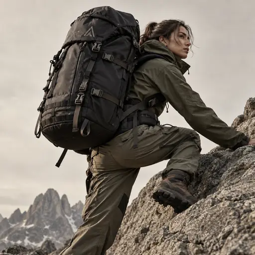
outdoor photography
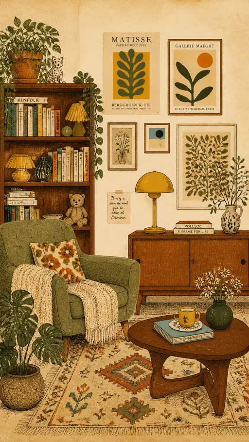
vintage interior illustration
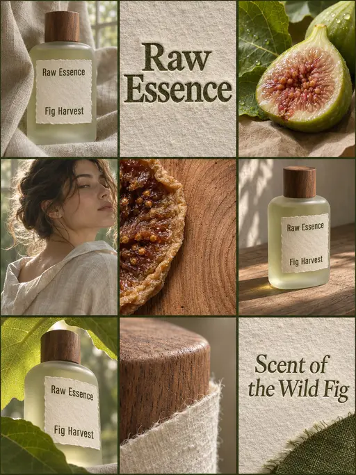
perfume advertising poster
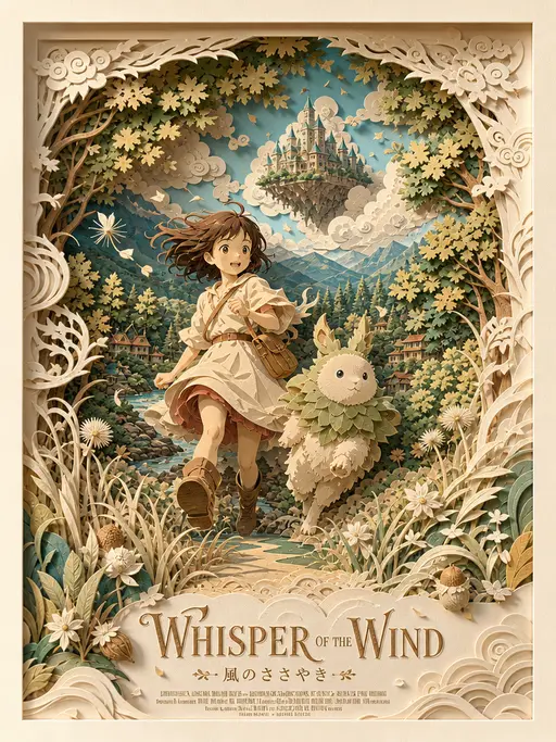
3D layered papercraft poster
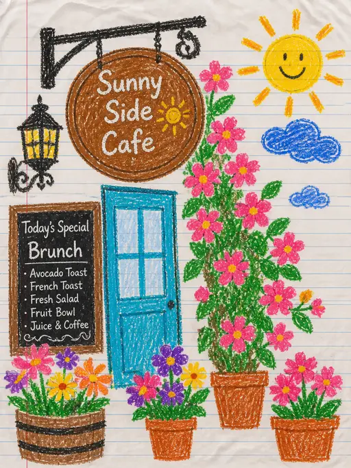
child's crayon drawing
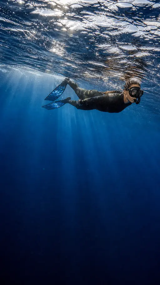
Underwater photography
blue ocean
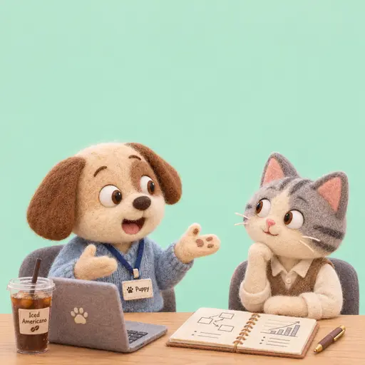
Felt-textured cartoon avatars
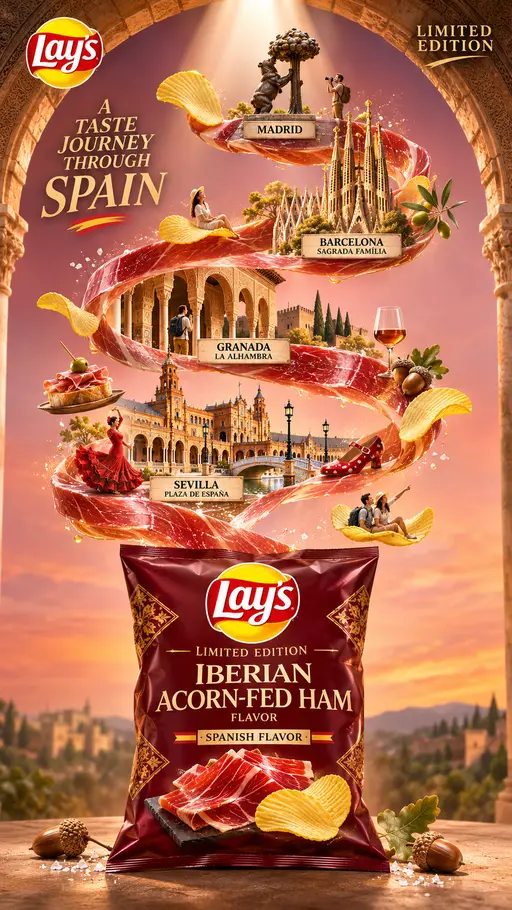
Creative Potato Chip Posters
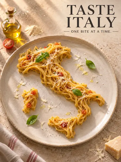
Food Advertising Posters
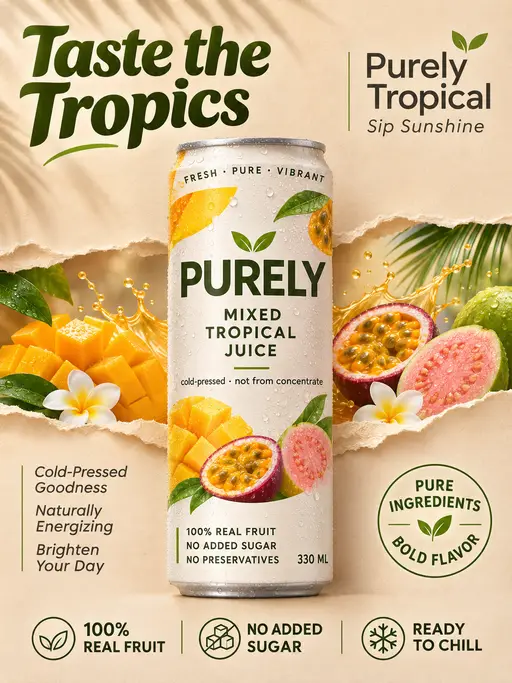
Fruit Juice Product Poster
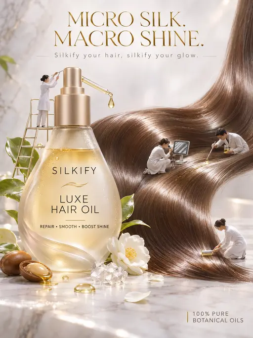
Advertisement Poster for Hair Care Essential Oil
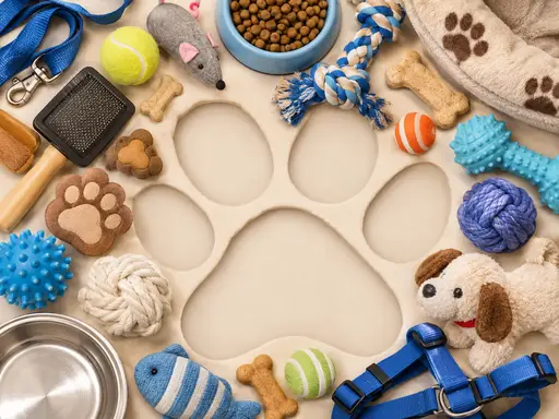
Pet Lifestyle Theme Creation
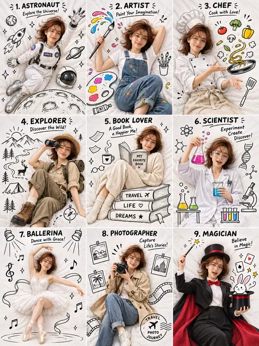
3×3 collage
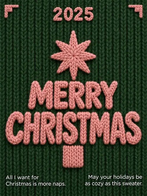
Christmas poster